

 Rafraîchir
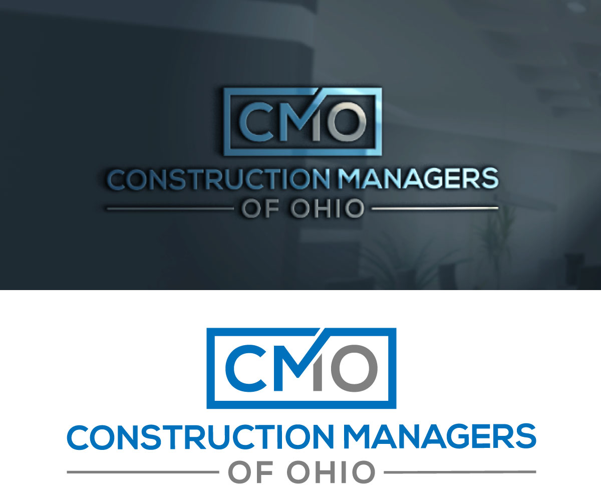
Commercial Construction Company Needs Fresh Logo
Vous souhaitez remporter un projet comme celui-ci ?
Ce client a reçu 615 designs de logo de la part de 212 designers. Il a choisi ce design de logo de hirosmek comme design gagnant.
Inscrivez-vous Trouvez des Projets de Design
-
 US$490
-
 615 designs
-
 212 designers
Brief de Design de Logo
I purchased a 45 year old commercial construction company in 2021 and have spent the past two years getting all of the internal systems updated. Now it is time to refresh our logo to reflect the new path forward. I am attaching the old logo that was based around the type of construction the company used to focus exclusively on, which is tilt-up. We no longer want to focus on one type of construction and I want our initials to be more of a focus as we go by "CMO" often. However, the Construction Managers of Ohio must be included I think so people know what it is "CMO" does. Color wise blues would be my preference and I have no interest in generic looking logos that have skyscrapers or tools.
Marché(s) Cible(s)
New Clients - Higher Education, Healthcare, Manufacturing, Office
Secteur / Type d'entité
Commercial Building Construction
Texte du logo
Construction Managers of Ohio
Styles de logo qui vous intéressent
Logo mot symbole
Logo (texte seulement)

Logo de Lettermark
Acronyme ou logo texte (texte seulement)

Styles de police à utiliser

Autres polices appréciées:
- Gotham and Gotham Rounded
Couleurs
Couleurs choisies par le client et à utiliser dans le design de logo:
Aspect
Chaque curseur illustre les caractéristiques de la marque client et le style que doit transmettre votre design de logo.
Élégant
Audacieux
Léger
Sérieux
Traditionnel
Moderne
Sympathique
Professionnelle
Féminin
Masculin
Coloré
Conservateur
Économique
Haut de gamme
Exigences
Bien d'avoir
- "CMO" initials
Ne doit pas comporter
- Generic skylines or tools