Lugus
Vous souhaitez remporter un projet comme celui-ci ?
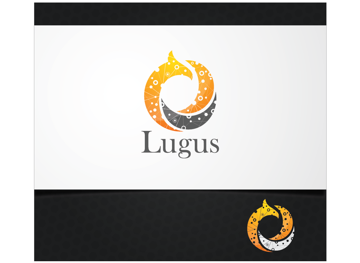
Ce client a reçu 110 designs de logo de la part de 49 designers. Il a choisi ce design de logo de Blind comme design gagnant.
Inscrivez-vous Trouvez des Projets de Design- Garanti
-
 €300
€300
-
 110 designs
-
 49 designers
Brief de Design de Logo
Note : when I got a good feeling with at least one designer, the project will be switched in non-refundable. By a good feeling, I mean a "wow !! " effect.
This logo will be for a new startup running on the web ( think "network" when you design the logo.)
Our aim is to diffuse (i.e. to sell) knowledge to our members in order to get them creating their own online business. The knowledge will be in the field of marketing and strategy. We will be running a blog with free and paid content.
The name of the company will be "lugus" (the first letter is a L). The emblem will be a cock (I mean the animal). It is not compulsory to have the cock in full, if you want, you can work with only the head of the cock. The cock should be shown sideways.
We would like our logo showing that we are active on the web, forming a community with our readers/clients/members. You must use (connected) dots somewhere to show that.
Our colors will be orange and dark gray (maybe with declinaison, i.e. you could also use yellow somewhere…)
Our tagline will be something like "gagner de l'argent et rendre le monde meilleur", it means "earn money and make the world a better place"
The emblem shouldn't smaller than the name.
Mises à jour
After the logo, we may need a design project for a wordpress templates.
Added Wednesday, February 05, 2014
First, let me thank all of you for the great work you are doing. The briefing is never an easy task, so I will try to make it as clear as possible.
Please take consideration of these :
1) The L should be in capital letter to be sure that no one thinks it as "iugus"
2) Use a white or light gray background to promote the logo
3) Must have dots and/or connected dots in the logo
4) The cock must look to the right, not the left
5) Do not use a full cock, use only the head or the head + the breast. So wherever I use the word "cock", you should understand "the head of the cock" or "the head and the breast of the cock"
6) The cock must not be real, you can use angular forms (you should use angular forms), with a real cock I feel like I am opening a restaurant ! (remember : it is for an internet company :-) )
7) Lugus is a celtic god of war, so make the cock a bit more aggressive (I've said a bit more, do not make a killer cock neither :-) )
8) The name "Lugus" must be below the picture of the cock
9) I've mentioned orange and gray as primary colors, you can use red or yellow and/or black a bit somewhere if you want
10) The picture of the cock must be at least as width as the name "Lugus" below it.
I will now answer to each of you personally and emphasize which point you should work on.
So again, I know it is not an easy task and let me thank you one more time for the work you are doing.
Added Wednesday, February 05, 2014
Maybe an idea to try : create something that is like a spider's web with connected dots, and the head of the cock (which should be more angular) is bursting this spider's web. (the head should be looking to the right).
Added Wednesday, February 05, 2014
One important thing to note and try is that the pictures (with the head of the cock and the connected dots) should be modern, high-tech like, as we are an internet company
Added Wednesday, February 05, 2014
Dear all,
I would like to thank you again.
For this second shot, you were 37 designers, submitting 61 new designs.
I really appreciate the time you've spent on this project.
As the deadline comes, I have to make decisions.
Until now, I don't have the "wow" effect I am looking for.
I have printed all the designs received and I have showed it to relatives and colleagues.
I looked to their eyes to see what they really felt about it.
I did the same exercise to myself and it ended up with this :
If I have to think why I like the design, it means that this design is not for me.
First, I have to think "this one has something", and then I can think why this one has something.
Doing this, I have chosen to work with 5 of you, to try to have what I really want.
If your design is not chosen, please do not consider that you have done a bad job.
Again, I appreciate your participation in this project.
I take the time to write this because I don't have the time to write to each of you personally.
The chosen designers will received personal feedback in a few hours.
Regards,
Sébastien
Added Friday, February 14, 2014
Well, I have look again and I decided to choose 7 designers for the next step, instead of the initially 5 planned :-).
Added Friday, February 14, 2014
Marché(s) Cible(s)
people between 20-35 yrs, with a deep passion in something, speaking french (as the site will be in french), they could have a college degree or a master degree, but not necessarily.
Our target live all over the world, our main market will be canada and france, but we want to touch any french speaking people in each country.
Secteur / Type d'entité
Marketing
Texte du logo
lugus
Styles de logo qui vous intéressent
Logo pictural
Un objet réel (texte facultatif)
Styles de police à utiliser
Couleurs
Couleurs choisies par le client et à utiliser dans le design de logo:
Aspect
Chaque curseur illustre les caractéristiques de la marque client et le style que doit transmettre votre design de logo.
Élégant
Audacieux
Léger
Sérieux
Traditionnel
Moderne
Sympathique
Professionnelle
Féminin
Masculin
Coloré
Conservateur
Économique
Haut de gamme
Exigences
Doit avoir
- a cock (the animal) (or literally or a suggested image of a cock)
the name of our company
connected dots somewhere (to show our internet appurtenance, our community, and so on…)
Bien d'avoir
- * connected dots showing the internet nature of our company
* a world or a suggested image of a world showing that our community is spread all over the world
* as we target people who do not dare to take the step of entrepreneurship, the logo should be "dynamic" and maybe showing "bravery" :-)
* the logo could feel as "technologic, high tec, ..." or "academic, university, wisdom, ..."
it's not my first project here, as I feel that we are on the good way, I will give more details for selected designers.
Ne doit pas comporter
- The cock in full
The width of the picture of the cock must not be smaller than the width of the name "Lugus"