Start-Up Healthy, Natural Foods Company
Vous souhaitez remporter un projet comme celui-ci ?
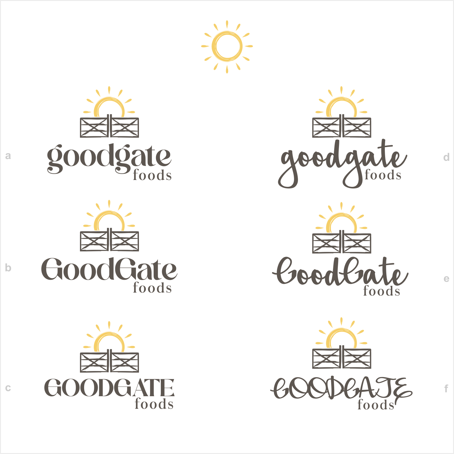
Ce client a reçu 116 designs de logo de la part de 25 designers. Il a choisi ce design de logo de Arham Hidayat comme design gagnant.
Inscrivez-vous Trouvez des Projets de Design-
 US$150
-
 116 designs
-
 25 designers
Brief de Design de Logo
GoodGate Foods (or goodgate can be written in all lower case, but always one word; foods on separate line, smaller font)
Small, start-up food business that is coming out soon with a healthy, whole grain, well balanced breakfast baking mix.
Logos I like:
Hand drawn, homemade, smart, vintage and/ or boho style. Attracted to this as a person - and it resonates with the company brand, as well.
Looking for a sunrise and a farm gate (simple, not fancy or wrought iron!) used smartly as a symbol - signifying the way, the path to a better day. Since we specialize in breakfast food, we also need a sun or sunlight color to invoke daybreak, sunrise. The sun seems like a good place to use color.
Our breakfast mix and future products have the right balance of carbs, protein and fats, making them a complete meal - much like the way a gate completes an entire fence. Might be a stretch, but if design could somehow show the whole fence, with emphasis on the open gate, that would be a bonus.
Adding a grass sketch or oat leaf / grass near the gate to signify that it is outside might be interesting.
Message our brand / logo conveys:
Want logo to show that we are fresh and different. Want to be seen as simple, human, handmade, and family friendly.
Main competitors:
Van’s, Kashi, Kodiak Cakes Powercakes, and Birch Benders
Color preferences:
As far as color palette, I like the muted, natural look of greens and yellows and blues.
No clear idea on font, but will be picky. Don’t want a font I see everywhere. Maybe play with the look of GoodGate in one font, and Foods in a different font? GoodGate can be all uppercase or all lowercase (goodgate). Definitely want a mix of fonts - maybe serif and script. I have always liked the look of a double-storey, lower case “g” and think it pairs well with all of the round letters in the company name. Because GoodGate Foods has two double “o” letters, maybe the “oo” are pronounced in someway (smaller, underlined, higher, etc.).
Mises à jour
Need a couple of days before selecting a winner
Did not hear back from designer of one logo option. The other logo option cannot find a font that works.
Marché(s) Cible(s)
Cool, kitchen savvy consumer that looks for healthier items to make at home. He/she shops at natural food markets or in the organic section at large chain grocery stores.
Secteur / Type d'entité
Healthy packaged foods; pancake / breakfast & baking aisle.
Texte du logo
GoodGate Foods or (goodgate foods - lowercase or upper; whichever works with the font choices)
Styles de logo qui vous intéressent
Logo pictural
Un objet réel (texte facultatif)
Styles de police à utiliser
Couleurs
Couleurs choisies par le client et à utiliser dans le design de logo:
Aspect
Chaque curseur illustre les caractéristiques de la marque client et le style que doit transmettre votre design de logo.
Élégant
Audacieux
Léger
Sérieux
Traditionnel
Moderne
Sympathique
Professionnelle
Féminin
Masculin
Coloré
Conservateur
Économique
Haut de gamme
Exigences
Doit avoir
- Sunrise and a farm gate - not a fence! - gates open and close. Usually two sides that are mirror images, or a latch in the middle showing that it opens.
Bien d'avoir
- Hand drawn, simple, soft, classic. Thoughtful, clever, approachable. Whole Foods shopper, sophisticated foodie type.
Ne doit pas comporter
- NOT corporate. Not young and cutesy; NO 70's retro or bold colors, shapes or fonts.