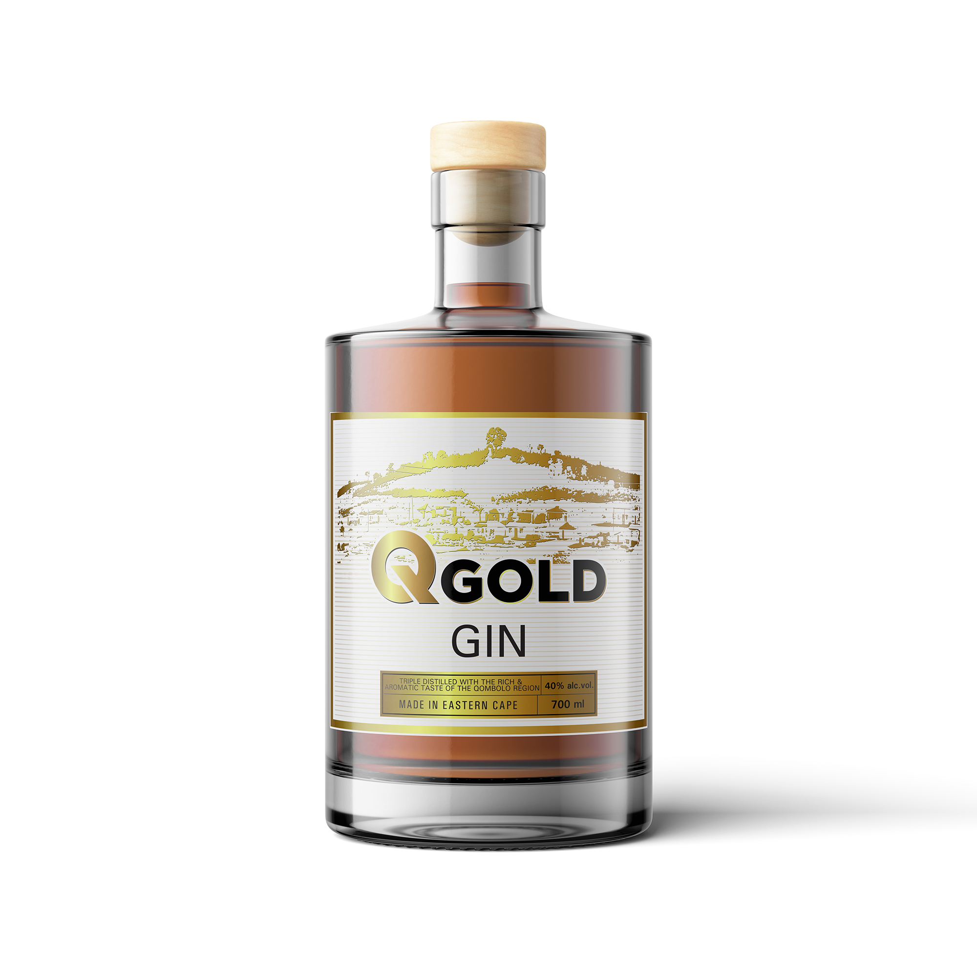
Q.Gold Gin - Bottle label Design
Vous souhaitez remporter un projet comme celui-ci ?
Ce client a reçu 14 designs étiquette de la part de 5 designers. Il a choisi ce design étiquette de ronin71 comme design gagnant.
Inscrivez-vous Trouvez des Projets de Design-
 US$120
-
 14 designs
-
 5 designers
Brief de Design Étiquette
We are manufacturers of Gin in South Africa.
The name of our Gin is Q.Gold Gin with Q standing for Qombolo, a Xhosa Village in the region of Eastern Cape.
We would like our brand to depict the following (really the focus of Gold on it)
> Prosperity of the place
> Wealth of the place, land, material or in the people
> Gold rush, potential, hope
As the brand matures, we would like to have campaigns with it. See ideas below:
> Q.Gold Premium
> Black gold edition
Limited edition will be released every year
- Q.Gold estopini (location)
- Q.Gold emlanjeni (location)
> Each batch of bottles with focus on a specific area/location in Qombolo. One that is known and will be highlighted on the map design of the bottle.
Bottles based on landmarks in Qombolo and landmark design in the Big Q.
Below we tried but we are not where we really want to be in terms of Gin Bottle elegance.
Marché(s) Cible(s)
Target market is the young crowd. Young Xhosa men and women working really hard to get their goals. Positive thinkers. Elegant. Fresh. Bold. Age from 24 to 45. People who enjoy quality products.
Secteur / Type d'entité
Beverage Industry. Craft Gin.
Styles de police à utiliser
Couleurs
Couleurs choisies par le client et à utiliser dans le design de logo:
Aspect
Chaque curseur illustre les caractéristiques de la marque client et le style que doit transmettre votre design de logo.
Élégant
Audacieux
Léger
Sérieux
Traditionnel
Moderne
Sympathique
Professionnelle
Féminin
Masculin
Coloré
Conservateur
Économique
Haut de gamme
Exigences
Doit avoir
- Gold colour as a theme. Try and make the background textured.