International MultiIndustry Team Coaching Site
Vous souhaitez remporter un projet comme celui-ci ?
Ce client a reçu 53 web designs de la part de 7 designers. Il a choisi ce web design de NZ Creatives comme design gagnant.
Inscrivez-vous Trouvez des Projets de Design- Garanti
-
 €350
€350
-
 53 designs
-
 7 designers
Brief de Web Design
Hello Designers,
We need a redesign of the pages attached.
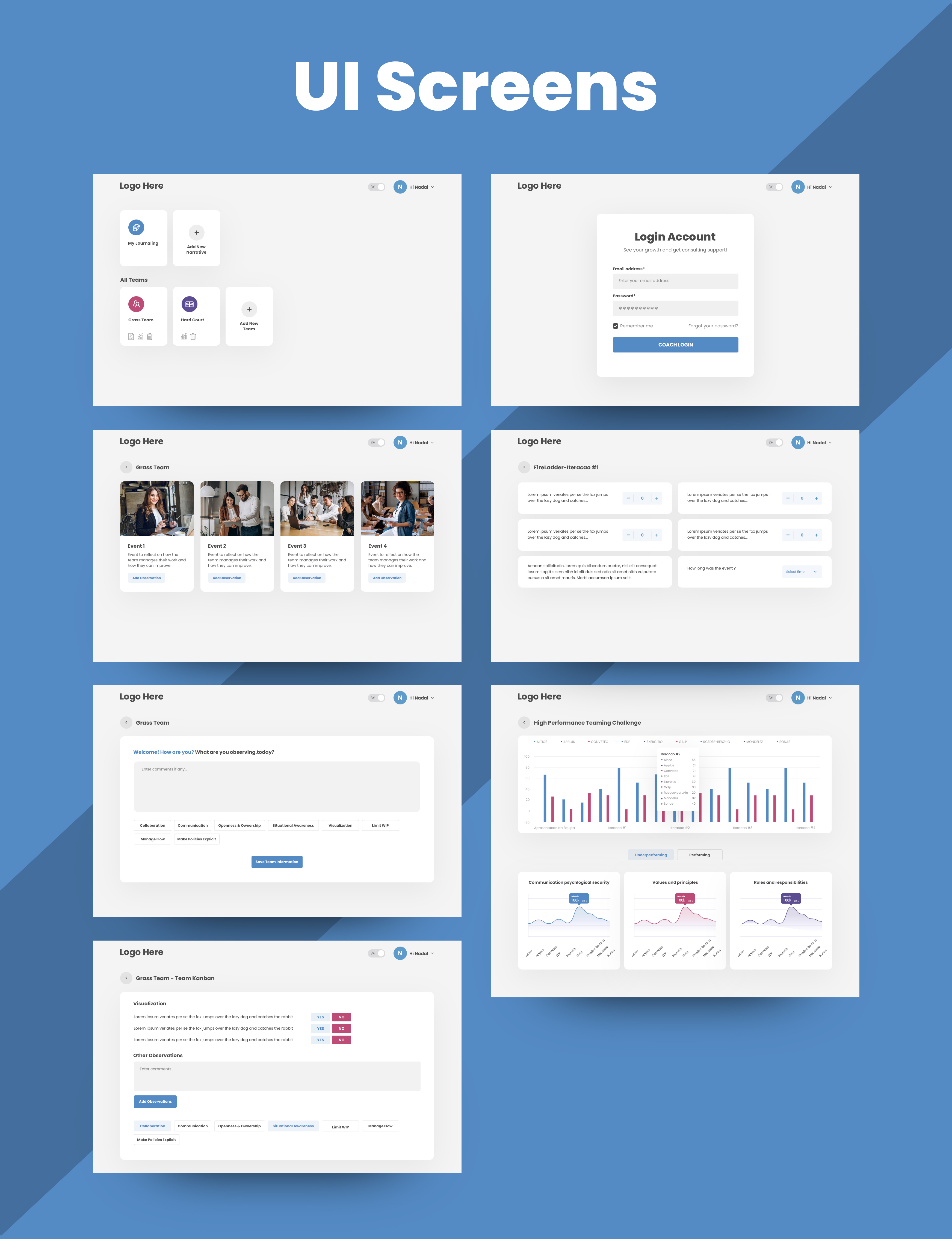
The design must be engaging and modern, with a focus on the user experience, particularly for the "observations" page. Because this is the main page of the website. It is to be used on a 10'' tablet or desktop, to record observations on the fly, so it must be intuitive and efficient.
The positioning of the metrics and observations and etc, are just a reference. you can switch it up if you feel there is a better way (PLEASE DO ;) ).
There are many categories (color coded with borders in the example hpt_6_observations.jpg) and observation metrics within each category. This is the Key page, because it is the One with the most interactions.
The user should know when it has selected a category (there should be some visual hint) and the different metric widgets should be accounted for.
There are 3: The time widget at the end, numerical widgets (recording more or less numbers), and boolean ones (selected or not).
For the numerical widgets, we show plus and minus characters, but you can change this, being creative, keeping in mind that it must work well on a mobile device and desktop, and must be intuitive and quick.
Set your creativity free with the login screen , home screen, categories secret, events screen, journaling and observations screen .
We would like the site/mobile version to have a very modern look. Something that would be found in very popular and user friendly apps.
***** The events, journaling, category and home screens are getting 2 much attention , please focus also on the observations screen *******
Imagine you are a psychologist tasked with observing the behaviour of teenagers during group work. And you have a tablet on which to record what you observe. Now imagine you need to observe during 3 classes: Biology, Math, Physics (these are events). For each class (event) you will have to record observations in 3 categories: Social Interaction, Leadership, Communication (these are categories).
Example of the metrics (these are observations) for Leadership:
" the teenager direct other colleagues" (boolean widget),
"the teenager speaks more than everyone else" (boolean widget)
"the teenager interrupts colleagues speaking" (number widget)
"the work took hh:mm" (time widget)
The observations screen can have any shape and form you think of. It doesn't need to be that single column with yes and nos, or that double column with the squared cards.
thank you.
Hope that was useful intel :)
Available for any questions you might have.
Good luck :)
Marché(s) Cible(s)
Enterprise teams
Nombre de Pages Demandé
5+ page
Styles de police à utiliser
Aspect
Chaque curseur illustre les caractéristiques de la marque client et le style que doit transmettre votre design de logo.
Élégant
Audacieux
Léger
Sérieux
Traditionnel
Moderne
Sympathique
Professionnelle
Féminin
Masculin
Coloré
Conservateur
Économique
Haut de gamme
Exigences
Doit avoir
- Modern design