Wine label design for a family winery in Slovenia
Vous souhaitez remporter un projet comme celui-ci ?
Ce client a reçu 10 designs graphiques de la part de 5 designers. Il a choisi ce design graphique de syanagawa comme design gagnant.
Inscrivez-vous Trouvez des Projets de Design-
 €70
€70
-
 10 designs
-
 5 designers
Brief de Design Graphique
We need new label design for our wines.
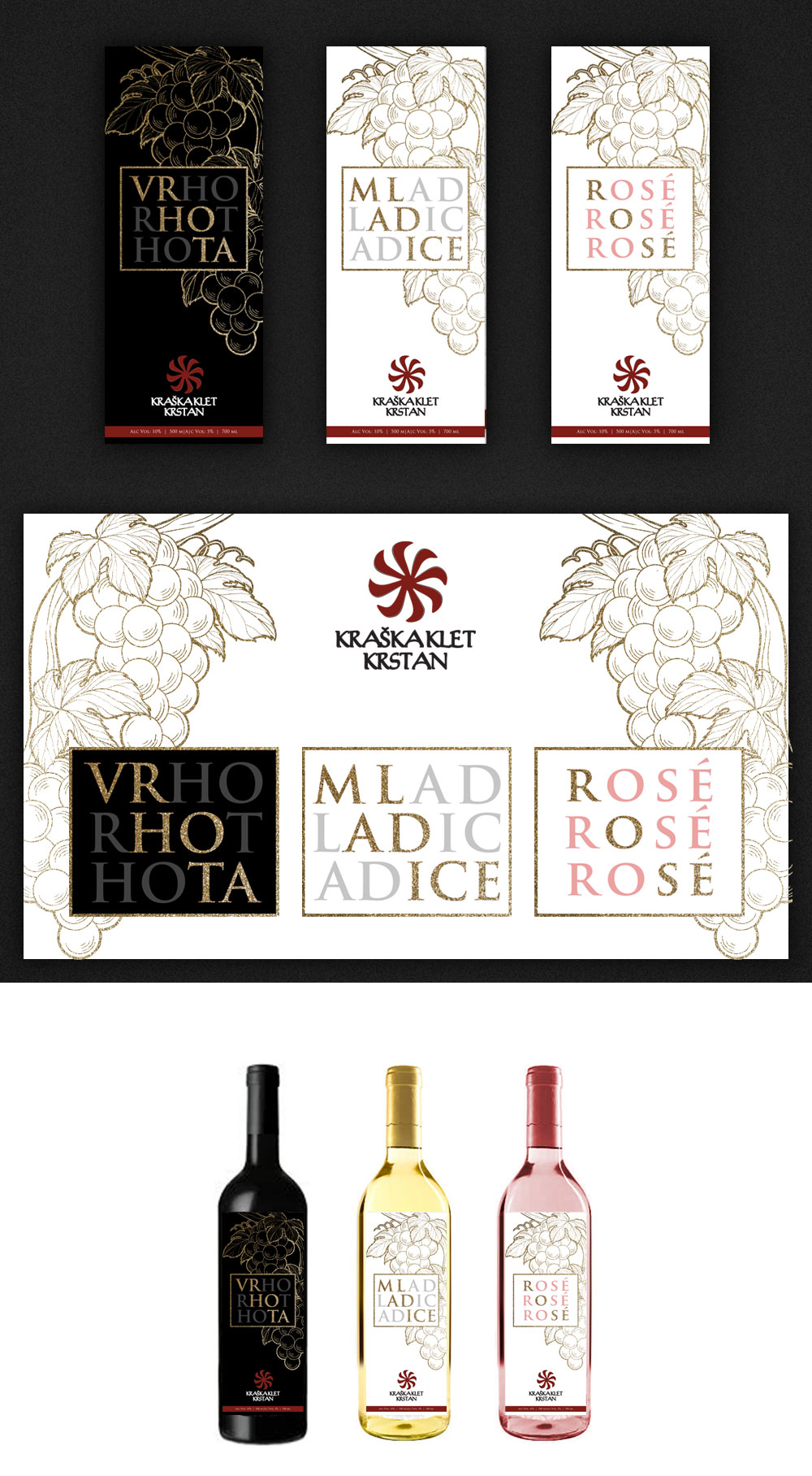
We are small family wine producers who focuses on good quality wine and loves to experiment, mixing tradition with new, more modern approaches. Our main product is ‘Teran’, red wine whose character is highly defined by terroir: more acidic, but rich body and very rich, dark colour (we say it's not red, but black). We also age a small portion of this Teran wine with wood, which we named 'Vrhota' (after one of our vineyards). From the same grapes as Teran we also produce a small quantity of Rose. And we also produce two white wine varieties: one is 'Belc', cuvee of several different sorts of grapes. The other is 'Mladice', Chardonnay wine, named after another of our vineyards. Aside from all that we also produce liquour (Teranov liker) made from Teran wine and a small quantity of other spirits (Grappa, various fruit liquors, a version of Jägermeister, and ‘Travarica’ which is grappa infused with various herbs and spices).
Belc, Rose and Teran are considered our 'basic' line, whereas 'Vrhota' and 'Mladice' are considered to be a higher quality line. Rose sits somewhere between this two.
In time we'd like to renew all of our labels. But the priority and subject of this ‘’project’’ is to create the two for our top line, Vrhota and Mladice and also for Rose.
For 'Vrhota' we already have a template label. The general idea behind it was play with letters and divide them along the label (VR HO TA). We found that we like the narrow, longer dimensions and that black label on black bottle, with letters that stand out due to colour or printing differences, work very well. But we're amateurs and the label is not finalized. We would ask you to do something on this basis, but please don't limit yourself only to this if you have a better idea.
For 'Mladice' the label should be in the same style to imply the same higher quality line - colours can and probably should be reversed to the lighter side (so to imply that it’s a white wine). Also, for this wine we'll use the same dark slender bottles, like you see on the image.
Please keep in mind that we'll print smaller series (1000-2000 pcs), so it must be possible to print the labels for a sensible cost. Solutions like classical offset gold print that requires large series of 10.000 pcs, will not work. But we can look into any digital printing/lacquering options that offer similar effects. Anyway, we are not experts on this field, so your advice on printing techniques is also welcomed.
Also, a word on our emblem: the logo is also not finalized and we will also ask you to work on it. The logo is part of the ornament on the doors of our homestead and represents a ‘kolovrat’ (‘spinning wheel’ in English), an old Slavic symbol for the sun, representing eternal life and spinning of time. We'd like to use it, but right now it's badly digitalized. If you'll need any better photos of it, let me know.
Marché(s) Cible(s)
30-60 yo, red wine lovers, appreciate local and speicality wines
Styles de police à utiliser
Aspect
Chaque curseur illustre les caractéristiques de la marque client et le style que doit transmettre votre design de logo.
Élégant
Audacieux
Léger
Sérieux
Traditionnel
Moderne
Sympathique
Professionnelle
Féminin
Masculin
Coloré
Conservateur
Économique
Haut de gamme
Exigences
Doit avoir
- long, narrow label dimensions (see attached Vrhota)