Logo Refresh for Australian Life Saving Club
Vous souhaitez remporter un projet comme celui-ci ?
Ce client a reçu 56 designs de logo de la part de 32 designers. Il a choisi ce design de logo de JR Studios comme design gagnant.
Inscrivez-vous Trouvez des Projets de Design-
 A$120
A$120
-
 56 designs
-
 32 designers
Brief de Design de Logo
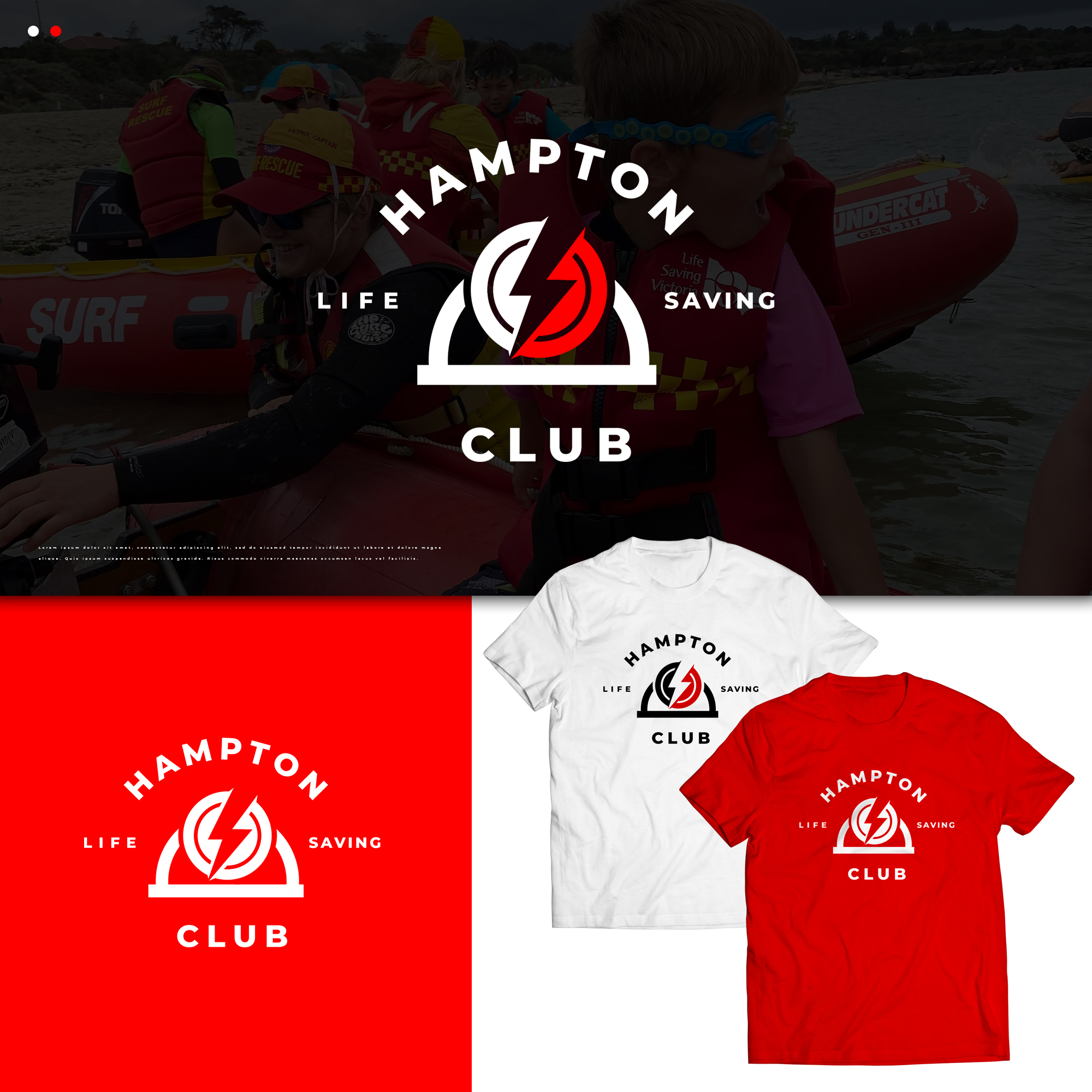
Our million-year-old logo is an terrible clip art mashup. While the general elements and colors need to remain, we could use a more professional sizing, arrangement, type treatment, maybe some depth, etc. So there's latitude, but not a ton of latitude. We have no attachment to the font, but it should be easy to read and simple.
The lighting bolts refer to our team name since the club was founded. The belt and reel thing in the middle speaks to the earliest days of lifesaving, too, but can be stylized (you'll see it in many of the other clubs' logos (examples attached, just FYI)).
The basic ask is just a cleanup. I'd love to consider just one bolt, an accent color*, etc., but it'd be a harder lift. Still, if you have an idea, share it! (*Red and yellow are offical surf lifesaving colors, so may want to stay away from those.)
More inspiration: www.hlsc.org.au
Should have mentioned: "Hampton" can be more important than "Life Saving Club"
Mises à jour
I'm absolutely amazed at the quality of the work here! I, however, am trying to manage a board of volunteers, and am struggling to even get on the calendar. If they don't get it together, I'll just have to pick my preferences and then re-connect with designers if they want one of the others (if that's even a thing). Thank you so much for your talent and response!
Added Tuesday, 13 September 2022
Texte du logo
Hampton Life Saving Club
Styles de police à utiliser
Aspect
Chaque curseur illustre les caractéristiques de la marque client et le style que doit transmettre votre design de logo.