New health software company connecting data to benefit patients and doctors
Vous souhaitez remporter un projet comme celui-ci ?
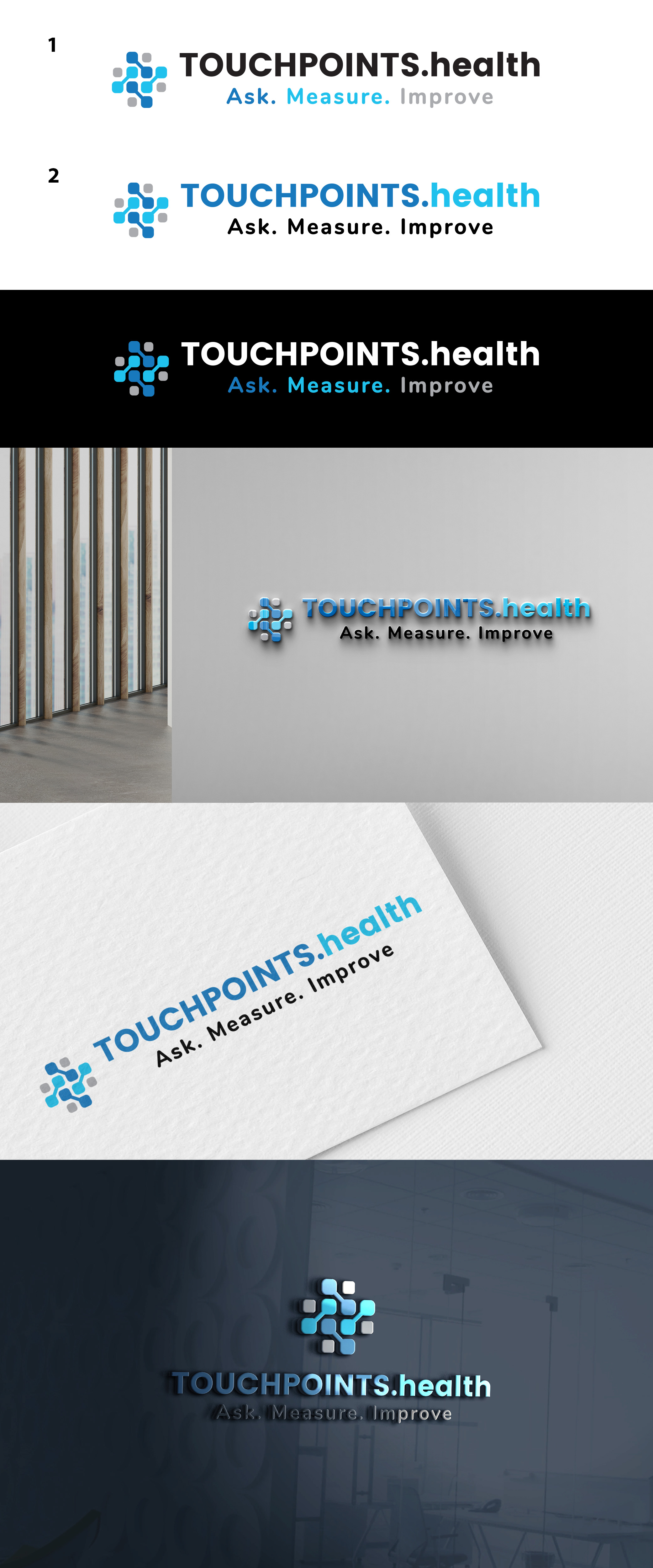
Ce client a reçu 137 designs de logo de la part de 70 designers. Il a choisi ce design de logo de DANIELLA SK (Swan) comme design gagnant.
Inscrivez-vous Trouvez des Projets de Design-
 £110
£110
-
 137 designs
-
 70 designers
Brief de Design de Logo
We need a clean logo for a first in class health software platform that improves patients journies using touchpoints doctors send them. The logo needs to reflect a 'touch' element as well as connected data points.
Keeping the TOUCHPOINTS.health with Ask. Measure. Improve below, focussing on the square logo to match it please.
Do's-We would like to keep the brand colours and fonts (see text file). We will use the logo as a favicon and as our main logo so needs to be unique enough to be recognisable from the logo alone as a favicon without the writing.
Dont's- Don't want any 'fingerprint' element or overly medicalised with health cross or snakes & staff etc.
The final design should communicate connected, secure data with a touch element.
Our current logo is enclosed so it's really re-designing the square logo preceding the words to a new, unique recognisable but clean element.
Texte du logo
The logo element doesn't need any words as it will sit alongside TouchPoints.health writing