Travel Agency Logo
Vous souhaitez remporter un projet comme celui-ci ?
Ce client a reçu 82 designs de logo de la part de 40 designers. Il a choisi ce design de logo de SF Creative comme design gagnant.
Inscrivez-vous Trouvez des Projets de Design-
 US$150
-
 82 designs
-
 40 designers
Brief de Design de Logo
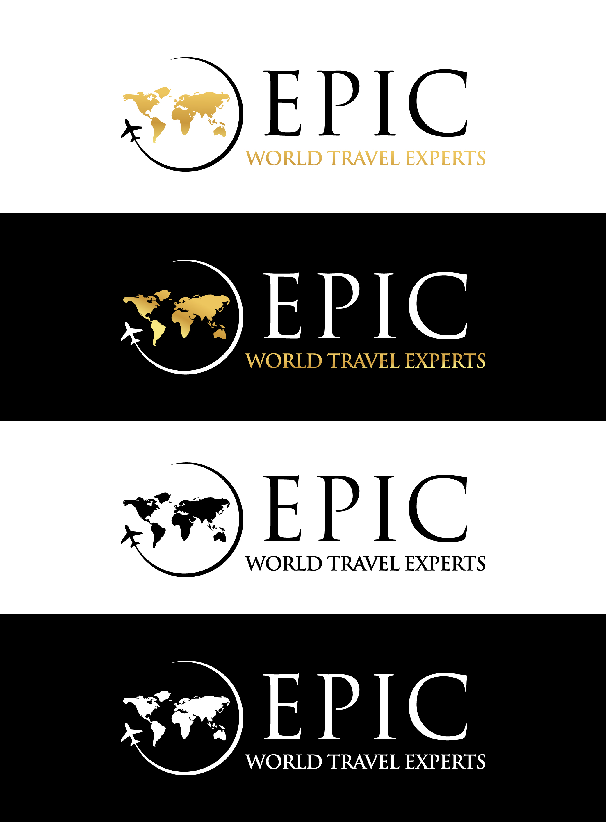
We are launching a travel agency with a focus on high-end or luxury vacations. We specialize in World travel - especially Europe, Asia, and cruises. We are looking for a logo design that has an elegant yet simple feel - not "cute" or "catchy."
Our official name is "Epic World Travel Experts" and we'd like the focus to be mainly the word Epic, with World Travel Experts as secondary (but not necessarily a tag line).
I've attached a sample color scheme we like, except perhaps replacing the black to a dark blue. The color scheme we gravitate to represents, to us, exciting colors relative to water (blues), sun/sunsets (yellows, oranges, purples), sand/earth (beige and browns). But in some way that's not too overly bold.
I've attached two logo designs we like elements of.
On "sample 2" we feel overall it has too many elements in the design, but we love a couple of the separate parts: the partial globe and the faded passport stamps.
On "sample 3" we love almost everything about it, with the exception of the wood background. We love the atlas (maybe using colors similar to those shown in our "Color Scheme"?) but this iteration seems to be used frequently, so something a little different would be ideal. We also love the font, perhaps only for the word "Epic" but then have the "World Travel Experts" underneath in a complimenting font, as in this example.
We had a brainstorm idea/image of the colors in the "color scheme" all running together, as if fading from one to the other, sort of in a "header" or "bar" style, horizontally, with the text over the top, similar to the fading colors in the "sample 3" atlas watercolor pic attached.
The final design should communicate sophistication but not arrogance. It should be memorable and easy to describe, not too complex.
Mises à jour
Your work has been really helpful, and has given us so much to consider. While we appreciate the time and expertise you've put into your work for us, many of the designs we've seen in our contest are things we've seen before in our industry. The focus of our agency is more luxury vacations which will cater towards the high-end traveler. In this case, a logo with less is actually more. We'd like to see creativity around our name (Epic) or initials (EWTE for Epic World Travel Experts), and fewer images relating to maps, globes, planes, trees, boats, etc.
The color palette we have gravitated to: black, cream, blush, gold - simple sophistication
The colors we have discovered don't represent us: pinks, blues, teals, etc.
Also, keep in mind, a variety of versions of the final design will be needed for different applications, such as: social media platforms, website, printed pieces and other marketing.
If you're still interested, we'd appreciate seeing your new designs!
Added Monday, 22 August 2022
Designs look the same
Texte du logo
Epic World Travel Experts
Styles de logo qui vous intéressent
Logo d'Enseigne
Logo contenu dans une forme
Logo mot symbole
Logo (texte seulement)
Logo de Lettermark
Acronyme ou logo texte (texte seulement)
Styles de police à utiliser
Aspect
Chaque curseur illustre les caractéristiques de la marque client et le style que doit transmettre votre design de logo.