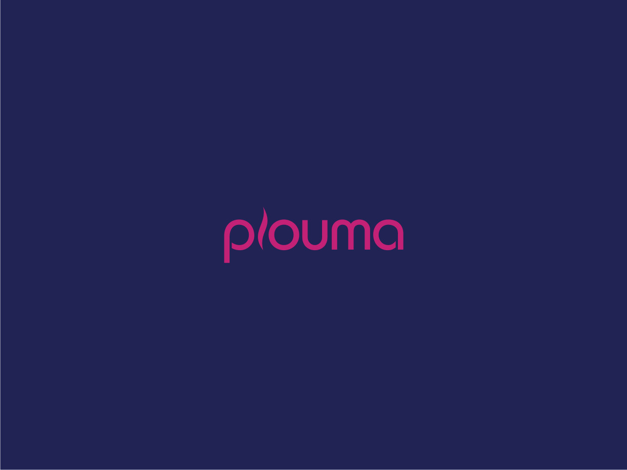
Looking for a logo for a new female owned cannabis accessories business: plouma

Vous souhaitez remporter un projet comme celui-ci ?
Ce client a reçu 104 designs de logo de la part de 55 designers. Il a choisi ce design de logo de Atvento Graphics comme design gagnant.
Inscrivez-vous Trouvez des Projets de Design- Garanti
Brief de Design de Logo
Start up, female led, female focused cannabis accessories business. Initial product line is vape pens and cases for vape pens but open to expanding. The business name is plouma. Preliminary mood board included below.
This will be an ecommerce business that will feel like a boutique. Lots of color, lots of texture. We will open with a relatively small amount of products so the branding feels even more important to attract the right customer. I'm happy to answer any other questions via message!
I know what I like. I'm looking for a statement logo/wordmark that doesn't have to incorporate what we sell but instead represents our aesthetic.
I live in Brooklyn, NYC and I see a LOT of imagery everyday. I like streetwear. I like old school black and white van slip ons. I like rattan and lacquered wood in bright jewel tones.
I chose the name plouma as sort of an anglicized version of "pluma" or "la pluma" in spanish. Plume, in english, means either a feather or a puff of smoke. In spanish, pluma also means pen. I love feathers and some other feather imagery but I don't want a logo that looks too literal. I like the wide to narrow, more retro looking fonts but I don't want anything that might feel dated in a few years (which I think is a lot of what I'm seeing lately!).
The color palette I've selected below includes things that I'm open to- certainly not all that I want included. The mood board includes some ways that I like color working together. I like cool tones and saturated colors- I don't think I will be satisfied with anything warm.
Mises à jour
Hello!
I have received wonderful customer service from DesignCrowd because none of the submissions aligned with my vision. I think what was mostly missing was visual elements- i think a wispy, full feather could be incorporated into the design. It doesn't have to be a feather- anything that isn't letters! But also nothing that looks too much like a marijuana leaf. I realize I prefer the softer, curvier letters that look like art. I am open to anything- I think I did a good job describing my aesthetic in the brief and the mood board captures how "not simple" I like things!
Thank you in advance-
Louisa
Added Monday, August 1, 2022
Marché(s) Cible(s)
"the modern mom"; professional womxn in urban and suburban areas in the US
Secteur / Type d'entité
cannabis and fashion accessories
Styles de police à utiliser
Autres polices appréciées:
- bold, retro, curves and shapes
Couleurs
Couleurs choisies par le client et à utiliser dans le design de logo:
Aspect
Chaque curseur illustre les caractéristiques de la marque client et le style que doit transmettre votre design de logo.
Élégant
Audacieux
Léger
Sérieux
Traditionnel
Moderne
Sympathique
Professionnelle
Féminin
Masculin
Coloré
Conservateur
Économique
Haut de gamme
Exigences
Doit avoir
- flexibility- i'd like to be able to have maybe an icon that is as recognizable as the logo
Bien d'avoir
- i want it to feel airy and soft (but doesn't have to "look" that way)
Ne doit pas comporter
- nothing too pot leaf or hemp looking