Supplement Company Needs a Label Design
Vous souhaitez remporter un projet comme celui-ci ?
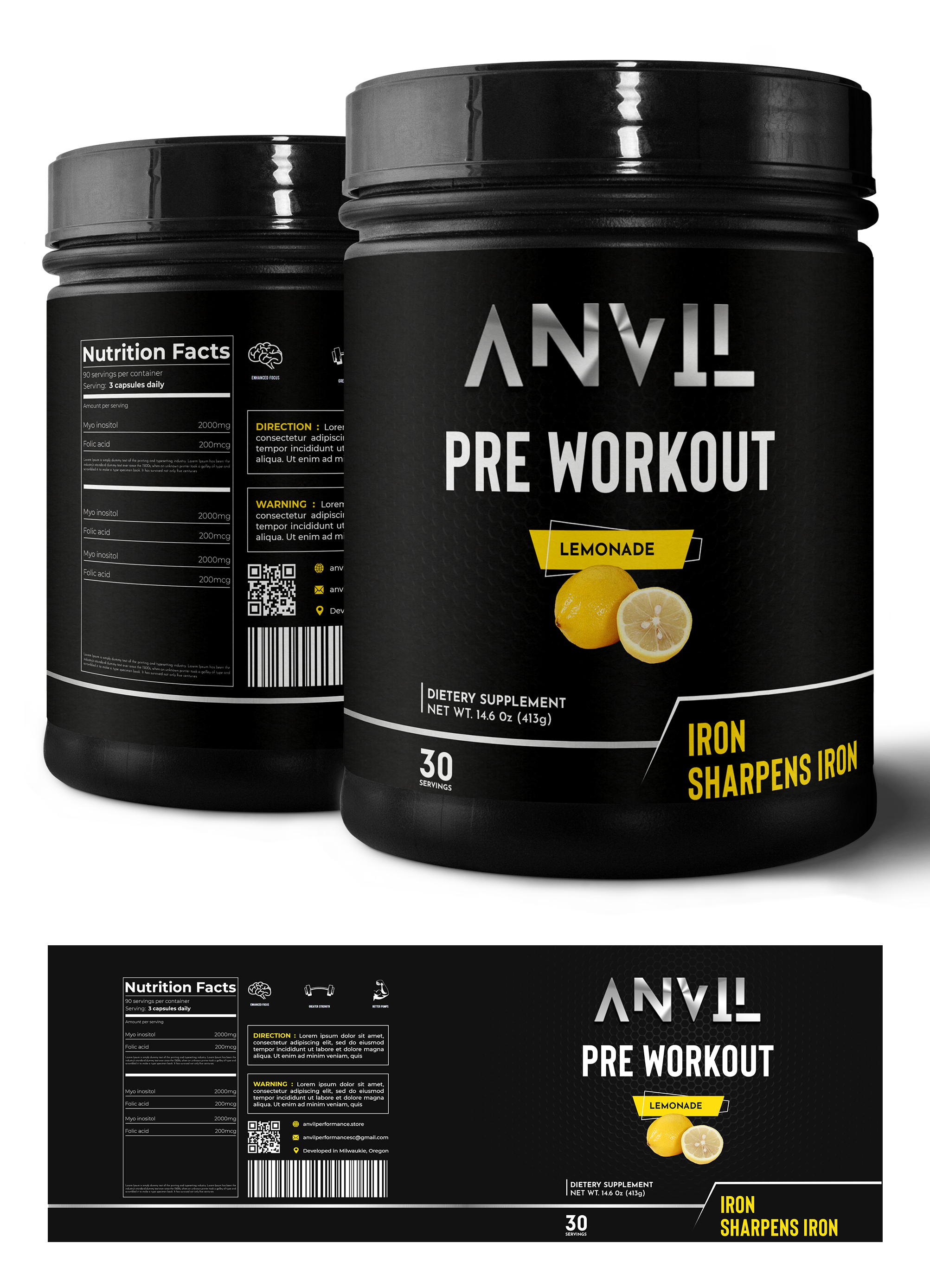
Ce client a reçu 23 designs étiquette de la part de 7 designers. Il a choisi ce design étiquette de Graphic Storm comme design gagnant.
Inscrivez-vous Trouvez des Projets de Design-
 US$120
-
 23 designs
-
 7 designers
Brief de Design Étiquette
We need a label design for our pre-workout tub. Our company name is Anvil Performance, we would like to emphasize the product's clinically dosed, science-based, transparent formula. We would like the label to mention our slogan "Iron Sharpens Iron." We would like you to experiment with colors and color schemes; the photo included is colorful, but that's not necessarily what we are looking for. We would like our main font & color scheme to match our theme of grittiness and boldness. We would like you to include how it boosts energy, enhances focus, creates bigger pumps, and elongates endurance. (Preferably on the back written vertically aside the supplement facts.) Photo 1 (Ghost) is the guideline for the overall idea of what the pre-workout should look like, excluding color scheme and font. Photo 2(Outwork Nutrition) is how we'd like to present the energy, focus, pumps, & endurance. This label shows the ingredients next to the supplement facts, however we'd like to show the boosted energy, enhanced focus, bigger pumps, and elongated endurance. The final design should communicate boldness, grit, but we would like it to remain uncluttered and clean looking.
Marché(s) Cible(s)
Our target market is primarily males who workout in the gym.
Styles de police à utiliser
Autres polices appréciées:
- Blanka
Aspect
Chaque curseur illustre les caractéristiques de la marque client et le style que doit transmettre votre design de logo.
Élégant
Audacieux
Léger
Sérieux
Traditionnel
Moderne
Sympathique
Professionnelle
Féminin
Masculin
Coloré
Conservateur
Économique
Haut de gamme
Exigences
Bien d'avoir
- Can incorporate the logo attached if you would like.