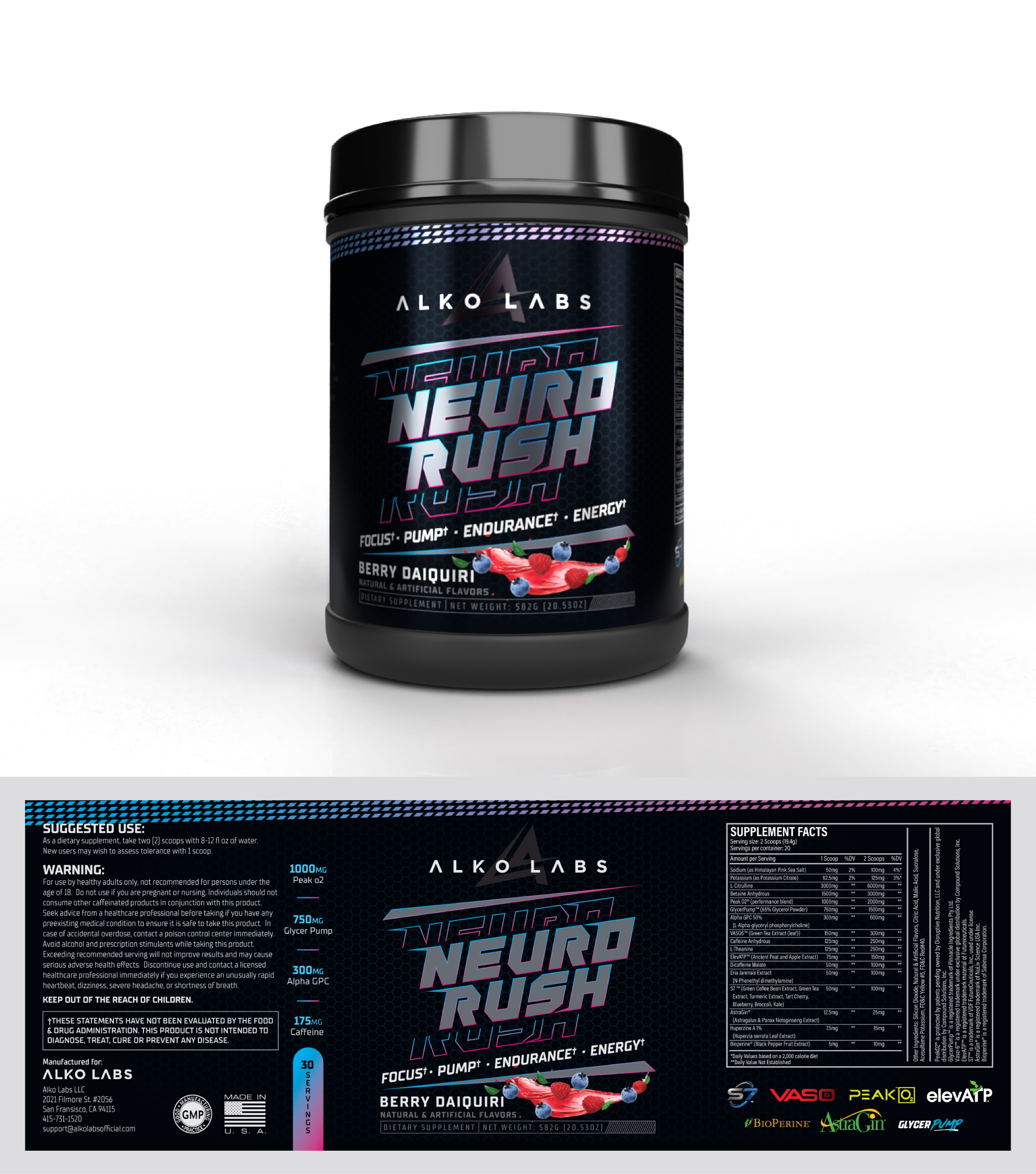
Neuro Rush Pre Workout Label Design
Vous souhaitez remporter un projet comme celui-ci ?
Ce client a reçu 14 designs étiquette de la part de 5 designers. Il a choisi ce design étiquette de Sana Creativos comme design gagnant.
Inscrivez-vous Trouvez des Projets de Design-
 US$120
-
 14 designs
-
 5 designers
Brief de Design Étiquette
Hi, I am looking to recreate my pre-workout label and completely rebrand my pre workout as I am switching dimensions to a 4inch x 11.25inch, along with incorporating a new company symbol. My company name is Alko Labs, I will link an image of my new company symbol / source file of the label and the pre workout name is Neuro Rush. I will also attach a few other pre workouts on the market which I would like you to take influence from as they have a very similar structure to what I would like my label to have: 1. company symbol, pre workout name, description, and flavoring ordered top to bottom. In the source file I attached, you will see that there are two columns (4 key ingredients with amount of servings at the bottom) and the trademarked ingredients graphics (Vaso 6, glycerpump, etc). Being that the label will become longer and thinner, these columns will have to be stretched and I believe it would be best to remove and/or replace the space in other ways. The label now does not have much brand identity and is only an electric ring with the name inside and I hope to have a new design with all of these core elements to create a consistent theme from my design from one product to the next. This will require the label to not look very intimidating but more welcoming, energetic, and sporty as this is a workout based supplement company. If you think the electric ring is a good addition to the label and can work around it, I would love to see what you can come up with and if you think there is a new design which will stand out, I am very happy to have the ring removed from the design, anything is welcomed and there is no preference. Also adding more exciting and welcoming colors like V1 and AP pre workout did in my example labels will be very important as it seems very intense now. The flavor for this label is Berry Daiquiri so any colors associate with berry would be best. I really like the blue color scheme that my label has now but I am open to change. My company symbol has sharp edges so I believe a bubbly look will NOT work well and having a design similar to the C4 label which has more sharp lines/ a lot of small details will be the best direction. Lastly, there are ALKO diamonds in the background which I really like so if you are able to leave them or manipulate them into the label somehow like RYSE did with their pre workout I would appreciate it. I will have the option of making certain parts of the label shine/ raised finish when printed to give more of a 3D pop so using a cool design like RYSE did in there background would be a great consideration. Overall, I give you total creative freedom and look forward to seeing the end result. All the best!