trak Diet
Vous souhaitez remporter un projet comme celui-ci ?
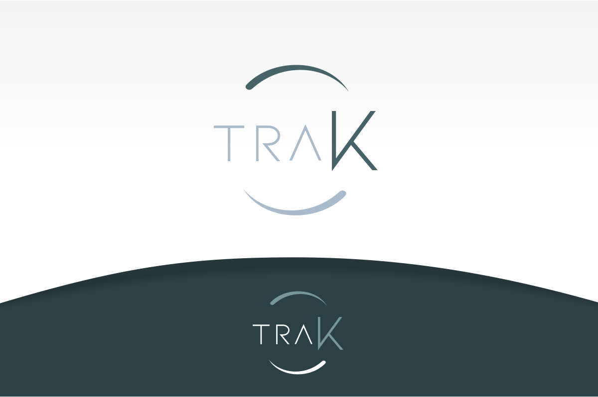
Ce client a reçu 135 designs de logo de la part de 47 designers. Il a choisi ce design de logo de Metamorphosis Design comme design gagnant.
Inscrivez-vous Trouvez des Projets de Design- Garanti
-
 C$150
C$150
-
 135 designs
-
 47 designers
Brief de Design de Logo
Logo description:
1/ We are a weight loss company that offers its program to dieters through a network of licensed healthcare professionals (B2B2C business model).
2/ We are located in both Canada and the USA.
3/ The design must look clean, sharp and professional (as our protocol is medically supervised). It must convey trust and a focus on outcomes.
4/ Why traK? 1/ We help people get back on track and take back control of their health 2/ The K is capitalized to emphasize the ketogenic nature of our weight loss protocol
5/ The design must NOT look cluttered, messy - no train or railroad tracks of any kind.
6/ The logo should look and feel timeless - it could feel contemporary provided that it does not look gimmicky.
7/ Within the design - the first 3 letters (tra) must be lowercase and the K must be capitalized.
8/ The logo should be gender-neutral
9/ Please keep in mind that this logo will not only be used on our different documentations, banners, posters, marketing collateral, but on our food boxes as well.
Color Palette:
1/ We enjoy the soft, muted tones from Aesop:
https://www.aesop.com/hk/en/c/fragrance/
https://www.aesop.com/hk/en/c/kits-travel/gift-kits/
2/ We are open to any color combination but we would rather avoid flashy tones (ie. no full-on primary colors).
3/ While we would be fine using soft color tones, we would like to avoid pastel tones due to their ubiquity.
Thank you so much for working on our project! :)
Mises à jour
Need extra days to review
Need extra days to review
Went on vacation/holiday
Marché(s) Cible(s)
Everyone who wants to lose weight. We target both men and women.
Secteur / Type d'entité
Weight Loss & Health Industry
Texte du logo
traK
Aspect
Chaque curseur illustre les caractéristiques de la marque client et le style que doit transmettre votre design de logo.
Élégant
Audacieux
Léger
Sérieux
Traditionnel
Moderne
Sympathique
Professionnelle
Féminin
Masculin
Coloré
Conservateur
Économique
Haut de gamme
Exigences
Doit avoir
- The focus needs to be on the K. The logo will be placed on both on food boxes, documents and website and so on. Pls keep this in mind.
Bien d'avoir
- We are open.
Ne doit pas comporter
- No silhouettes / no people designs. Nothing gimmy or childish.