RAQUEL MALAGA - estudio de arquitectura
Vous souhaitez remporter un projet comme celui-ci ?
Ce client a reçu 96 designs de logo de la part de 66 designers. Il a choisi ce design de logo de S.N.Y™-01 comme design gagnant.
Inscrivez-vous Trouvez des Projets de Design-
 €110
€110
-
 96 designs
-
 66 designers
Brief de Design de Logo
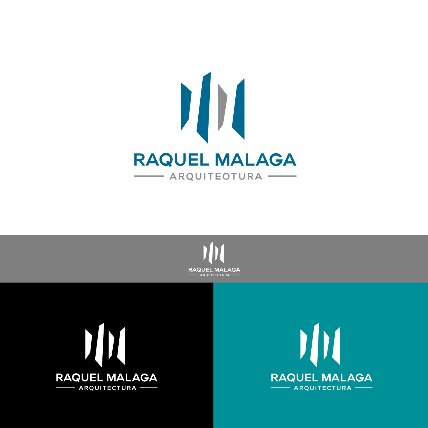
"RAQUEL MALAGA - architecture" is a young architecture studio, with a history of seven years. Now we are moving to a new office, and we need to define the image.
We currently have a logo consisting of four vertical elements, the first of which is longer. There are two versions, one in the form of a more informal sketch (used in posters and cards) and another more geometric (used in documents).
I like the logo as such, although some variation can be accepted.
What I really need is an accompanying text that is not just a typography, but has character on its own: either some letters designed exclusively for the company's logo and image, or an existing font that draws attention or subtly modified to give more prominence and importance to the text.
Do not forget that we are an architecture studio. The typography must be clean (sans serif) and the possibility that it works both with the freehand logo and with the geometric logo will be valued.
I would like the logo to be elegant and with personality.
Attached I include the current logo and the color used.
Texte du logo
RAQUEL MALAGA - arquitectura