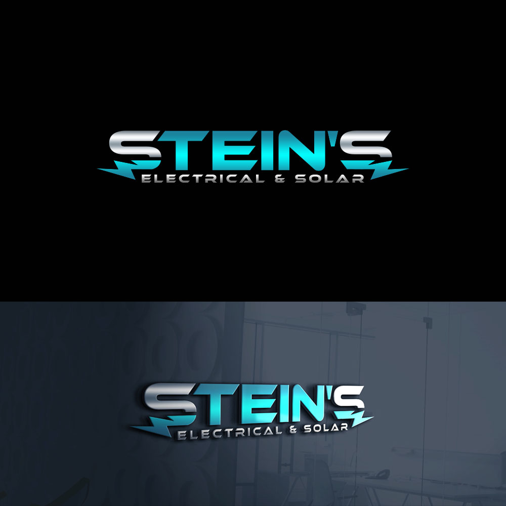
Stein's Electrical & Solar logo design

Vous souhaitez remporter un projet comme celui-ci ?
Ce client a reçu 109 designs de logo de la part de 33 designers. Il a choisi ce design de logo de PsyPen comme design gagnant.
Inscrivez-vous Trouvez des Projets de DesignBrief de Design de Logo
I really want to go all out with this design as this logo design will be with my business for a life-time. I want it to stand out from other logo's and be the best in the trade industry.
I will attach some images below that I would like to implement into my design.
I would like to make the font the exact same or very close to the picture 'Main Power'. I love the font and how the letters look with the (A,P & R), to me it really makes it stand out from others. With that being said, I think we do that for Stein's or maybe try it with 'Electrical & Solar'. If you think you can make the font look even better than feel free to do so, so it suits best.
I would like to have Stein's as the top line and Electrical & Solar underneath. For the start of 'Stein's', I would like to have a mean/sharp looking lightning bolt for the 'S' as 'Stein's' will be the focal point of the design. I don't want a standard looking lightning bolt, I really want this to be flashy & look like a lot of work has been put into it.
Can you also add a neon outline around the lightning bolt, so half of the bolt outline is blue & other half is grey for example but I'd like to see different variations, e.g red w/ grey or white, blue with grey or white & green with grey or white. I think that would make it stand out too.
With the font, It needs a gloss finish with a two-colour tone. Similar to the 'Final Finish' logo. With the logo, can you make one side half green and one-half white or grey. I like the shadowing on the gloss finish too. Can you also try red and blue with that ^. Examples of what I mean are in the designs below. I think red, green or blue are best colours for logo but by that being said, I don't want red, green & blue all on the one design. I want green with a grey or white (whatever looks best) on one design & then blue with grey or white on another etc.
I think all that would look best on a dark background like grey or black or close to black but It might look okay on white?
I have also found an image off google that I will attach below that we could implement into the design instead of the lightning bolt. This could potentially look better & please play around with it and make it look better if you can. I would still like to see both options though, one with lightning bolt & one with that 'S' with electricity ends.
Very excited to see what you guys can do & looking forward to seeing the results.
Thank you,
Regards,
Nick
Texte du logo
Stein's Electrical & Solar