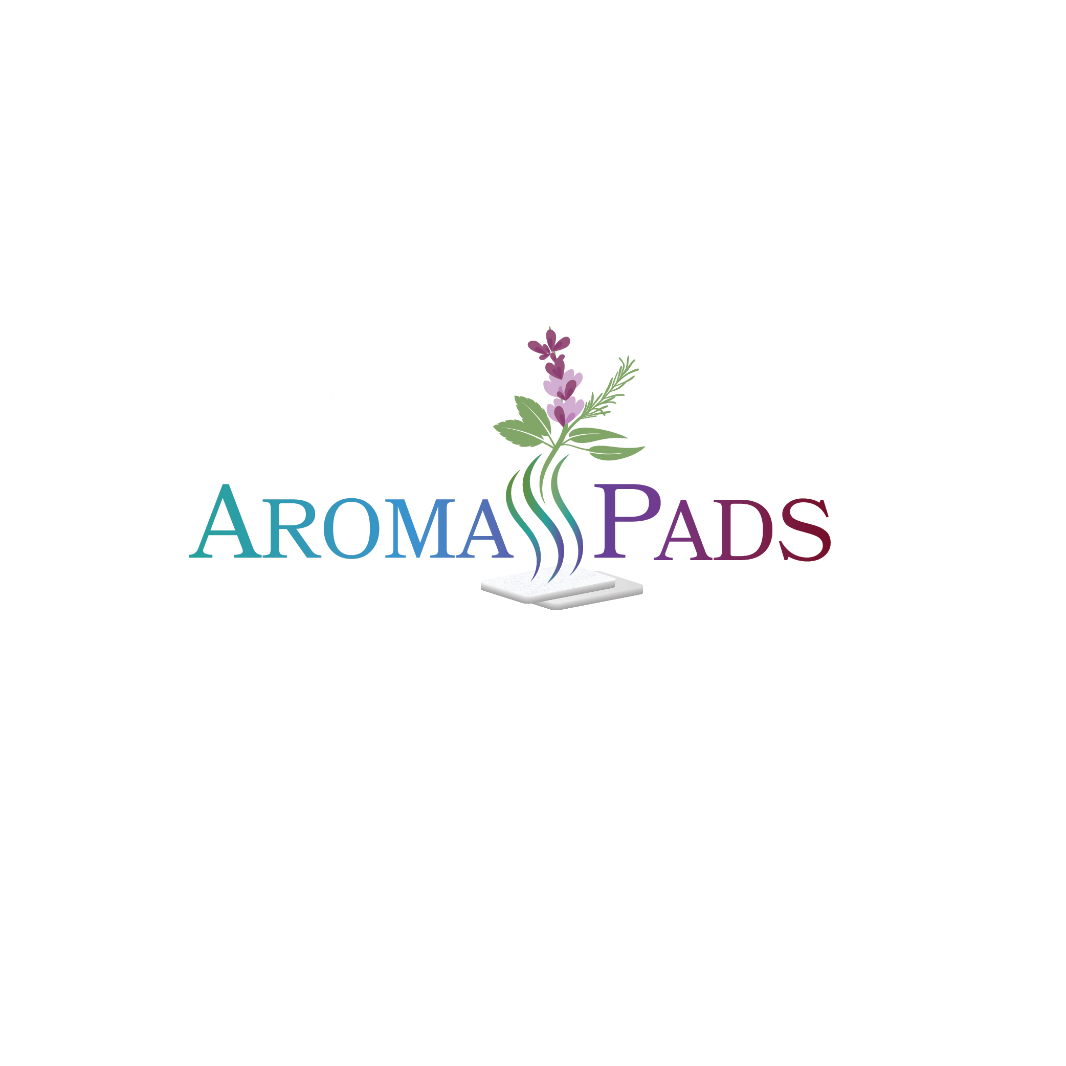
Essential Oil Aroma Pads needs a Logo Design

Vous souhaitez remporter un projet comme celui-ci ?
Ce client a reçu 188 designs de logo de la part de 47 designers. Il a choisi ce design de logo de SARA BA comme design gagnant.
Inscrivez-vous Trouvez des Projets de Design- Garanti
Brief de Design de Logo
update on 13Jan - due to an excellent entry, I will be closing the contest on 16Jan. if you still interested in making a design please do so before that date. thank you!
__
Aroma Pads manufacturers mixtures of pure essential oil fragrances in Canada that are on cotton white Aromatherepy pads for use in humidifiers and diffusers, for personal wellness, comfort, energizing and - just making your home smell great!
Our products are made with all sorts of different essential oils such as peppermint, lavender, eucalyptus, sage, bergamot, rosemary, thyme, lemon, etc. With scents that are described as woody, spicy, floral, citrus, and earthy.
The logo needs to have aroma vapour coming from the Aroma Pads logo with a white rectangular pad somewhere (not too much / overpowering though) in the logo so it’s clear what the customer is getting, and should be able to have a colour scheme that gives the different emotions people would feel when using our different types of products, such as soothing /comforting / relaxing / relieving, and uplifting / warm / stimulating, that blend together, with green floral / herbs in the logo to mark all our products roots in nature.
This blending should be in the "Aroma Pads" text (or will let designer perhaps design a pictoral / emblem that shows this kind of blending, or the blending can be in the vapor)
Logo should definitely be very colorful; to clarify, this color should reflect the soothing and also uplifting element of the aromatherapy products.
Hi everyone, thank you everyone so far for your submissions, general comments that will be included in the brief are:
1. Text / aroma from the pad should be colorful and focus on the warming and soothing feelings from the aromatherapy. Please do not put too much of one color in the logo, needs to have many different colors (but also not be a rainbow of color) - try to have the colors blend.
2. Please try to have the green in your design in the form of leafy plants / leaves of a plant that is listed above (eg. eucalyptus, peppermint, lavender).
3. Colorful vapor coming out of the pad is very good. Colorful is a must, yet focusing on the soothing and uplifting
4. Aroma pad can also be placed on the bottom of the logo (not mandatory) with the vapor going through the text and above the text in a colorful manner.
5. Try not to have the aroma pad too large since it distracts from the text.
6. Aroma should always be moving upwards - not sideways.
7. Please keep the aroma pad a rectangle.
Mises à jour
Need extra days to review
Marché(s) Cible(s)
Upscale spas, direct sales to consumer homes
Secteur / Type d'entité
Aromatherepy
Texte du logo
Aroma Pads
Styles de logo qui vous intéressent
Logo d'Enseigne
Logo contenu dans une forme
Logo pictural
Un objet réel (texte facultatif)
Styles de police à utiliser
Autres polices appréciées:
- designer's choice
Aspect
Chaque curseur illustre les caractéristiques de la marque client et le style que doit transmettre votre design de logo.
Élégant
Audacieux
Léger
Sérieux
Traditionnel
Moderne
Sympathique
Professionnelle
Féminin
Masculin
Coloré
Conservateur
Économique
Haut de gamme
Exigences
Doit avoir
- The logo needs to have aroma vapour coming from the Aroma Pads logo with a white - rounded corner - rectangular pad somewhere in the logo so it’s clear what the customer is getting, and should be able to have a colour scheme that gives the different emotions people would feel when using our different types of products, such as soothing / comforting / relaxing / relieving, and uplifting / warm / stimulating, that blend together. This blending should be in the "Aroma Pads" text (or will let designer perhaps design a pictoral / emblem that shows this kind of blending) . with green floral / herbs in the logo to mark all our products roots in nature.
Ne doit pas comporter
- Do not abbreviate aroma pads with AP. White Aroma Pad should not be "overpowering" or take up too much space. Focus is on blended color and aroma.