Technology Services company needs a refreshed & more professional logo design
Vous souhaitez remporter un projet comme celui-ci ?
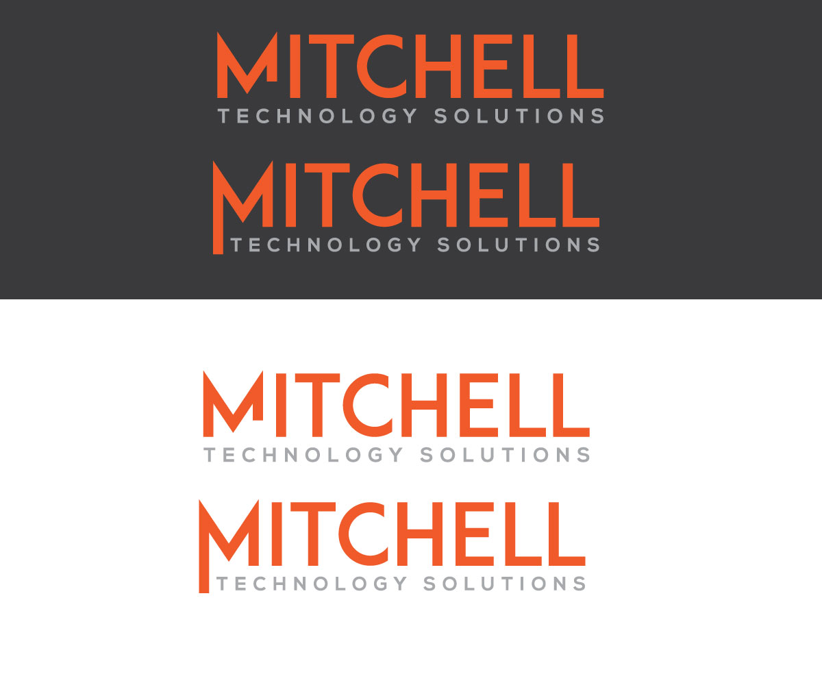
Ce client a reçu 141 designs de logo de la part de 62 designers. Il a choisi ce design de logo de Luckey yaari comme design gagnant.
Inscrivez-vous Trouvez des Projets de Design- Garanti
-
 A$150
A$150
-
 141 designs
-
 62 designers
Brief de Design de Logo
We need a refreshed logo done for "Mitchell Technology Solutions". We have an existing brand colour which needs to be kept (orange), at least somewhere in the logo. The rest of the logo and design is open and up to you. The existing logo we don't mind, but it feels dated and bland and a bit cheap. Our company offers different IT/tech solutions & services to business customers. We like how our existing logo focuses on the "M", but maybe it needs even more focus, we don't know. We'll leave that up to you. The "Mitchell" part is way more important than "technology solutions" part. We're happy for the "M" or "Mitchell" to be the main focal point. We like the style of the "M", but are open to completely changing it, or a refresh -- up to you. We are currently using the "M" as a favicon and as the square logo. We don't mind if the new logo is still rectangle, but would need to be able to make something square out of it. We're also happy for the new logo to be square. Completely open to ideas!
Texte du logo
Mitchell Technology Solutions