adventuredirect.com
Vous souhaitez remporter un projet comme celui-ci ?
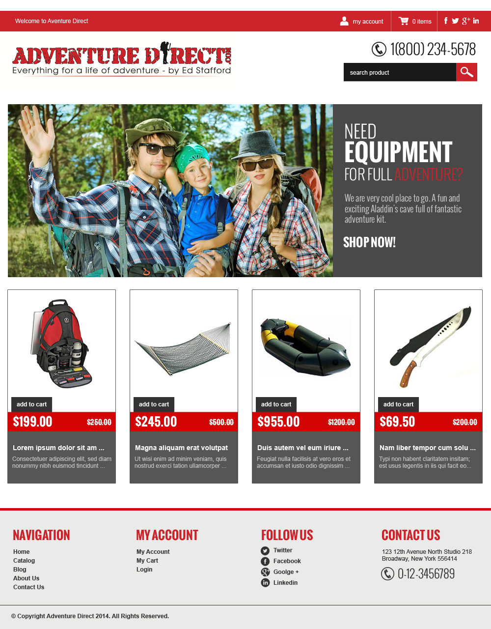
Ce client a reçu 41 web designs de la part de 11 designers. Il a choisi ce web design de jeckx2 comme design gagnant.
Inscrivez-vous Trouvez des Projets de Design- Garanti
-
 £525
£525
-
 41 designs
-
 11 designers
Brief de Web Design
I would like an amazing design for a eCommerce website called adventuredirect.com.
The logo was designed on DesignCrowd and is attached below. Whatever your design - it MUST use this logo. Please don't waste your time designing new logos.
The logo is on both black and white backgrounds as I've not yet made my mind up whether to ditch "cool black" in favour of more "fresh, clean white"! I'd like to look at both options.
Adventure Direct is going to be the first destination of choice for anyone who is bored or frustrated at home and wants a life full of adventure. It will stock outdoor clothing and equipment, training kit, expedition gear, and travel clothing and accessories.
But it is a very cool place to go. A fun and exciting Aladdin's cave full of fantastic adventure kit. We will stock inflatable pack rafts, machetes, hammocks and other expedition gear as well as standard outdoor clothing.
This is NOT a geeky outdoor store selling pac-a-macs and walking poles.
The unique thing is that everything stocked is hand selected by me, Ed Stafford, an experienced explorer who became the first person to walk the Amazon in 2010. edstafford.org is my site. I now make TV for Discovery Channel.
There will be items at every price level from "only the best" - absolute top end kit, to "get the job done" - stuff that won't break the bank. Everything stocked works. If it doesn't - I won't sell it.
So although the theme is fun and adventurous I have to have it also feeling like a place of professional, expert advice. A place of substance and depth.
Thanks in advance for all your ideas and designs!
Best
Ed
Mises à jour
The designs that I like the best have used jungle images as background wallpaper - possible with a green tint to them so that they really do look like background rather than the focus. The focus should obviously be the kit for sale. The best designs have this on a fresh white or light grey background so that it stands out. I like the main logo being in a black header and footer. But the feel of the site can easily become too dark if too much back is used or if the green background image is too dark. We want adventure and cool - but it has to feel light and professional enough to be accessible by people of all ages. Most websites that are successful are white after all and whilst I'd like to be a bit more adventurous than that we shouldn't over do the darkness!
Added Thursday, February 06, 2014
Marché(s) Cible(s)
The target market is primarily 16 to 50 years old outdoor enthusiasts however I will be selling to older people and kids, male and female, so it can't be too modern, too macho, or too complicated to put anyone off.
Aspect
Chaque curseur illustre les caractéristiques de la marque client et le style que doit transmettre votre design de logo.
Élégant
Audacieux
Léger
Sérieux
Traditionnel
Moderne
Sympathique
Professionnelle
Féminin
Masculin
Coloré
Conservateur
Économique
Haut de gamme
Exigences
Doit avoir
- Bold, professional, adventurous feel. Not cluttered but not so minimalist that it looks boring too. I would like to select a few colours and work with them.
- Red for high lighted emphasis. See logo
- Greens/blacks/greys as background.
- Clean menu system. I'm probably going use a tailored version of http://fresh-fresh.myshopify.com with mega menus.
Bien d'avoir
- Some personalisation that makes the site mine. Use of hi res images below as background could work although I am keen for the site to look clean and easy to navigate.
Ne doit pas comporter
- Hundreds of boxes and text and clutter. I want this site to show off the items in a classy manner. This is NOT sports direct.com! This is a site where hand selected items are proudly displayed and put together, after a lot of thought.
%C2%A9keithducatel_brief312006.jpg?AWSAccessKeyId=ASIARQT47ZIU5XUF6TAC&Expires=1764275128&response-content-disposition=attachment%3Bfilename%3D%22About%201%20%28can%20you%20flip%20horizontally_%29%20%C2%A9%20Keith%20Ducatel%20Friday%2C%2031%20January%202014%2011_20_07.jpg%22&x-amz-security-token=IQoJb3JpZ2luX2VjEMD%2F%2F%2F%2F%2F%2F%2F%2F%2F%2FwEaCXVzLWVhc3QtMSJHMEUCIE9IUIdz2b%2BLU2nWyfheqjDyilKBAxtg%2BBFxsIVdvTvQAiEAz4zvsQUKZi0UoeMw3B%2FIc38djZFlUqvGImQtFFZm9hUq9AMIif%2F%2F%2F%2F%2F%2F%2F%2F%2F%2FARAAGgwxMDQ0MTUwODcxNDUiDAlI81G%2BbBXTlr%2FTdCrIA8VNMxFW5gOLlqESpft%2FDIr9P%2FLo6qEXNQ5l0cCMX0Lz1cy9z%2Fbbycy72N0KhpZqJYPtTAES8J53oHNzdwr98rT9VjQveMxldp4s0KU7%2BXKIkuibkEgHYLjTS7OlLETwNL61h5MlhDdNnUceVQePEwRI22DVLdYK3lHA0LngguTNaqPj5vZpNCJZIF6rubxt3ckT8qVZbpvI%2BhqhFKjaWDdYDe%2BqjVJNh5NRFEagq8%2BTFvg8u1RHBZ%2B7EJdPPZm%2FL5h8Fjlw0MbHzDe1RlaamkYUOEeqSO4iSlL7%2BL5781%2FZUKV4onnFVn%2FatcVLptE7jZVzQ80GVPq2eLQWOgLfyUcvR7Zt5jwHm67hPE6KZ1bu0IDARm6mFazdyasuevCP03mDfVkTadkMw9gi%2FgUEejDTtkh1F9vlgkBE6%2Bpj08Mviwbrd0IJBk4lhNwHcwxwoQ%2FazfKU1BqD8fF4mQ3WcM%2Fs%2FY2FS7roEXwz7XPaSQVOfH%2FcVbk2Ctro8sKHJRz8ogSYgMSAiBi4DBQjDtIkk9ybk7teZa90yQEng2ne3hd0WCcrKoPw7c8wqgmPmfJ%2FXTQDQpkaPQnWEbM3vCpuXoivGmM6OUEOCzD1vZzJBjqlAa%2FtAxmtJa2UFE2DgQva0dRgA3EAY4e6KZmTS4e4qqnNEZwVacgS5%2BbwX7DjufsW8HhZAncnwk8%2BUVjiG8QCa%2Fa8uEEExxOWjSZmuFYO2QOISZKXo2TakLOmhS2%2BkM%2BThaiJethVNx8BLay7iY7j%2F30mBfJjYfDrSmSfjZlVqYS8tufa7s2S9bu4kiH2UjAdrYXZvXLS0etjMxVoKLuJRLKm4mJFWQ%3D%3D&Signature=G%2Fb3APTWpRjdGSZehCm26lr2%2F1k%3D)