Cyber Security Platform/Company running Bug Bounties and Vulnerability Disclosure Programs
Vous souhaitez remporter un projet comme celui-ci ?
Ce client a reçu 42 web designs de la part de 15 designers. Il a choisi ce web design de Sbss comme design gagnant.
Inscrivez-vous Trouvez des Projets de Design- Garanti
-
 US$320
-
 42 designs
-
 15 designers
Brief de Web Design
We have a preliminary design for the landing page (see attached). But we are looking to make it a lot more appealing, modern, ‘techie’, engaging, creative, professional and beautiful.
I don't like graphics with 'miniature people' / cartoon characters.
The font is boring and font sizes are probably not optimal.
The icons are not on point.
There doesn't seem to be a clear and unique design language, color scheme, etc.
The background graphics are too plain. There should maybe be some design elements like for example in hackenproof.com. I imagine also the 'M' from the march1st logo could be used as a graphical element in the background or otherwise...
We also need it to integrate the newly designed logo (see m1 logo design attached), Please note that the colors of the logo are still preliminary. Feel free to change them. Also, if you feel the logo can be improved still, happy to get your suggestions.
Not sure about the Shield logo. It’s a graphic that is overused on Cyber Security websites.
The background of the first screen will be animated and possibly interactive. I am attaching a separate design brief for information.
Examples of websites/designs I like:
www.feedmusic.com
https://www.confluera.com
https://dribbble.com/shots/12582716-Storemaven-s-website
https://hackenproof.com/
https://onedesigncompany.com/approach
Mises à jour
Designs look the same
Marché(s) Cible(s)
Cyber Security, Infosec, IT
Secteur / Type d'entité
Cyber Security
Nombre de Pages Demandé
1 page
Styles de police à utiliser
Aspect
Chaque curseur illustre les caractéristiques de la marque client et le style que doit transmettre votre design de logo.
Élégant
Audacieux
Léger
Sérieux
Traditionnel
Moderne
Sympathique
Professionnelle
Féminin
Masculin
Coloré
Conservateur
Économique
Haut de gamme
Exigences
Doit avoir
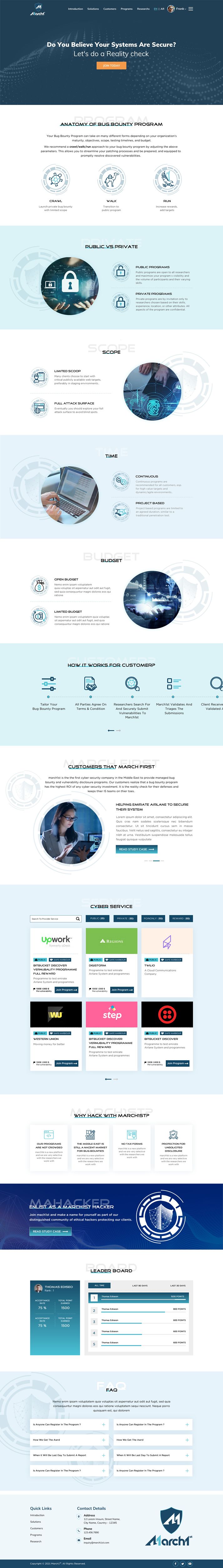
- The ‘Anatomy of a Bug Pounty’ has 4 Parameters (Public vs. Private, Scope, TIme and Budget) and each one of those has 2 Options to choose from.
It needs to be somehow clear that the two are exclusive options - i.e. one or the other.
Bien d'avoir
- The website will initially target the Middle East. This is why we chose the camel (single hump!) and the falcon in the Crawl - Walk - Fly analogy.
Other Middle Eastern elements can be used (Palm, Desert, etc.) However if we do, it should be in a very modern way... possibly even abstract to some degree. Definitely not looking for ‘traditional’ look.
Font: Current font is boring (Arial). Looking for more modern font options.
Ne doit pas comporter
- Should not overuse typical Cyber Security graphics like shields and locks
Quite a few initial designs have kept the orange color of the initial design. Prefer not to use it... esp. not this particular kind of orange.