

 Rafraîchir
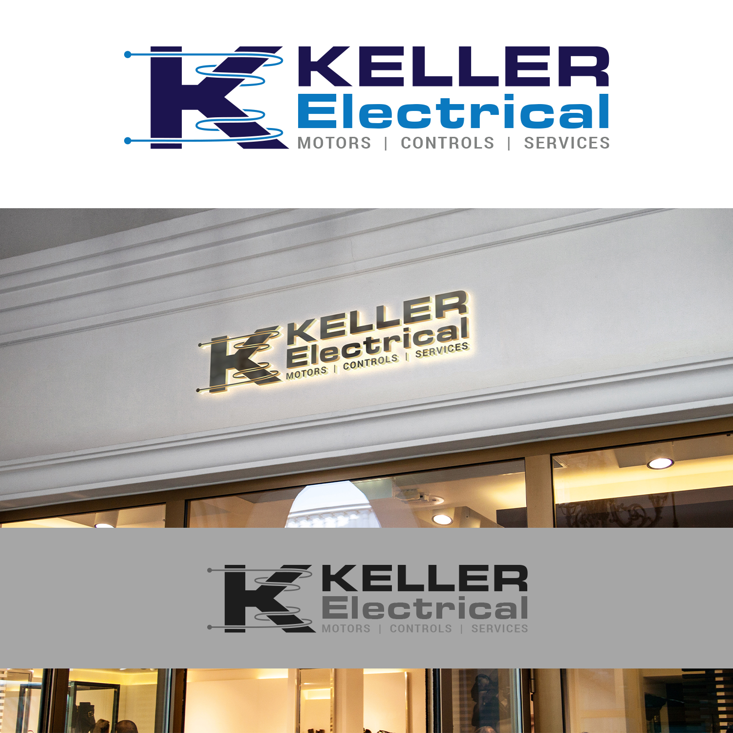
Laron/Keller Logo Refresh for 2021 - Modernizing without losing tradition
Vous souhaitez remporter un projet comme celui-ci ?
Ce client a reçu 64 designs de logo de la part de 17 designers. Il a choisi ce design de logo de Maxo-Biz comme design gagnant.
Inscrivez-vous Trouvez des Projets de Design
-
 US$250
-
 64 designs
-
 17 designers
Brief de Design de Logo
Two companies "Laron" and "Keller" will be merging facilities in 2021. They'll continue to operate independently. Since they're in the same building would like customers to know that they are capable of being one company while still operating separately. To do this we'd like to make a logo that can be used as one on business cards, letter head, etc but also can be split into separate logos for more brand loyal offerings.
-We'd like to keep the same font styles (Laron is in Eurostile LT Pro Bold Extended #2, we have no information on what Keller Font is currently)
-Concept 1 is essentially both the current logo's with their tag lines. We're trying to modernize this.
-The Keller graphical 'K' logo is going to be retired, concept two is what we're wanting to replace it with. The K is wrapped with electrical wire, it would be nice to show it some how 'electrified' without using lighting bolts.
-We'd like to be able to use the Laron/Keller logo together as seen in Concept 1, but have them completely separate as well for independent use.
-The logo should have two versions, the highly stylized versions below for business cards, letter heads, fax sheets, etc. As well as a simple version used for T-Shirts and other physically printed media that a highly stylized version wouldn't support.
-Both companies are Blue/Gray colors, with Laron and Keller using their tones in Concept1 specific to the company. We'd like to keep these colors
- We'll want all the major file types for future use, eps, png, jpeg, ps, etc
-Both logos will need to have the Brand Name, Business Work Type (Mechanical vs Electrical) and their tag lines.
Update 1/19/2021
-I'm noticing a lot of focus on the Keller Logo & not much on the Laron. Remember these are both separate logos that should be similar, but different, the idea is to use them together when needed as well as independently. We're wanting to keep the Gears, but modernize them for Laron - Mechanical. Keller is the only organization doing 'Electrical'.

Mises à jour
All the submissions are coming along nicely! Our team really enjoys working with each of you who have made submissions. I please ask that if I've responded with any criticism to please read cafrefully so that we make sure that we select the right person for the team. Once a logo is chosen we'd like to discuss further projects, like a style guide including: Email Signature, Letterhead, Fax Cover Sheets, PowerPoint Backgrounds, etc. Thank you, and good luck to everyone!
Added Thursday, January 21, 2021
Texte du logo
Laron Mechanical / Keller Electric
Styles de logo qui vous intéressent
Logo d'Enseigne
Logo contenu dans une forme



Logo pictural
Un objet réel (texte facultatif)



Logo de figurine
Logo avec illustration ou personnage
Styles de police à utiliser
Autres polices appréciées:
- Stated in brief
Aspect
Chaque curseur illustre les caractéristiques de la marque client et le style que doit transmettre votre design de logo.

