

 Rafraîchir
Web Design & Hosting Company Logo
Vous souhaitez remporter un projet comme celui-ci ?
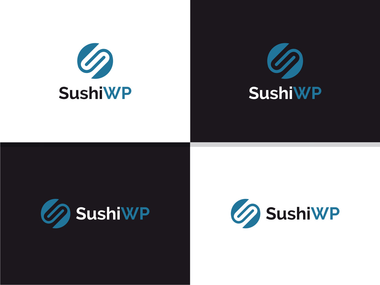
Ce client a reçu 53 designs de logo de la part de 33 designers. Il a choisi ce design de logo de Atvento Graphics comme design gagnant.
Inscrivez-vous Trouvez des Projets de Design
-
 £210
£210
-
 53 designs
-
 33 designers
Brief de Design de Logo
We are a UK company offering exclusively WordPress & WooCommerce website development, as well as Search Optimisation & Marketing.
Because the company is WordPress centric, and due to the branding rules that are defined by WordPress, we are understandably unable to use that name in our company name.
Therefore the workaround used by many different brands is to use the WP initials which obviously stand for WordPress.
We deliberately use the "WordPress Blue" colour in our existing logo, this is something that we would like to retain.
The logo should work in both website environment (as a masthead logo) and also be compatible with social media conventions.
In this case I envisage a horizontal logo that works well in the website masthead and perhaps a smaller square version that many social media channels seem to prefer.
Ideally the logo should feature an icon, with the logo before the text. I envisage the icon would be in the "WordPress Blue" with the text in black, but i'm open to creative suggestions or new ideas. This icon would also be utilised as the "favicon" for the website.
The logo should also be compatible with or be provided in an additional reversed version that works on a dark background.
Marché(s) Cible(s)
Corporate/Business Clients
Texte du logo
SushiWP
Styles de police à utiliser

Couleurs
Couleurs choisies par le client et à utiliser dans le design de logo:
Aspect
Chaque curseur illustre les caractéristiques de la marque client et le style que doit transmettre votre design de logo.
Élégant
Audacieux
Léger
Sérieux
Traditionnel
Moderne
Sympathique
Professionnelle
Féminin
Masculin
Coloré
Conservateur
Économique
Haut de gamme
Exigences
Doit avoir
- Must include this colour blue: #0073AA - We like the contrast of black with this colour.
The "Sushi" and "WP" elements of the name should stand out in their own right, easily differentiated and not just lost as one word.
We are ideally looking for a logo that includes an icon, or that in some way uses the WP part of the name as the icon.
Ne doit pas comporter
- Please, the design should NOT feature any of the following;
Chopsticks, anything related to Sushi fish, rolls, etc...
This is far too contrived and not the direction I want to go in.