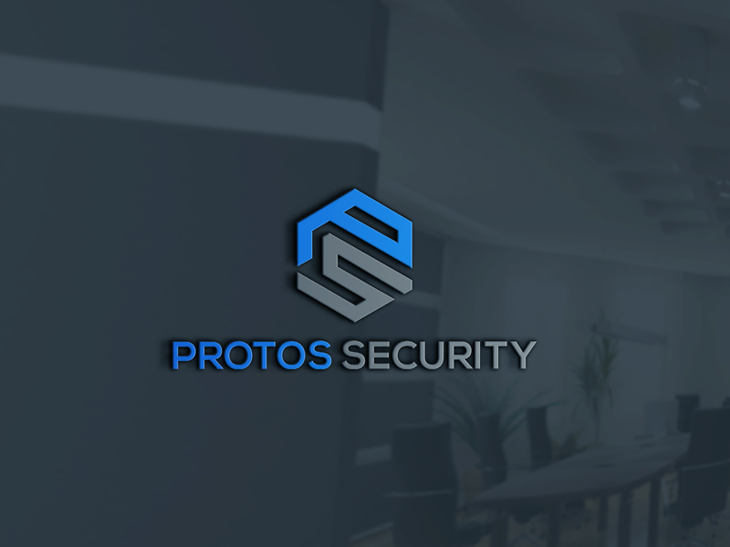
Logo Redesign for Protos Security
Vous souhaitez remporter un projet comme celui-ci ?
Ce client a reçu 102 designs de logo de la part de 45 designers. Il a choisi ce design de logo de Entarlogo comme design gagnant.
Inscrivez-vous Trouvez des Projets de Design- Garanti
-
 US$110
-
 102 designs
-
 45 designers
Brief de Design de Logo
Protos Security was founded in 2006 and has grown rapidly since then. We provide security officer services along with a client portal which gives our clients visibility into the performance of the security program in real-time. We were acquired by a private equity firm last year and now require a rebrand to put our branding on par with where we're headed (even more growth and acquisitions). Our current logo (and overall branding) is challenged in that it 1) is really long and thin 2) is a non-appealing shade of green which doesn't pair well with any complementary colors 3) doesn't include an icon which is tough since we're doing a lot of digital marketing. We want to have a completely different look and feel and appear as a more mature organization. Initial ideas include 1) darken the green (to represent technology we'd like to keep some shade of green) 2) add secondary colors into the design (maybe blues or grays but open to ideas) 3) drop the tagline 4) add an icon that represents both technology and security guards 5) fits nicer into layout so it's more easily read/seen.
Marché(s) Cible(s)
Security decision makers
Secteur / Type d'entité
Security Guard
Texte du logo
Protos Security
Styles de logo qui vous intéressent
Logo abstrait
Conceptuel / symbolique (texte facultatif)
Styles de police à utiliser
Aspect
Chaque curseur illustre les caractéristiques de la marque client et le style que doit transmettre votre design de logo.
Élégant
Audacieux
Léger
Sérieux
Traditionnel
Moderne
Sympathique
Professionnelle
Féminin
Masculin
Coloré
Conservateur
Économique
Haut de gamme
Exigences
Doit avoir
- Initial ideas include 1) darken the green (to represent technology we'd like to keep some shade of green) 2) add secondary colors into the design (maybe blues or grays but open to ideas) 3) drop the tagline 4) add an icon that represents both technology and security guards 5) fits nicer into layout so it's more easily read/seen.
Ne doit pas comporter
- The green needs to change to something darker which pairs with other colors more easily. Should not include a tagline.