

 Rafraîchir
fitness and lifestyle coaching business that needs a logo design
Vous souhaitez remporter un projet comme celui-ci ?
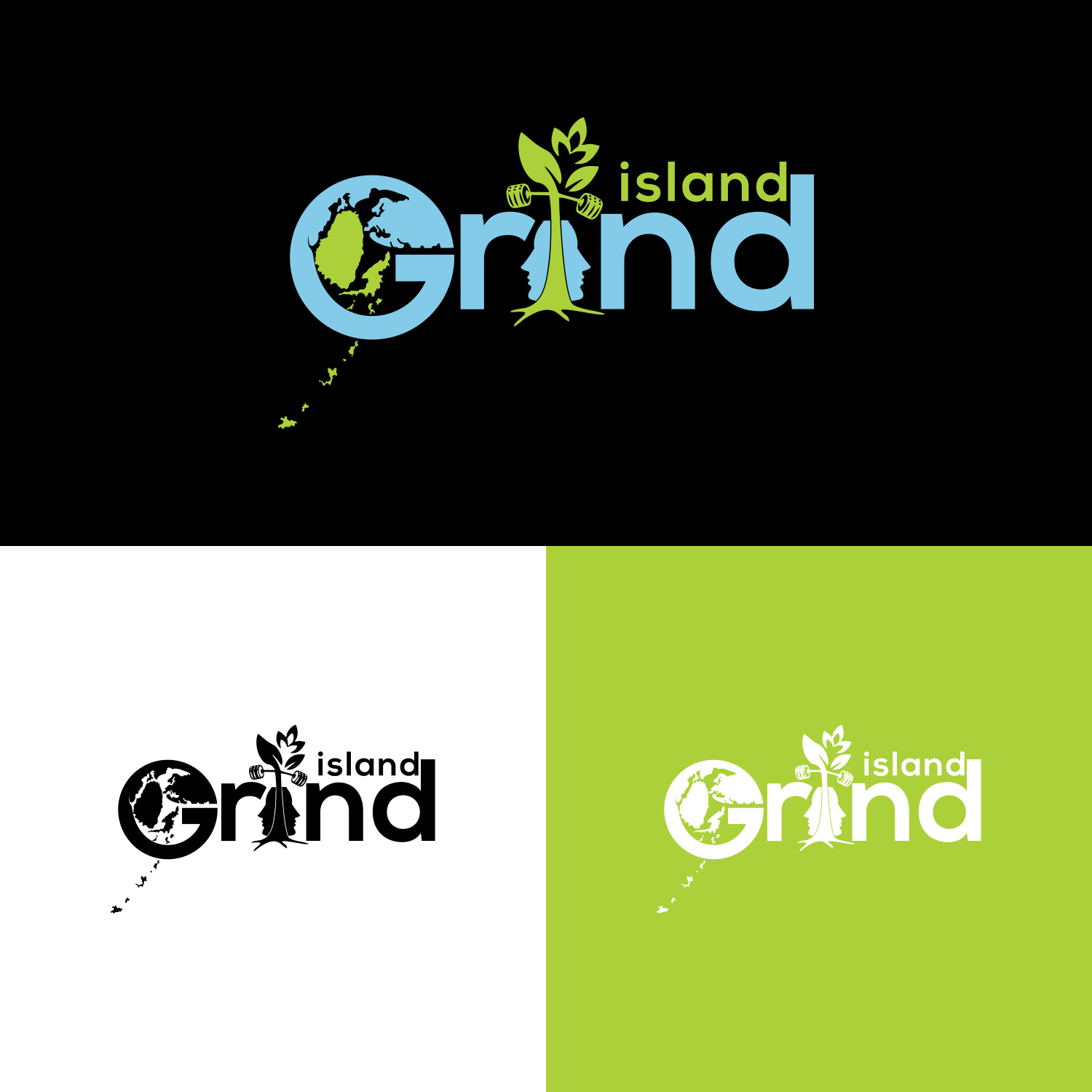
Ce client a reçu 48 designs de logo de la part de 15 designers. Il a choisi ce design de logo de veni 6 comme design gagnant.
Inscrivez-vous Trouvez des Projets de Design
-
 C$130
C$130
-
 48 designs
-
 15 designers
Brief de Design de Logo
So the design is for my logo i already have my logo which is represented in the pictures below i want it to mainly remain the same like everything should stay like the colours and the design but i want a few changes made to it. They are:
The letter G in the word grind
So the first change I want to make is with the letter G of the word grind I love the current style of the G. But I want to make a change to it, so I want to make the Letter G itself to be a little wider and bigger so that I can draw things in the draw like the world map I want it to look earthy like these examples I want G to look like these in the photos below:
The second thing
The rock
The second thing I want to change is the shape of the rock, that the tree in island grind is growing out of I still want the tree growing out of it the same way. But what I want the shape of the rock to be in the shape of a man’s face with the split in it the same way and the tree growing out of it.
3rd Thing
The islands
The last thing that I wanted to change was the chain of islands that are coming out of the G. I really like them, the only thing is that I want is them to represent my actually chain of islands where I’m from so I’ll send you a pic of my actually island chin and we can those the new chain of island. This how my actually chain of island look in photos below
Secteur / Type d'entité
Fitness
Texte du logo
island grind
Styles de logo qui vous intéressent
Logo mot symbole
Logo (texte seulement)


Styles de police à utiliser

Aspect
Chaque curseur illustre les caractéristiques de la marque client et le style que doit transmettre votre design de logo.
Élégant
Audacieux
Léger
Sérieux
Traditionnel
Moderne
Sympathique
Professionnelle
Féminin
Masculin
Coloré
Conservateur
Économique
Haut de gamme
Exigences
Doit avoir
- Its must look like the orginal logo i want everything the same in the logi j ust the changes that i asked for
Bien d'avoir
- The letter G
So the first change I want to make is with the letter G of the word grind I love the current style of the G. But I want to make a change to it, so I want to make the Letter G itself to be a little wider and bigger so that I can draw things in the draw like the world map I want it to look earthy like these examples I want G to look like these in the photos below:
The second thing
The rock
The second thing I want to change is the shape of the rock, that the tree in island grind is growing out of I still want the tree growing out of it the same way. But what I want the shape of the rock to be in the shape of a man’s face with the split in it the same way and the tree growing out of it.
3rd Thing
The islands
The last thing that I wanted to change was the chain of islands that are coming out of the G. I really like them, the only thing is that I want is them to represent my actually chain of islands where I’m from so I’ll send you a pic of my actually island chin and we can those the new chain of island. This how my actually chain of island look in photos


