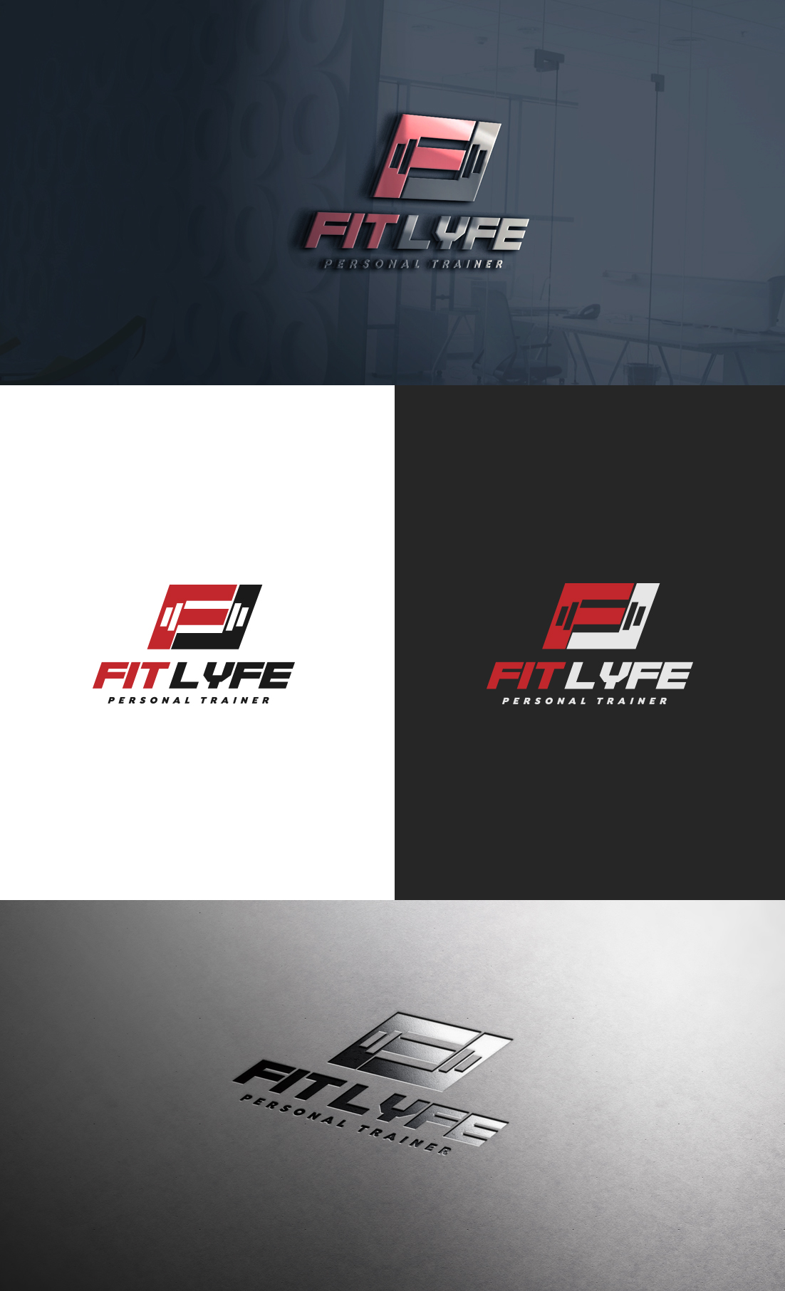
My personal Training Business (1-on-1 & Online service) needs an edgy/motivating logo design.

Vous souhaitez remporter un projet comme celui-ci ?
Ce client a reçu 55 designs de logo de la part de 28 designers. Il a choisi ce design de logo de GLDesigns comme design gagnant.
Inscrivez-vous Trouvez des Projets de DesignBrief de Design de Logo
I need a design for my personal (health/fitness) training business called "Fit Lyfe." I work with everyday people aiming to improve their health (physically/mentally), reconstructing their life-habits, and unlocking their true potential. I would like the design to be Black (primary)/Red (secondary).....OR Black (primary)/White(secondary).
I'd like the final design to relay the "power to overcome."
I think I want the "F" and the "L" of "Fit Lyfe" to stand out more than the rest of the word. The design can be somewhat edgy, but bold/motivational to the eye. Open to other ideas though!
Someone created this logo about a month back (attached file below), but it just doesn't do it for me. I think the barbell to the right of the text is too plain and looks like something that was created off Paint on windows '98.
The "F" & "L" stand out, but that's about it.... the remaining font of the words don't match the first letters either.
I want this to be something that I can place on shirts/merchandise too :)
Marché(s) Cible(s)
-Male & female
-All ages
-anyone looking to Improve their quality of life through fitness
Secteur / Type d'entité
Personal Trainer
Texte du logo
Fit Lyfe
Styles de logo qui vous intéressent
Logo d'Enseigne
Logo contenu dans une forme
Logo mot symbole
Logo (texte seulement)
Aspect
Chaque curseur illustre les caractéristiques de la marque client et le style que doit transmettre votre design de logo.
Élégant
Audacieux
Léger
Sérieux
Traditionnel
Moderne
Sympathique
Professionnelle
Féminin
Masculin
Coloré
Conservateur
Économique
Haut de gamme
Exigences
Doit avoir
- Black + Red
OR
Black + White
Bien d'avoir
- The "F" & "L" of FitLyfe to stand out more than the rest. They can be merged together or apart. Making sure that it has that edgy (but easy to read) motivational look.
(updated...)
I'm liking the designs so far that place the "F" & "L" together in some sort of a shape (box, triangle, etc) with some sort of emblem through or in it (weight, fitness oriented shape, etc)