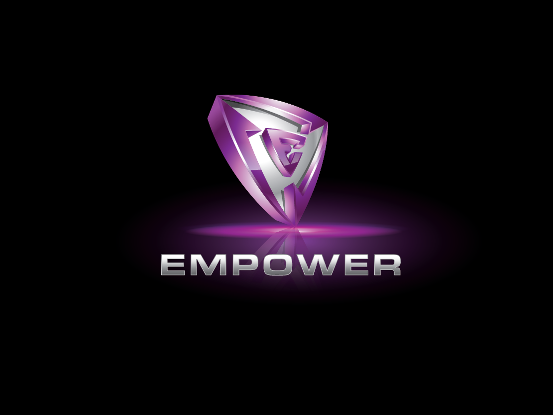
The Empower App
Vous souhaitez remporter un projet comme celui-ci ?
Ce client a reçu 121 designs de logo de la part de 27 designers. Il a choisi ce design de logo de danhood comme design gagnant.
Inscrivez-vous Trouvez des Projets de Design-
 C$200
C$200
-
 121 designs
-
 27 designers
Brief de Design de Logo
We need a logo designed for a smartphone app called "Empower" that will provide tools and resources to victims of abuse. The app has a positive spin to it, and focuses on building on the users strengths. I like bright green, personally, but I am open to other colors or combinations of colors.
Mises à jour
Having seen everyone's creative ideas, I now have a much clearer idea of what I am looking for. Here's the picture in my mind that I am sold on.. It is based on a combination of the last two photos that I uploaded (the red shield that is titled backward, and the shiny metallic E surrounded by a circle). I would like to have the shape of a shield, but having the arrows within, and, then have the "e" button inside this shield. I will upload a sketch right now because it is hard to describe in words, but the idea will be simple if you just take a look at my sketch. Overall, I really also like the shiny effect of the "e" example photo and would like to have this effect throughout the whole logo (this effect is achieved through highly contrasted shading I think).
Added Friday, January 31, 2014
New pictures have been uploaded. If you refer back to the previous photo that had many logo ideas on it, there was a red triangle with a bright dot, and the color intensity faded away as it progressed around the circle. I am also open to you using that instead of arrows (it will simplify the look further). Thank you and I am excited to see what you come up with.
Added Friday, January 31, 2014
Marché(s) Cible(s)
The audience is victims of abuse. This can be anyone.
Secteur / Type d'entité
Building
Texte du logo
Empower
Styles de logo qui vous intéressent
Logo d'Enseigne
Logo contenu dans une forme
Styles de police à utiliser
Couleurs
Couleurs choisies par le client et à utiliser dans le design de logo:
Aspect
Chaque curseur illustre les caractéristiques de la marque client et le style que doit transmettre votre design de logo.
Élégant
Audacieux
Léger
Sérieux
Traditionnel
Moderne
Sympathique
Professionnelle
Féminin
Masculin
Coloré
Conservateur
Économique
Haut de gamme
Exigences
Doit avoir
- I want the design to be based on a triangle with a button in the middle. A key feature of the app is allowing the user to "check in" on the current level of tension/ safety in the relationship. So I like their to be a sense of movement or "button-like" feel to the logo.
Bien d'avoir
- I would like the logo to have a three dimensional feel, based on their being some shading to make it "pop". see the new photos i uploaded