Train Track Map for Internal App needs STYLE!
Vous souhaitez remporter un projet comme celui-ci ?
Ce client a reçu 39 designs graphiques de la part de 14 designers. Il a choisi ce design graphique de typefdesign comme design gagnant.
Inscrivez-vous Trouvez des Projets de Design- Garanti
-
 US$190
-
 39 designs
-
 14 designers
Brief de Design Graphique
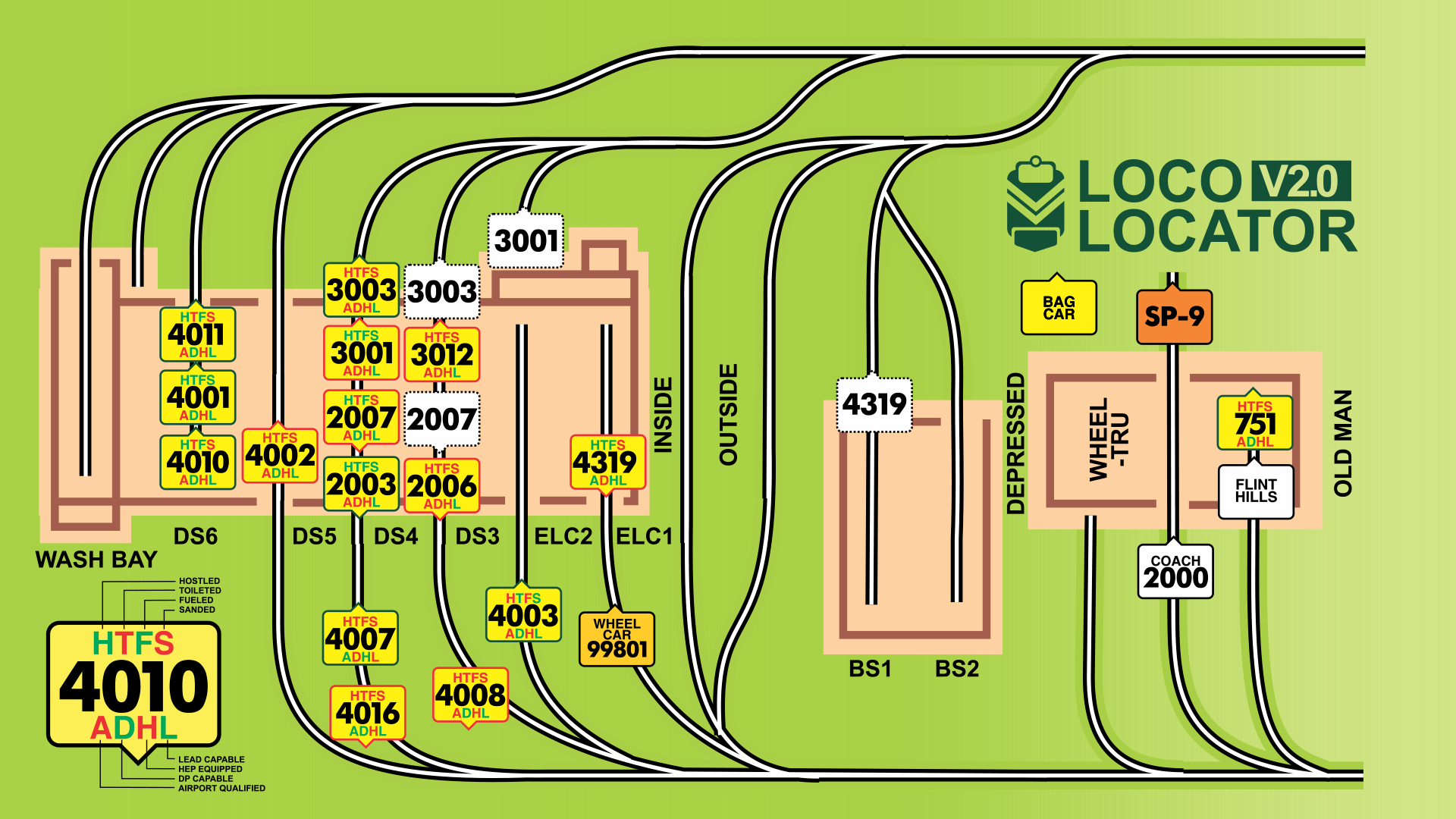
We have built a great HTML5 app to mange the location of our locomotives and the background image is a logical view of our train yard. The background image is ugly and maybe too literal because we are all programmers and not graphics folks. Could you help us build a more attractive and less "literal" iconography for the tracks?
Your map will need to keep all the tracks and buildings in the same place, but it will be more attractive and maybe have more stylized iconography for the tracks and the "blue lights"? We are open to color changes but they need to work with our app.
I've attached the vanilla version of the map and a screen shot of the app for reference.
Marché(s) Cible(s)
internal railroad users
Styles de police à utiliser
Aspect
Chaque curseur illustre les caractéristiques de la marque client et le style que doit transmettre votre design de logo.
Élégant
Audacieux
Léger
Sérieux
Traditionnel
Moderne
Sympathique
Professionnelle
Féminin
Masculin
Coloré
Conservateur
Économique
Haut de gamme
Exigences
Doit avoir
- Correct placement of track and building elements. Size 1920 x 1080
Bien d'avoir
- Cool track symbology as opposed to the realistic wonky versions.
Ne doit pas comporter
- colors that won't allow the loco icons to stand out.