Donutday
Gagnant
Vous souhaitez remporter un projet comme celui-ci ?
Ce client a reçu 469 designs de logo de la part de 194 designers. Il a choisi ce design de logo de Rawrandrawr comme design gagnant.
Inscrivez-vous Trouvez des Projets de Design- Garanti
-
 US$300
-
 469 designs
-
 194 designers
Brief de Design de Logo
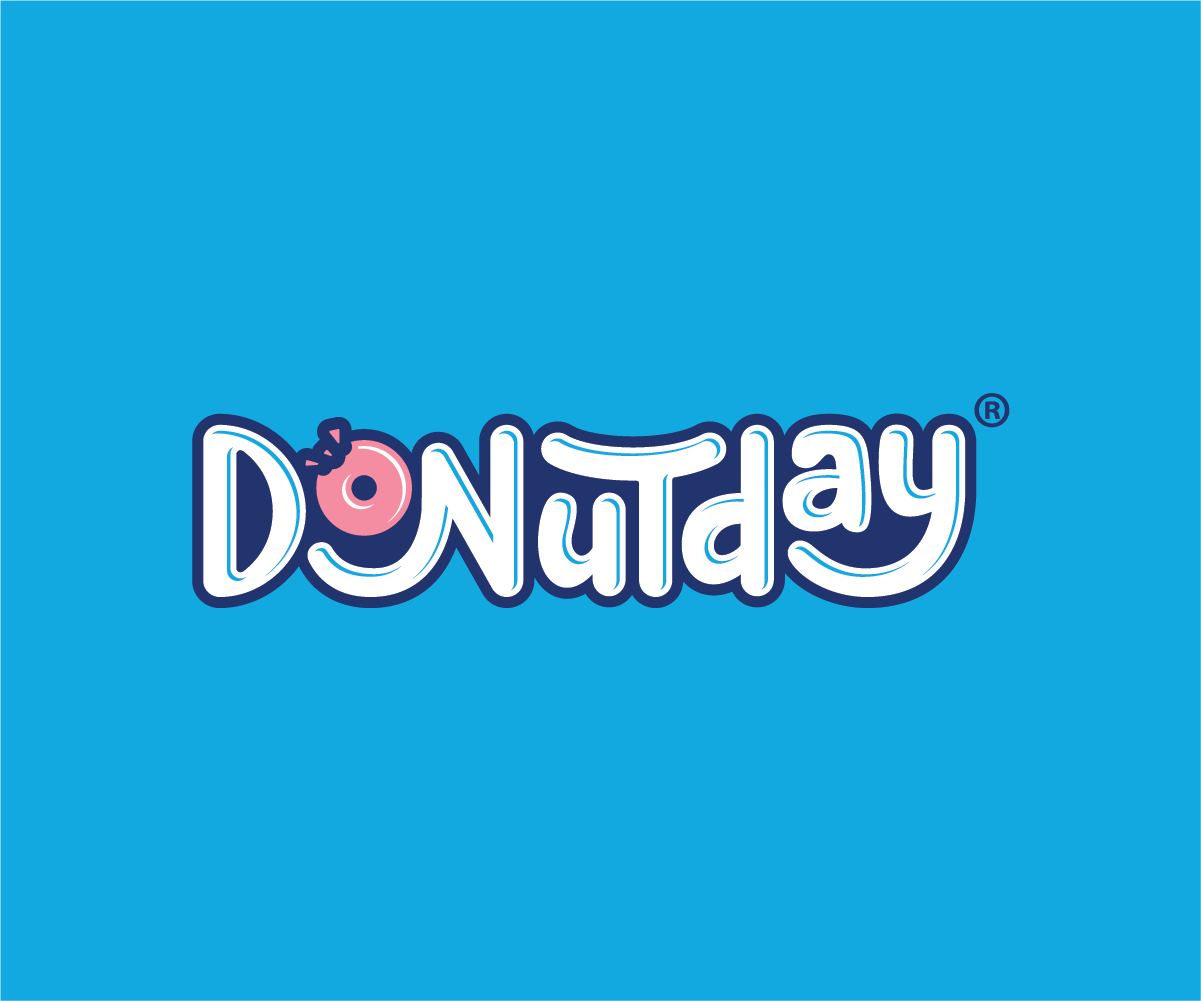
This logo is for a family friendly donut shop
TYPOGRAPHY
- It is one word (Donutday) together.
- Written in cursive OR with a hand written feel to it (please see attached samples).
- With a simple childish, classy and a little bit feminine feel to it.
- Thick/bold lines.
COLORS
- Light Blue (Pantone 2995 C) (primary color)
- Pink (1775 C) (primary color)
- White (primary color)
- Navy (Pantone 288 C) (secondary color)
Marché(s) Cible(s)
families, especially targeting kids, moms and women.
Texte du logo
Donutday
Styles de logo qui vous intéressent
Logo mot symbole
Logo (texte seulement)
Styles de police à utiliser
Sans Serif
Scénario
Aspect
Chaque curseur illustre les caractéristiques de la marque client et le style que doit transmettre votre design de logo.
Élégant
Audacieux
Léger
Sérieux
Traditionnel
Moderne
Sympathique
Professionnelle
Féminin
Masculin
Coloré
Conservateur
Économique
Haut de gamme
Exigences
Doit avoir
- It must have a donut as the "o" in (Donutday) with a bite taken out of the donut. Please don't put sprinkles on it.
Bien d'avoir
- You don't have to use all the colors. I'd like to see the background in the lighter blue with the logo in white and maybe the donut in pink.
Imagine the logo being perfect to be displayed on a pylon sign like McDonalds and others.
Ne doit pas comporter
- No pointy edges in the letters. I want the corners to be slightly or entirely curved to give it a cuter/softer look.
Please don't put sprinkles on it.
Fichiers
Télécharger tous les fichiers - 63,3 MBJPG
872B360A-FE53-4876-BE3B-7D8AB6F00F9F
vendredi 28 août 2020
HEIC
IMG_8897
vendredi 28 août 2020
PNG
IMG_8121
vendredi 28 août 2020
JPG
8174917C-5A19-4F2E-97EA-E478B614A7AB
vendredi 28 août 2020
PNG
IMG_8193
vendredi 28 août 2020
PNG
IMG_8695
vendredi 28 août 2020
PNG
IMG_8094
vendredi 28 août 2020
PNG
IMG_8259
vendredi 28 août 2020
PNG
IMG_7916
vendredi 28 août 2020
PNG
IMG_9236
vendredi 28 août 2020
PNG
IMG_9230
vendredi 28 août 2020
PNG
IMG_7782
vendredi 28 août 2020
PNG
IMG_8030
vendredi 28 août 2020
PNG
IMG_5219
vendredi 28 août 2020
PNG
IMG_7199
vendredi 28 août 2020
PNG
IMG_8829
vendredi 28 août 2020
PNG
IMG_7207
vendredi 28 août 2020
PNG
IMG_7200
vendredi 28 août 2020
Paiements
1e place
US$260
Primes de participation x 4
US$10