

 Rafraîchir
Plant and Beef lovers! Kristinedal redesign
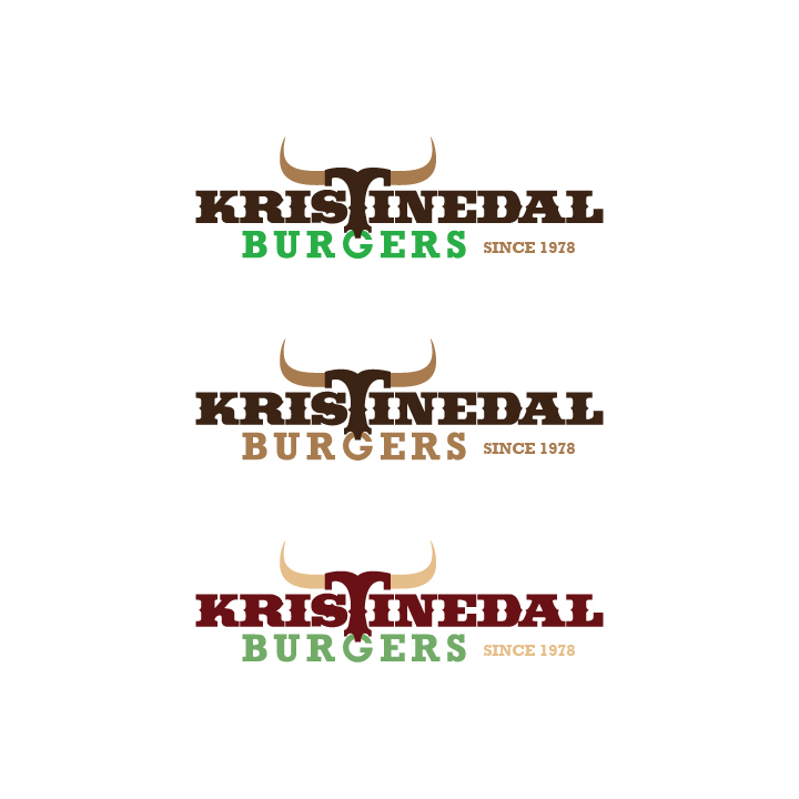
Vous souhaitez remporter un projet comme celui-ci ?
Ce client a reçu 185 designs de logo de la part de 53 designers. Il a choisi ce design de logo de Lykos comme design gagnant.
Inscrivez-vous Trouvez des Projets de Design
- Garanti
-
 €360
€360
-
 185 designs
-
 53 designers
Brief de Design de Logo
LATEST UPDATE: WE ARE STILL LOOKING FOR THE PERFECT BALANCE BETWEEN MEAT AND PLANT!
AND!
Still with the horns just as the look in the original logo provided.
AND
a icon with OUR FOUNDING FATHER and a PITCHFORK plain no roast on!
We had added photos of the pitchfork.
Could also be a version with the pitch fork alone.
A version of the original logo could be: KRISTINEDAL - Ox- & PlantBURGERS'
Please check the draft under files.
We have increased the winner price with 100 Euro more.
All the best from Jeppe at Kristinedal dk
UPDATE! AGAIN!
Sorry but we have further adjustments.
Loose the horns! After many considerations we have decided to take the horn out of the text.
Please keep the 'Burgers' so the complete text pieces is 'Kristinedal' 'Burgers' 'Since 1978'
We like to see examples of the logo with the font Manhandle.
Add a iconic burger or bulls head/horns.
Give it a last shot!
Thanks :)
Kristinedal is a burger-bar that dates back to 1978 where my granddad for first time cooked his special burgers on the Roskilde County Fair. The beef in the burger was roasted in special big iron owns that he had made. You see him on one of the photos grabbing a roast in the own. My granddad had a farm where he bred topnotch Hereford cattle. One time every year a showed the world his breeding result in the bulls and cows. And one a year the people could buy a burger and taste the fruits of his efforts with the beef qualities. It was prime beef they tastes and stood in lines for hours to get a sample.
The cattle was bred on the farm Kristinedal and grassed along the hills surrounding lake Buresø in Denmark.
Now 45 years after, 3. generation is still cooking beef accordingly to granddads pincipels of giving the people a extraordenary tasting expirence. Now 45 years after well launch open the first full time open Kristinedal Burgerbar!
Not only prime quality beef burgers will be cooked, no.. 3. generation has developed a selection of juicy plantburgers to match the beef. As a customer you can pick from both plant and beef. No need to be strictly to one side. Choose both!
W need a redesign of the original logo: ‘Kristinedal Oxburger’
LINK to Logo-files:
https://drive.google.com/file/d/1s5taBwkSE9g0Tb4krsXG6F-Gh9-MmnHr/view?usp=sharing
Change to: ‘Kristinedal Burgers - since 1978’
Like the T-horn symbolizes cattle, bull and beef. We need a symbol eg. a plant spire to represent the veggie side of our burgers. Could be from the nose ring or another place in the logo. Maybe the ‘Burgers’ could be incorporated in the ring/plant-spire e.g. the G or B.
The text ‘since 1978’ will give a clear understanding of our long history of making quality burgers. This text can be smaller and a bit less in focus.
We like to logo to show granddad as an icon. He was the fouding father of the business and the farm Kristinedal. Eg. KFC use of the colonel.
We like a country look and feel.
Could use photos here provided:
https://drive.google.com/drive/folders/1u5Z1-eEkL6a8Vbj7cpgHnfluqSZuLlo6?usp=sharing
The logo will brand our entry in the permanent burgermarked in Copenhagen - Denmark, with ambition to expand world wide.

Mises à jour
Welcome all designers!
We have a wish for a redesign of our old logo which signals beef and country-style. We want the people who also enjoy veggie burgers to see their craving in our logo. So we both embrace the beef lovers and the plant lovers. We do not see the world as black and white but believe that we all can choose our diet from meat and plant.
And we want our long history to be shown in the logo. My grandfather started breeding Hereford cattle in the sixties and in 1975 he opens his first beef-sale at the local county fair - Roskilde Dyrskue. From there we have been on Roskilde Festival, one of the biggest festivals in Europe.
So give us your best shot at your ideas for a new logo that embraced a varied burger diet.
All the best from
Jerry & Jeppe
Kristinedal owners
Added Tuesday, July 28, 2020
Hi all designers
Thanks for your both creative and stylish designs.
We like to see versions where the beef side is clear horns/nosering and the plant side is present and incorporated in the letters and the wholeness, The plants should not take over and become trees ;)
Tomorrow we will go through them all and finish the rating og somment on wishes for changes. Please be patient.
Allt the best from Kristinedal Management
Added Wednesday, July 29, 2020
Need extra days to review
Need extra days to review
Slow in providing feedback
Slow in providing feedback
Gathering more feedback
Designs look the same
Need extra days to review
Hi all designers
We are in the final stage of the project. And yes we know the process has been long on the way from our behalf. Sorry about that.
But we have increased the winner fee and also 2. place. Therefore please consider giving the design a shot more.
We would really appreciate it :)
We look for a design with the original logo untouched just added 'KRISTINEDAL' underneath 'OX & PLANTBURGERS'. or just 'BURGERS' and 'Since 1978'
AND an icon of the pitch fork or our my granddad (founding father) with the pitch fork.
Keep the original colors dark brown and light brown.
THANKS ALOT :)
Added Sunday, September 27, 2020
Marché(s) Cible(s)
Fastfood buyers in big cities
Texte du logo
Kristinedal Burgers - since 1975
Styles de logo qui vous intéressent
Logo de figurine
Logo avec illustration ou personnage
Logo mot symbole
Logo (texte seulement)


Styles de police à utiliser

Autres polices appréciées:
- Manhandle
Aspect
Chaque curseur illustre les caractéristiques de la marque client et le style que doit transmettre votre design de logo.
Élégant
Audacieux
Léger
Sérieux
Traditionnel
Moderne
Sympathique
Professionnelle
Féminin
Masculin
Coloré
Conservateur
Économique
Haut de gamme
Exigences
Doit avoir
- Horns and plants
Bien d'avoir
- Like the T-horn symbolizes cattle, bull and beef. We need a symbol eg. a plant spire to represent the veggie side of our burgers. Could be from the nose ring or another place in the logo. Maybe the ‘Burgers’ could be incorporated in the ring/plant-spire e.g. the G or B.


