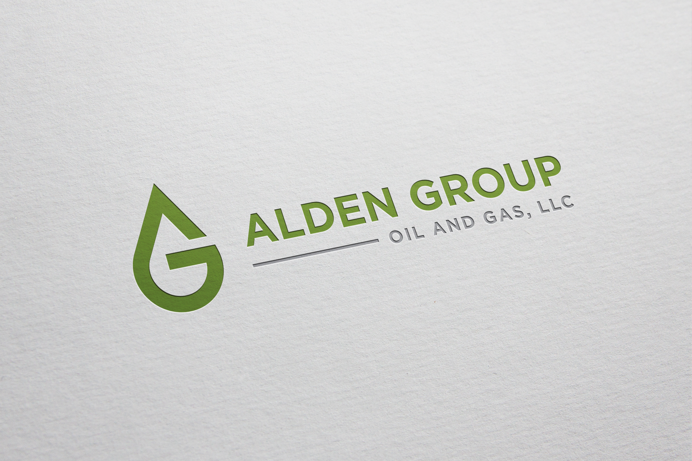
Alden Group Logo Design - Simple and Quick! *
Vous souhaitez remporter un projet comme celui-ci ?
Ce client a reçu 313 designs de logo de la part de 140 designers. Il a choisi ce design de logo de FreshDesignss comme design gagnant.
Inscrivez-vous Trouvez des Projets de Design-
 US$300
-
 313 designs
-
 140 designers
Brief de Design de Logo
Logo for a start up oil and gas company. Looking for clean, minimalist, sharp. Subtle reference to oil and gas is great, but nothing really flashy. I like subtle designs. Clean and efficient is the message I am trying to send with a design. I have pasted kind of an example below. Might be interesting to do something fun with the A. Perhaps make it look like an oil derrick or something. Any other ideas are welcome. I would like the text spelled out with 'Alden Group' larger and 'Oil and Gas' smaller. We may create subordinate companies under the Alden umbrella so I would like to be able to use the same logo, but change out the 'Oil and Gas' . Alden Group Analytics as an example. Analytics would replace Oil and Gas in the logo. Feel free to be creative! Last note, I am looking to use a dark green as kind of a base color. It is standard in the industry that dark green represents oil on a chart, so that is the symbolism. I would also love to see a recommended color pallet with three primary and three secondary colors that I could add to a standard power point template.
Secteur / Type d'entité
Oil And Gas Exploration
Texte du logo
Alden Group Oil and Gas, LLC
Styles de logo qui vous intéressent
Logo mot symbole
Logo (texte seulement)
Styles de police à utiliser
Couleurs
Couleurs choisies par le client et à utiliser dans le design de logo:
Aspect
Chaque curseur illustre les caractéristiques de la marque client et le style que doit transmettre votre design de logo.
Élégant
Audacieux
Léger
Sérieux
Traditionnel
Moderne
Sympathique
Professionnelle
Féminin
Masculin
Coloré
Conservateur
Économique
Haut de gamme
Exigences
Doit avoir
- Simple, clean, minimalist design
Ne doit pas comporter
- Overly animated or flashy design. Simple is better!