

 Rafraîchir
Friends of Fourth Ward Logo Design Project
Vous souhaitez remporter un projet comme celui-ci ?
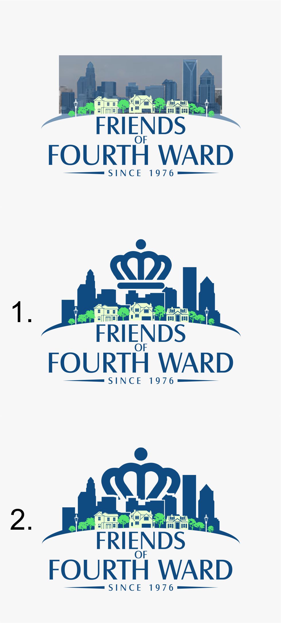
Ce client a reçu 190 designs de logo de la part de 65 designers. Il a choisi ce design de logo de DigitalArt comme design gagnant.
Inscrivez-vous Trouvez des Projets de Design
- Garanti
-
 US$150
-
 190 designs
-
 65 designers
Brief de Design de Logo
We need an updated logo. Website is being redesigned here (and you can see the old logo.) https://fofw.scdconsultingservices.com/
Fourth Ward is a neighborhood next to uptown Charlotte, NC- with a large park, fountains, and a neighborhood of historic houses.
Friends of Fourth Ward is the website name. (FOFW)
The old logo needs updating- cleaner and more modern
See brainstorming ideas attached. The Crown is part of Charlotte- we were named after Queen Charlotte.
Our current color pallete is Snorkel from Pantones 2020 colors- if you want to add color. https://www.pantone.com/color-intelligence/color-of-the-year/color-of-the-year-2020-palette-exploration

Mises à jour
We have a committee trying to decide which is the best design and has not made a decision yet. (I apologize for the delay.)
The main comment I am hearing is that they want some sort of residential look added to the logo.
Friends of Fourth Ward is a **neighborhood** right next to a bustling downtown area (with tall buildings.) They like the skyline, they like the logos with the crown, but really want to see some houses and/or trees to signify the Fourth Ward Neighborhood. (and are willing to give up the "Crown" to get it.)
So- they want some sort of houses/trees/greenery -added to the bottom of the design- and yet keeping it simple.
Here is an example of a row of houses, and the skyline behind it.
https://fofw.scdconsultingservices.com/living-here/
Added Tuesday, June 23, 2020
Slow in providing feedback
Marché(s) Cible(s)
Neighborhood of Fourth Ward.
Design will also be used in social media, and on our brochures
Texte du logo
Friends of Fourth Ward (since 1976)
Styles de logo qui vous intéressent
Logo d'Enseigne
Logo contenu dans une forme



Styles de police à utiliser
Autres polices appréciées:
- Really not sure- modern, yet not silly
Aspect
Chaque curseur illustre les caractéristiques de la marque client et le style que doit transmettre votre design de logo.
Élégant
Audacieux
Léger
Sérieux
Traditionnel
Moderne
Sympathique
Professionnelle
Féminin
Masculin
Coloré
Conservateur
Économique
Haut de gamme
Exigences
Doit avoir
- skyline
then some sort of residental look under it (green, trees/houses)- maybe a lightpost as part of the design?
We are a neighborhood, living in the shadows of the skyline.
Bien d'avoir
- crown
City skyline
Can use colors from Snorkel- Pantone palette of the year 2020
https://www.pantone.com/color-intelligence/color-of-the-year/color-of-the-year-2020-palette-exploration
Ne doit pas comporter
- older look

