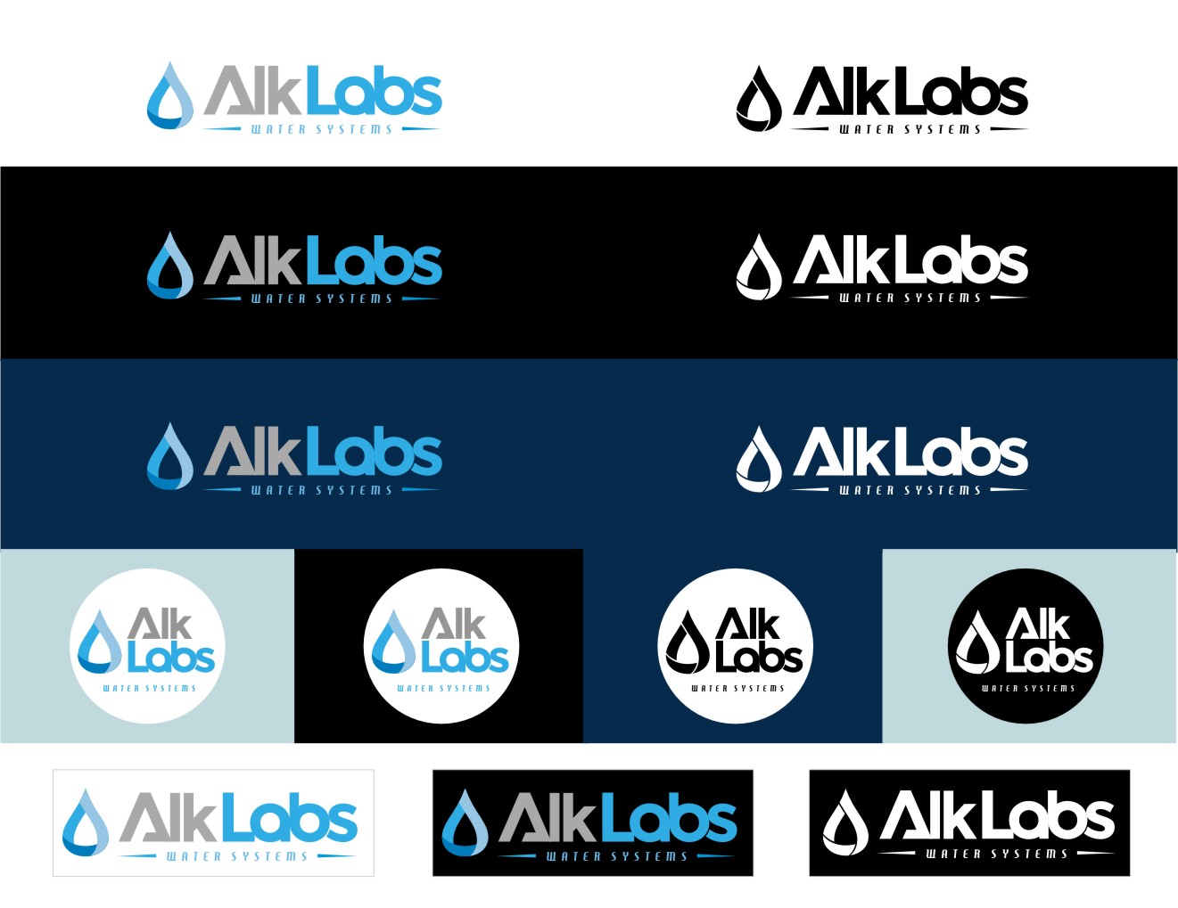
Water Business needs a great logo

Vous souhaitez remporter un projet comme celui-ci ?
Ce client a reçu 113 designs de logo de la part de 56 designers. Il a choisi ce design de logo de LIZZY LO comme design gagnant.
Inscrivez-vous Trouvez des Projets de Design- Garanti
Brief de Design de Logo
I need a logo re-done, mastered. We had one made months ago, and I particularly do not LOVE it. I think its cool. I like the concept, but I think it could be better. I attached the AI file I have on our current logo and also a few of the products we will be branding. I need a logo that is stack-able, and one that is Linear. I am open to having a logo outside of the wording, or incorporating it into the name like the one we have. We are a startup company that will be in the "water" business. Creating whole home water filters/systems, as well as other products that make water better, and more alkaline. I would assume colors that are blue, maybe some green, grays. Not sure. Colors can be changed easily enough. We want to logo to look, rich yet minimalist, professional but not boring. Not too many colors. Try to stay under 4 colors. Feel free to google whole home water filters, alkaline shower heads, alkaline water pictures etc. to get a feel for the competition.
** Today someone submitted a logo without the "S" at the end of the company name. So Alk lab insted of Labs, and it looked really good. Not sure if it rolls off the tounge as easily, but it does look more symmetrical. I did just go buy that domain as well, and may consider that. I also bought alkalinelab.com and am open to seeing logos with that variation.
Marché(s) Cible(s)
Home owners, health conscience people.
Texte du logo
Alk Labs
Styles de logo qui vous intéressent
Logo d'Enseigne
Logo contenu dans une forme
Logo mot symbole
Logo (texte seulement)
Styles de police à utiliser
Aspect
Chaque curseur illustre les caractéristiques de la marque client et le style que doit transmettre votre design de logo.
Élégant
Audacieux
Léger
Sérieux
Traditionnel
Moderne
Sympathique
Professionnelle
Féminin
Masculin
Coloré
Conservateur
Économique
Haut de gamme
Exigences
Bien d'avoir
- ** Today someone submitted a logo without the "S" at the end of the company name. So Alk lab instead of Labs, and it looked really good. Not sure if it rolls off the tounge as easily, but it does look more symmetrical. I did just go buy that domain as well, and may consider that. I also bought alkalinelab.com and am open to seeing logos with that variation.
***one of the stickers I need to make will have a 3 to 1 inch ratio. 3 wide 1 high
That would be the dimensions I'd look for in the rectangular or linear logo