Weedoo overhaul web design for google improvment
Vous souhaitez remporter un projet comme celui-ci ?
Ce client a reçu 100 web designs de la part de 21 designers. Il a choisi ce web design de Starlyn DS comme design gagnant.
Inscrivez-vous Trouvez des Projets de Design- Garanti
-
 US$1000
-
 100 designs
-
 21 designers
Brief de Web Design
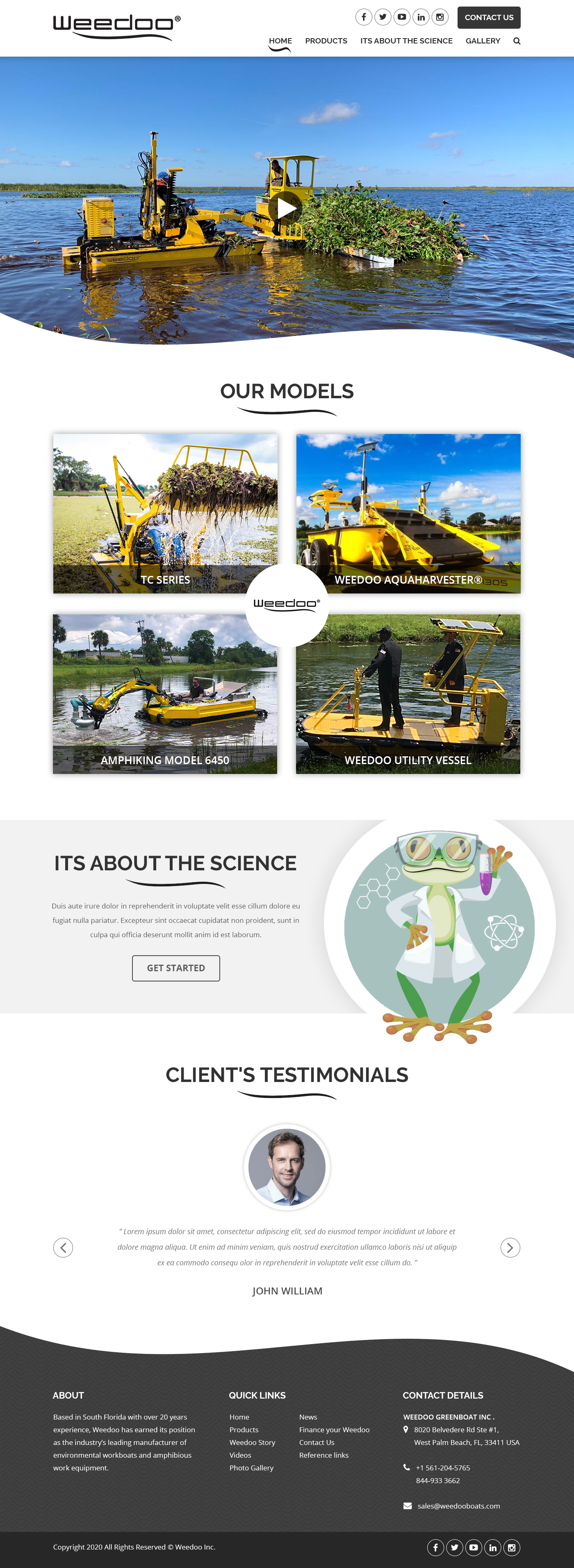
We had to rebuild the necessary menus and content regarding the new search techniques but the GUI is horrific. I’m looking for a new look as the current website was great but now functionality is not appealing.
Mises à jour
The home page should have the social media icons on top of the header. The contact us should be just a button as 98% of people will more like fill out the crm form opposed to calling. Our CRM form goes to our salesforce so no need to place any gui for forms as we will do that on its own page. At that contact us page it will have the form for sure and our phone etc.
On the home page we need the video on top to start without pressing play. Beneath the video would be Our models in a clever quadrant. The words and usage of repeat words can be handled after we determine the layout. However, for navigational purposes we need the video, our models, and testamonials on the cover. The gallery and other items can be on other pages.
Also, the use of the frog with a white lab coat would be greatly appreciated under "Its about the Science" tab that we desperately need. People are placing Herbicides in our water and we want the use of the frog to be the mascot. Perhaps using the frog in the lab coat opposed to me might be better fit. If you take one minute and watch this video you will see what Freddy the Frog means to us.
https://www.youtube.com/watch?v=iTPYNrATF9U
Added Sunday, May 31, 2020
Marché(s) Cible(s)
men between the ages of 25 and 65 and people that are looking to have a skidsteer for the water
Code
Codé - Design et Code demandé
Nombre de Pages Demandé
4 page
Styles de police à utiliser
Couleurs
Le designer choisit les niveaux de gris à utiliser dans le design.
Aspect
Chaque curseur illustre les caractéristiques de la marque client et le style que doit transmettre votre design de logo.
Élégant
Audacieux
Léger
Sérieux
Traditionnel
Moderne
Sympathique
Professionnelle
Féminin
Masculin
Coloré
Conservateur
Économique
Haut de gamme
Exigences
Doit avoir
- It must have the new look but be able to incorporate menu options that I’ve optimized Google’s latest and greatest changes.
Bien d'avoir
- I would like to open up with a video of the boat in action because Video seem to attract people. I like www.seaveeboats.com for look. However I’m not sure how I can have what I want and stay within menus that are appealing. We are using Railway for the font but open for suggestions.
Ne doit pas comporter
- It should not have so many graphics that you lose focus of the actual boat so I prefer everything to be black and white so the boat pops in yellow