Improving and modifying an existing logo
Vous souhaitez remporter un projet comme celui-ci ?
Ce client a reçu 30 designs graphiques de la part de 9 designers. Il a choisi ce design graphique de YERR® comme design gagnant.
Inscrivez-vous Trouvez des Projets de Design-
 US$110
-
 30 designs
-
 9 designers
Brief de Design Graphique
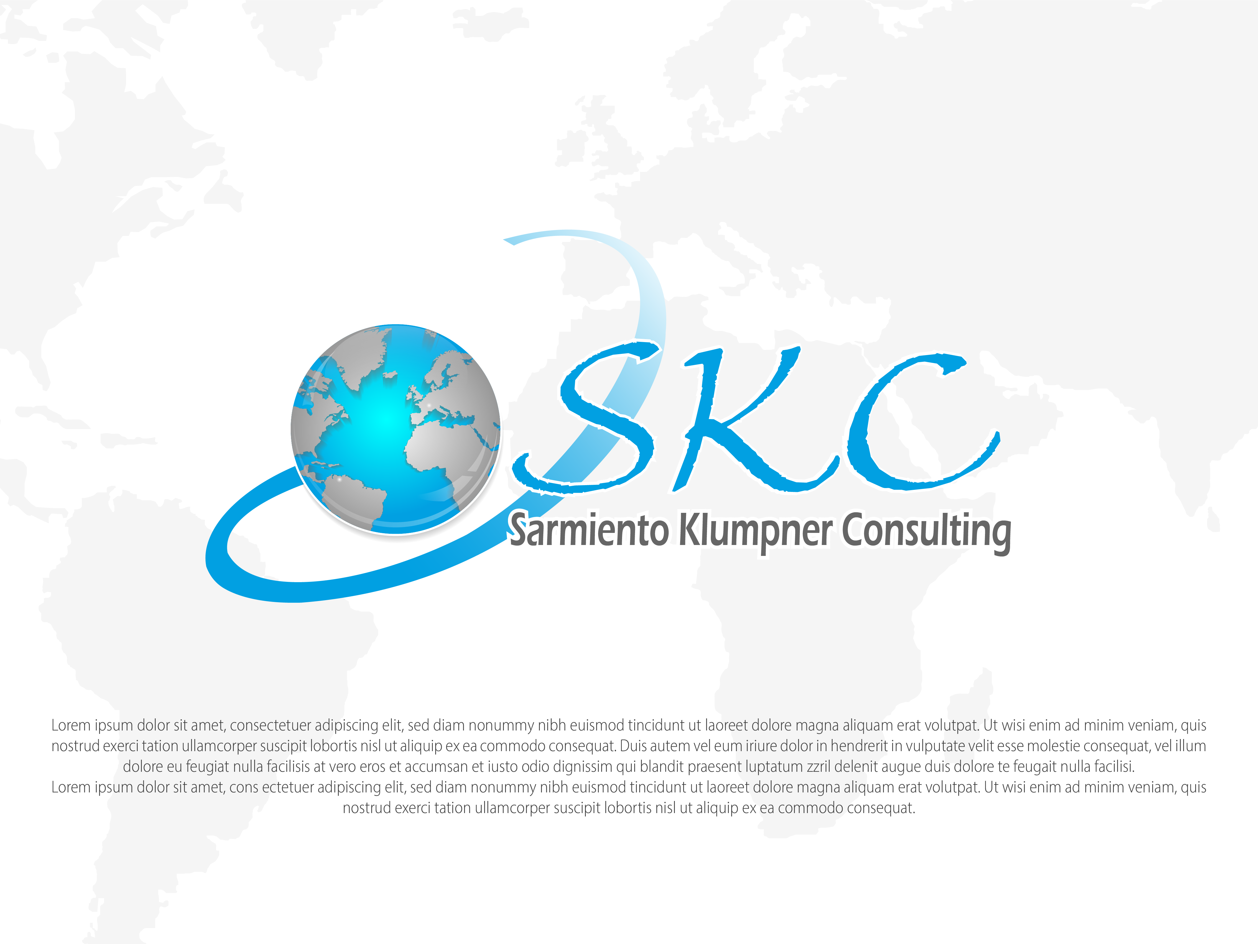
I need to improve a logo that I already have.
The following are Required modifications:
1. the letters "SNC" should become "SKC".
2. SKC should have the same size. These letters could be a bit smaller than the world.
3. the name Sarmiento Núñez Consulting should become Sarmiento Klumpner Consulting, and could be written less bold, thick, and maybe in a gray tone or less dark/black.
4. the world should show South-America and Western-Europe at the same time. The colours of the world should be inverted. Blue for the sea, metallic gray for the continents.
5.The spiral surrounding the world could become degrading blue.
6. the same white dot that appears in Venezuela, should appear in Switzerland
7. The colors to use are white, black, gray and blue (Ocean blue, Azure, or so). The red becomes blue.
8. the look and feel should be more or less the same as it is right now.
Marché(s) Cible(s)
people seeking for legal counseil
Secteur / Type d'entité
Legal
Styles de police à utiliser
Autres polices appréciées:
- calibri, calibri light, big caslon, TNR
Couleurs
Couleurs choisies par le client et à utiliser dans le design de logo:
Aspect
Chaque curseur illustre les caractéristiques de la marque client et le style que doit transmettre votre design de logo.
Élégant
Audacieux
Léger
Sérieux
Traditionnel
Moderne
Sympathique
Professionnelle
Féminin
Masculin
Coloré
Conservateur
Économique
Haut de gamme
Exigences
Bien d'avoir
- Required modifications:
1. Letters "SNC" should become "SKC".
2. SKC should be of same size, and could be a bit smaller than the world.
3. The name Sarmiento Núñez Consulting should become Sarmiento Klumpner Consulting, and could be written less bold, thick, and maybe in a gray tone or less dark/black.
4. The world shows South-America and Western-Europe. The colours of the world should be inverted. Blue for the sea, metallic gray for the continents.
5.The spiral surrounding the world could become degrading blue or stay gray.
6. The same white dot that appears in Venezuela, should appear in Switzerland
7. Colors to be used: white, black, gray and blue (Ocean blue, Azure, or so). The red becomes blue.
8. The look and feel should be more or less the same as it is right now.