Brand new start up connecting advertisers to the gaming community needs a cool website design
Vous souhaitez remporter un projet comme celui-ci ?
Ce client a reçu 50 web designs de la part de 5 designers. Il a choisi ce web design de lemosys infotech comme design gagnant.
Inscrivez-vous Trouvez des Projets de Design- Garanti
-
 US$520
-
 50 designs
-
 5 designers
Brief de Web Design
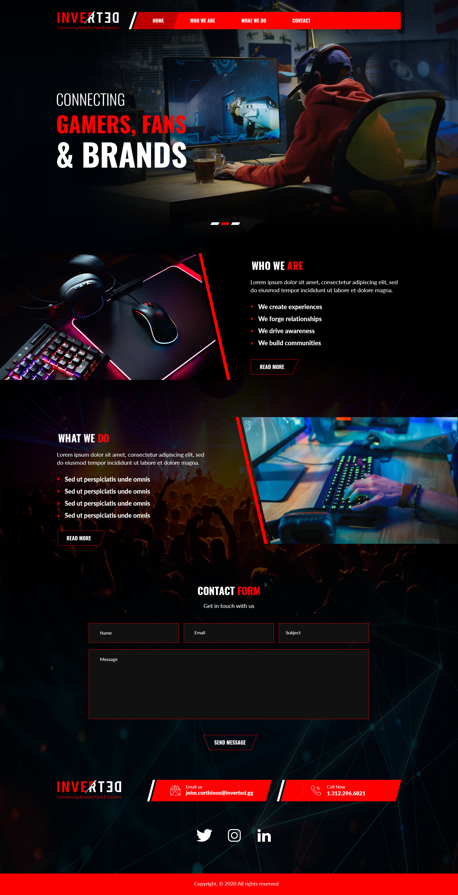
The company is called Inverted with the tagline "Gamers, Fans, and Brands". I connect the advertisers and their brands/services with sponsorship opportunities within the gaming community, which includes popular streamers, professional gamers and teams as well as venues that host popular events.
I need a website that's fun, eye-catching and playful but not at the expense of professionalism. I'm in the gaming space so some degree of playfulness within the site and context is desired.
As an example, I envision a plugin for the initial load screen where the letters of my logo (see uploaded files for visual) fall from the top of the screen upside down (hence the "inverted") and bounce into place centered on the screen above the fold . Once that sequence concludes (a few seconds), it holds in place and then the letters turn into correct form to form the logo. After all that the tagline appears underneath. I think a 5 second total sequence of all this makes the most sense and it only loads when you initially visit.
I have other ideas but welcome yours. If you've worked in this esports/gaming environment before, I would love to hear your thoughts and suggestions. If you haven't, that's ok too.
Please keep in mind, I need to keep a professional tone throughout this project's design. Fortune 500 companies and the largest ad agencies in the world will be my clients. I need them to know that Inverted is legit and credible not goofy and all "gamey"
Marché(s) Cible(s)
it's two fold. The primary target will be adults 25-54 but a secondary target is streamers/gamers/video gaming community that is mostly male 12-34.
Secteur / Type d'entité
Advertising
Code
Codé - Design et Code demandé
Nombre de Pages Demandé
4 page
Styles de police à utiliser
Aspect
Chaque curseur illustre les caractéristiques de la marque client et le style que doit transmettre votre design de logo.
Élégant
Audacieux
Léger
Sérieux
Traditionnel
Moderne
Sympathique
Professionnelle
Féminin
Masculin
Coloré
Conservateur
Économique
Haut de gamme
Exigences
Doit avoir
- A fun, playful website that is also professional.
I'm going to eventually drop in video examples of work I've done.
Cool backgrounds can either be developed or be from static pictures i own or use from large gaming tournaments showcasing the excitement around the experience.
Use whatever logo uploaded in the files that you think works best with your design
Bien d'avoir
- Experiment with cool fonts as long as they are easy to read
Have fun with little "easter eggs" in the design such as things the visitors discovers when navigating the web page. Maybe when the cursor rolls over a letter in the logo, it reacts in a fun way such as inverting or expanding???
I'm open to anything fun as long as it doesn't dominate the experience. Playful should be limited to a few fun things but not be the epi-center of the experience.
If you want to explore other options or get better explanation on what this means, email me.
Ne doit pas comporter
- It shouldn't feel too business-like or static. I need a balance that leans professional with fun throughout that does NOT compromise the user's experience.
Do not play off of existing/traditional gaming clip art or proprietary trademarks like the atari symbol, Xbox logo, Space Invader monster, etc...