Crisp, Impactful, Web Design Needed
Vous souhaitez remporter un projet comme celui-ci ?
Ce client a reçu 87 web designs de la part de 18 designers. Il a choisi ce web design de Sol. Design comme design gagnant.
Inscrivez-vous Trouvez des Projets de Design- Garanti
-
 US$370
-
 87 designs
-
 18 designers
Brief de Web Design
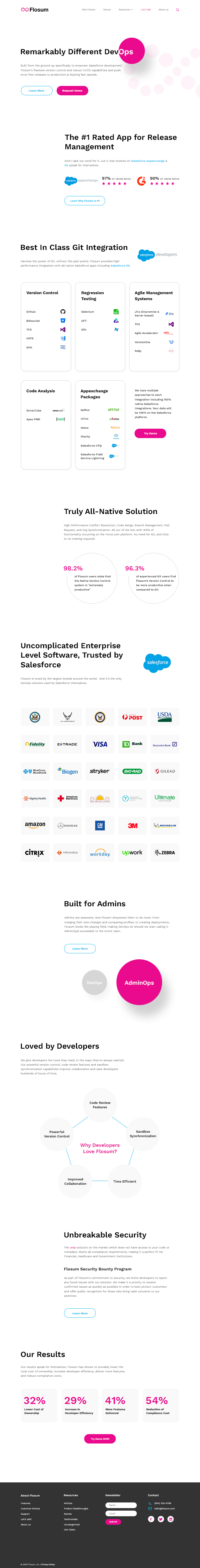
We are looking to redesign our website, beginning with our Home Page. We are a Saas company, and our product is called Flosum. It is an application that allows Salesforce Development teams to more easily customize their Salesforce Instance. In its essence, Flosum is a complete end-to-end DevOps solution with built-in merge tools, version control, continuous deployments, static code analysis, user story management, regression testing tools & more. Flosum is completely built on Salesforce, for Salesforce.
Our current website is www.flosum.com.
Our largest competitors are Copado, Gearset and AutoRabit.
We like the simple messaging/feel that apple.com utilizes.
Websites that inspire us are apple.com and https://user.com
Like the websites above, we want the design to be SIMPLE, CLEAN & ORGANIZED .
We are hoping the final design will incorporate our current branding, but be more clean, elegant, powerful, and drive increased action from the viewer. It should present a successful, trusted enterprise-level software image - tightly aligned with Salesforce and communicate the overall message that we make Salesforce development easier and save companies time, money and resources. We want to make sure we look like a large company and attract enterprise-level companies, but also connect well with Developers. Should NOT be boring, but rather crisp and impactful. I have attached the text for the homepage below as well as our logo and some of the recent materials we have put together that provide information about our company. In the text document we have provided some ideas for infographics, but hope the winning designer will use their own creativity to come up with something that will wow us. Our branding colors are T-mobile pink - hex ea0a8e ONLY along with a grayscale/black. We do not want the final design to be too pink however - just utilizing that for statement/accent purposes.
Instead of placing the most emphasis on using cool graphics, images, etc. The focus should be on conveying the message in a clear, impactful, way. The structure of the page should be very clear. The placement should be hierarchical. The page needs to be super well-organized. See this page: [https://www.gartner.com/en/insights/top-insights](https://www.gartner.com/en/insights/top-insights)
Please place an emphasis on font/typography. The font that we must use a very easy to use font. The font should be big, clean full.
Please design multiple pages.
Please do not use any stock photos
Please do not use cartoon-like images and instead use more professional looking infographcis.
Mises à jour
Gathering more feedback
Marché(s) Cible(s)
Any company that utilizes Salesforce and customizes their Saleforce instance, particularly enterprise-level/large organizations. Specific roles that we're looking to appeal to include CTO's, CRM Managers, Salesforce Developers, Salesforce Architects, Salesforce Technical Architects, Salesforce Program Architects
Secteur / Type d'entité
SaaS
Nombre de Pages Demandé
4 page
Styles de police à utiliser
Couleurs
Couleurs choisies par le client et à utiliser dans le design de logo:
Aspect
Chaque curseur illustre les caractéristiques de la marque client et le style que doit transmettre votre design de logo.
Élégant
Audacieux
Léger
Sérieux
Traditionnel
Moderne
Sympathique
Professionnelle
Féminin
Masculin
Coloré
Conservateur
Économique
Haut de gamme
Exigences
Doit avoir
- Flosum Logo, \Provided Homepage Text, Graphics
Ne doit pas comporter
- stock photos, cartoon-like images