Food Choices & Patient-Reported Outcomes in Parkinson's disease
Vous souhaitez remporter un projet comme celui-ci ?
Ce client a reçu 22 designs graphiques de la part de 3 designers. Il a choisi ce design graphique de JK18 comme design gagnant.
Inscrivez-vous Trouvez des Projets de Design-
 US$290
-
 22 designs
-
 3 designers
Brief de Design Graphique
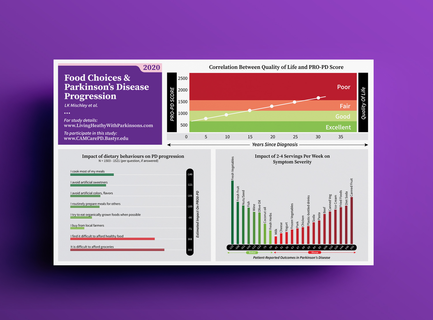
We have spent the past 7 years studying food choices and rate of PD progression. We want to show people which foods have the most significant impact. <br/><br/>The infographic attached called "Social Health in PD" is the first in this 6-part series, recently designed by someone on DesignCrowd. I'd like this entire series to "pair nicely" with one another, but also have unique personality, which is why I've opened the contest up. <br/><br/>The PRO-PD scale is the point of reference, it explains that higher scores are worse, low scores are better. I'd like to stick with the green is good, red is bad theme. ish. <br/><br/>The blue bar chart with food is "the grand finale." THIS is the information people have been waiting for for decades! I expect this to be highly circulated-- passed to physicians, support groups, getting tens of thousands of shares online! Below, I uploaded the 2019 version (also produced by someone from Design Crowd). On my ppt screen shot, that data on the bottom left is also REALLY important. Can make another bar chart? Or find some other creative way to communicate it? OK to not include the p-values (OK to remove the far right column). Thanks!
Mises à jour
Low designer entries
Marché(s) Cible(s)
Patients, their partners/ families, and health care providers.
Aspect
Chaque curseur illustre les caractéristiques de la marque client et le style que doit transmettre votre design de logo.
Élégant
Audacieux
Léger
Sérieux
Traditionnel
Moderne
Sympathique
Professionnelle
Féminin
Masculin
Coloré
Conservateur
Économique
Haut de gamme
Exigences
Doit avoir
- Must include the legend-- some version of the PRO-PD scale vs. Quality of Life, as a point of reference. If possible, I'd like to stick with [some shade of] green is good, with it being clear that scores are getting worse [red-ish] as the scores increase.
- Must have the website, so people can go look for more information/ details about the project.
Bien d'avoir
- Coordination with the "Social Health ..." infographic below.