In-Two Logo for apparel brand targeting rowers
Vous souhaitez remporter un projet comme celui-ci ?
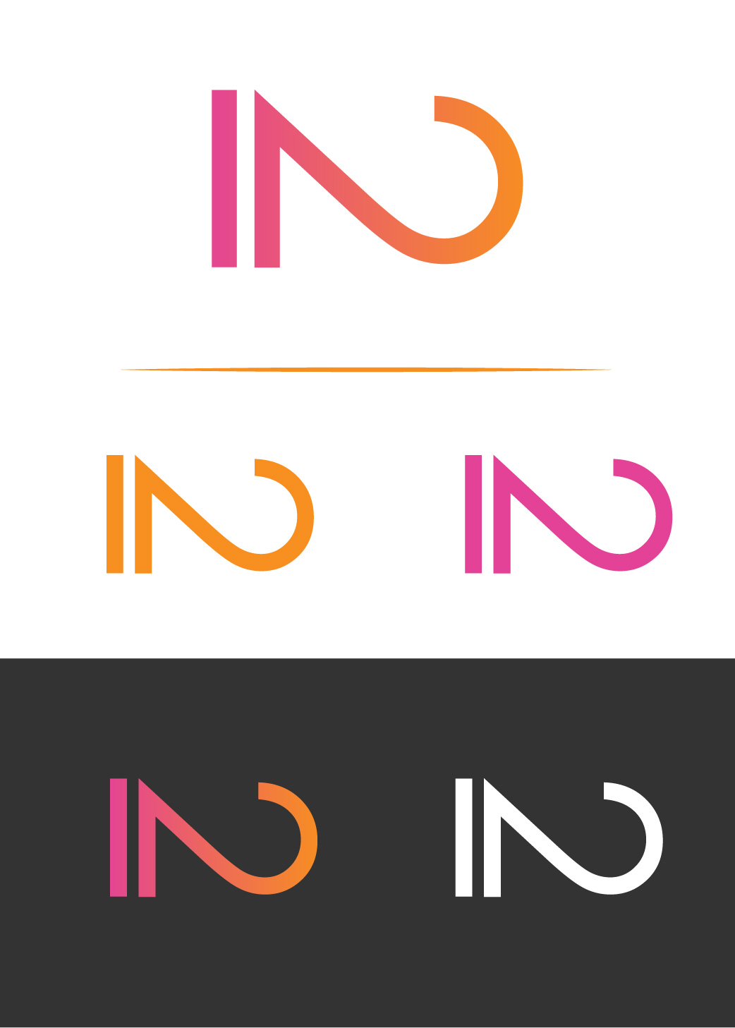
Ce client a reçu 66 designs de logo de la part de 33 designers. Il a choisi ce design de logo de rtninedesign comme design gagnant.
Inscrivez-vous Trouvez des Projets de Design- Garanti
-
 US$150
-
 66 designs
-
 33 designers
Brief de Design de Logo
I need a logo designed for In Two. The number "2" can be used in place of "Two" . In Two is a brand focusing on apparel for athletes, specifically rowers and crew teams. I would like to stay away from kitschy drawings of oars because they get put on anything anyone does for rowing. We will require a simplified version of the logo in a single color so that it can be easily screen printed. We would need an all black and an all white version. with a transparent background. The logos for the web and other media can include colors. We would like the logo colors to stand out. We have thought about using a combination of tangerine and hot pink, but we are not fixated on that. Obviously these color are very bright and could easily be overdone.
Marché(s) Cible(s)
Athletic fitness minded individuals. competitive athletes specifically rowers
Texte du logo
"In Two"
Styles de logo qui vous intéressent
Logo pictural
Un objet réel (texte facultatif)
Logo abstrait
Conceptuel / symbolique (texte facultatif)
Logo mot symbole
Logo (texte seulement)
Logo de Lettermark
Acronyme ou logo texte (texte seulement)
Styles de police à utiliser
Couleurs
Couleurs choisies par le client et à utiliser dans le design de logo:
Aspect
Chaque curseur illustre les caractéristiques de la marque client et le style que doit transmettre votre design de logo.
Élégant
Audacieux
Léger
Sérieux
Traditionnel
Moderne
Sympathique
Professionnelle
Féminin
Masculin
Coloré
Conservateur
Économique
Haut de gamme
Exigences
Doit avoir
- Sand serif fonts, no "Varsity" fonts. The brand should have an element of sophistication to it. An identifiable visual graphic logo as well as a word mark that can be used independently.
Bien d'avoir
- An example of a brand image we like is track smith, they provide running apparel. The logo can use the spelling of two or the numeral 2, but should probably not use both unless it really add something. From the early submissions it looks like the designers are unfamiliar with rowing. The pictures includes are to give you an idea of what "rowing" looks like and what the target market looks like.
Ne doit pas comporter
- Serif fonts, script, Big block varsity lettering. Pictures of oars. oars are very over done. Oars as part of something else eg. a boat is fine. Anything overly stereotypically nautical, ie ships wheels etc.. Track smith is a high end retail store, we like their image and their branding. We do not want to steal their rabbit or clone their logo. No rabbits!