INVERTZ Bakery
Vous souhaitez remporter un projet comme celui-ci ?
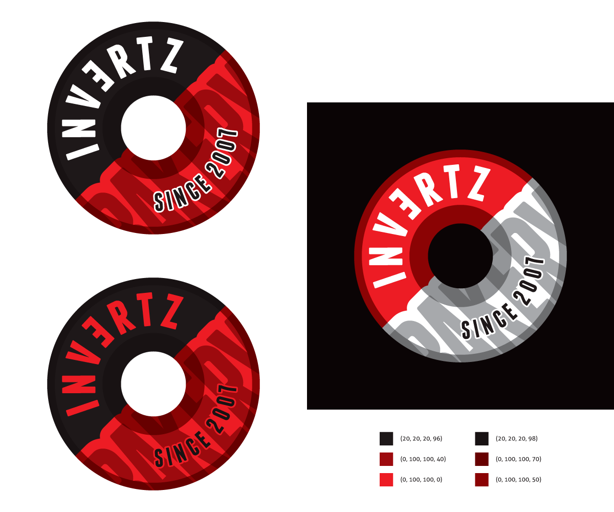
Ce client a reçu 70 designs de logo de la part de 27 designers. Il a choisi ce design de logo de Kitchenfoil comme design gagnant.
Inscrivez-vous Trouvez des Projets de Design- Garanti
-
 S$242
S$242
-
 70 designs
-
 27 designers
Brief de Design de Logo
Payment guaranteed.
Please download the file I've uploaded to get the feel of the logo i need.
Check updates for most recent feedbacks/changes by me.
Name of store: Invertz (Invert the "e" please? flip it horizontally)
What are we: A bakery owned by 2 ladies. We bake cakes, cupcakes, cake pops and tarts.
Target audience: 18-30 year old females
Brand colours: Black, white and red
Logo feel: Bold, loud, modern and sophisticated. Shouldn't give the "girlish" vibe.
Mises à jour
I've updated the entire design brief and have included a file showing the kind of logos I'm looking out for from you guys. Please do have a look again. Thanks all!
Added Monday, January 20, 2014
We're currently getting several designs incorporating the use of the "dolly paper" because it's a bakery and we sell cakes. But if you have ideas beyond the "dolly party" emblem type logo, we would love to see that too. Thanks!
Added Tuesday, January 21, 2014
I'm also open to designs with two ladies in the logo!
Added Wednesday, January 22, 2014
Marché(s) Cible(s)
18 - 30 year old females
Secteur / Type d'entité
Bakery
Texte du logo
Invertz
Styles de logo qui vous intéressent
Logo d'Enseigne
Logo contenu dans une forme
Logo pictural
Un objet réel (texte facultatif)
Logo abstrait
Conceptuel / symbolique (texte facultatif)
Aspect
Chaque curseur illustre les caractéristiques de la marque client et le style que doit transmettre votre design de logo.
Élégant
Audacieux
Léger
Sérieux
Traditionnel
Moderne
Sympathique
Professionnelle
Féminin
Masculin
Coloré
Conservateur
Économique
Haut de gamme
Exigences
Doit avoir
- Invert the "e" in INVERTZ horizontally.
Colours should be red, black and white.
Bien d'avoir
Ne doit pas comporter
- Should not give a "girlish" feel.