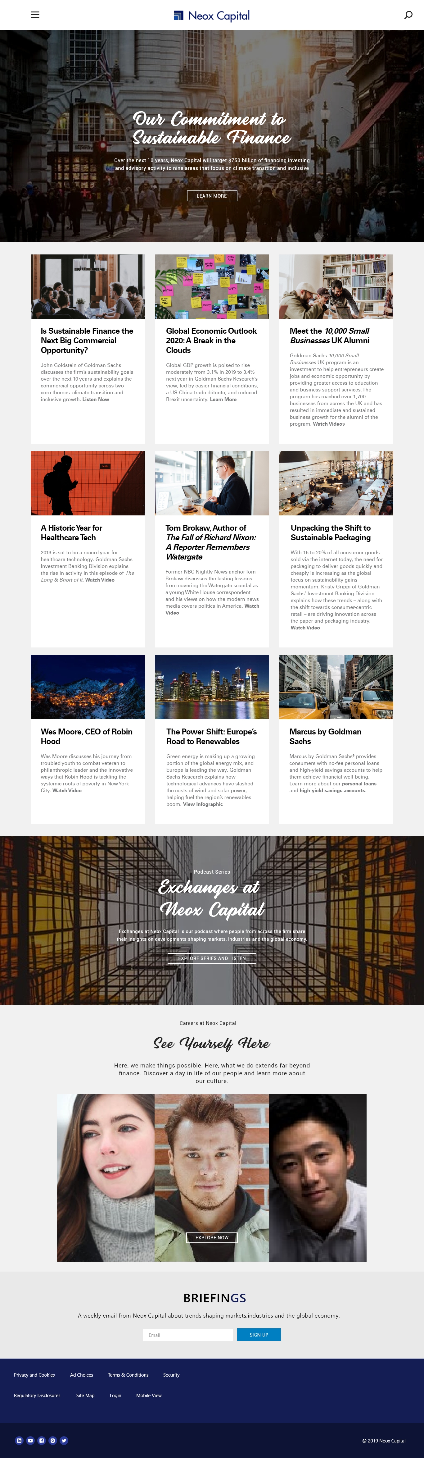
New and upgraded www.neoxcapital.com content & design financial markets
Vous souhaitez remporter un projet comme celui-ci ?
Ce client a reçu 86 web designs de la part de 15 designers. Il a choisi ce web design de Hamzah Rahmatullah comme design gagnant.
Inscrivez-vous Trouvez des Projets de Design- Garanti
-
 US$1120
-
 86 designs
-
 15 designers
Brief de Web Design
We need an upgrade of our site. The current site is www.neoxcapital.com
Navigation with full site map i.e. the user can select any page from any menu item.
The “Insights” (Insikter) page will remain as is except new design AND with far more possibilities to add thumbnails, picts, videos etc. The user will have to logon to be able to read the full story.
The “Produkter & Tjänster” (“How to invest” in current web) will contain about the same info as the current “How to invest” pages.
Some pages will contain one or more videos and or speaker supported “live” graphics which we will supply. The media content shall be easy to change.
The site will have two languages from start, English and Swedish. There will be more languages added within 1 year or slightly more.
All texts will be provided by us.
I’m attaching a PDF with suggested content for some of the new pages. However this is just content and absolutely no design. We need new design for the total of the site as well as for the graphics.
Expectation info:
These sites (Both major players in our business) can be used as inspiration:
https://www.juliusbaer.com/eu/en/
https://www.goldmansachs.com/index.html
Below some opt-OUT and opt-IN graphic rules in connection with the Web supporting our business acumen and brand:
Opt-OUT:
- images similar to educational comic books - it signals an authoritarian approach where the customer is small (insubstantial).
- images that signal trading, cyber, mystery and fast-paced business. We are extremely long-term and invest in real companies
- avoid images containing coins, calculators and banknotes. We're not a savings bank company. or payment service-branch
- avoid images of large data flows, because we should not make facts complex, but simple and comprehensible
- avoid sensing pictures of photo models. We are real people who stand for our efforts. We're not going to hide.
- avoid pictures of suits and tie. They signal rigid-banking. We're smart-investment, flexible, adaptable. Rather curl up your sleeves and show that we’re building something valuable.
- avoid pictures of skyscrapers and cool bank pictures - because they signal the more old valuations of big capital and giant banks - that we are not at all. I know we've had clean facades before. As long as we're not talking about bank skyscrapers, I'm in.
Opt-IN
- pictures of Peter in moderate amount - he is our symbol person
- films with Peter and explaining graphical films - explaining and clarifying
- images of pedagogy that give the customer a sense of overview and insights that we give to the customers in our service
- illustrations that explain and deepen our work
- pictures and bars that in 3d illustrate our consistent results and stable delivery
- images that signal that we have a full grasp of data, flows and analyses - without the image becoming a space adventure
- use the logo as a grid, shape and colour.
- no genre portraits, rather pictures of real customers - which gives a sense of why they are customers here
- images that support our core i.e. is science, innovation, unrestricted thinking (“out of the box” – (don’t like that sentence)), smart-solutions, data-driven, client-cantered, flexible and adaptable to client needs and expectation.
- Solid - to be trustworthy in any economic climate
- Long term - consistent work and choices. No trading. Numbers talk
- Data-driven - real tech - combining years of work in finance with straight on tech
Presenting on the webpage:
The story in text and illustration
Show the truth - we have a great history to show and give space
Only numbers and graphs that has a meaning - no artificial numbers etc.
Updates
Went on vacation/holiday
Marché(s) Cible(s)
Europe
Code
Codé - Design et Code demandé
Nombre de Pages Demandé
5+ page
Couleurs
Le designer choisit les couleurs à utiliser dans le design.
Aspect
Chaque curseur illustre les caractéristiques de la marque client et le style que doit transmettre votre design de logo.
Élégant
Audacieux
Léger
Sérieux
Traditionnel
Moderne
Sympathique
Professionnelle
Féminin
Masculin
Coloré
Conservateur
Économique
Haut de gamme
Exigences
Doit avoir
- Colours in line with www.neoxcapital.com