Real Estate Company Logo - Bold, Classy, Timeless yet modern
Vous souhaitez remporter un projet comme celui-ci ?
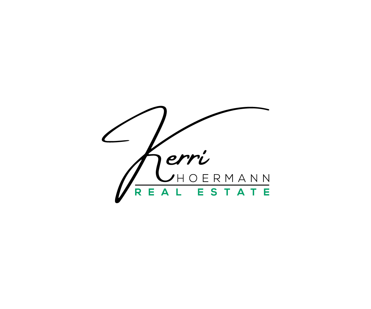
Ce client a reçu 531 designs de logo de la part de 188 designers. Il a choisi ce design de logo de Raiyan 3 comme design gagnant.
Inscrivez-vous Trouvez des Projets de Design- Garanti
-
 US$150
-
 531 designs
-
 188 designers
Brief de Design de Logo
I’d like a simple strong logo made so I can put it on business cards, websites and real estate signs. I think less is more and I would like it to look classic and modern. I do not want it to look dated in 10 years. I think real estate signs should be simple so you can easily see them from far away. It does not need to have “for sale” or anything like that built into the logo.
Mises à jour
Need extra days to review
Marché(s) Cible(s)
High end luxury and investment real estate. My clients are high end business minded individuals.
Secteur / Type d'entité
Real Estate
Texte du logo
Kerri Hoermann Realty OR Kerri Hoermann Real Estate Company
Styles de logo qui vous intéressent
Logo mot symbole
Logo (texte seulement)
Logo de Lettermark
Acronyme ou logo texte (texte seulement)
Styles de police à utiliser
Couleurs
Le designer choisit les couleurs à utiliser dans le design.
Aspect
Chaque curseur illustre les caractéristiques de la marque client et le style que doit transmettre votre design de logo.
Élégant
Audacieux
Léger
Sérieux
Traditionnel
Moderne
Sympathique
Professionnelle
Féminin
Masculin
Coloré
Conservateur
Économique
Haut de gamme
Exigences
Doit avoir
- It must be bold, confident and classy. Timeless too.
Bien d'avoir
- Vivid colors to catch attention. In my area there are already a lot of red signs (like Keller Williams) and blue signs (Kuper Sotheby’s) and green (Phyllis Browning Company) - google those names and you’ll see my competition. Corie Properties is a smaller firm but their logo is also bold and catches the eye. I like the idea of using yellow with blue OR orange with blue simply because no one else is using those colors. My fear is that those color combinations will look dated. I do not have to have those color combinations though! I am open to anything. I’m in San Antonio so my market has a lot of influence from Mexico. I uploaded an image of Otami art so you can get an idea of the influence Mexico has on the entire city. San Antonio has a lot of Fiesta style decor in general. I like the idea of incorporating that but, again, I worry that will make my logo looked dated and not modern or classic.
Ne doit pas comporter
- “For sale”