Harmony Community Church logo
Vous souhaitez remporter un projet comme celui-ci ?
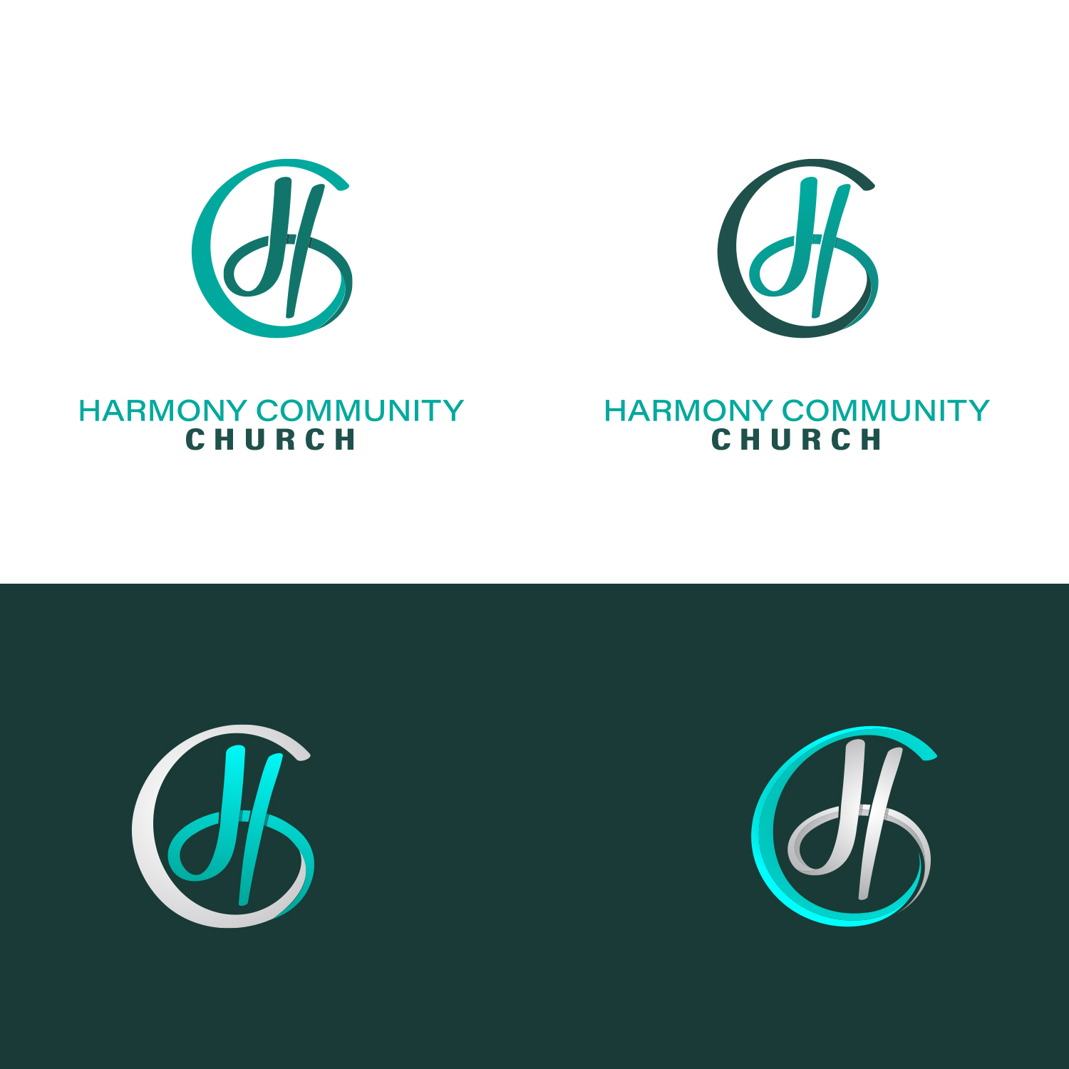
Ce client a reçu 387 designs de logo de la part de 133 designers. Il a choisi ce design de logo de GenArt comme design gagnant.
Inscrivez-vous Trouvez des Projets de Design- Garanti
-
 US$150
-
 387 designs
-
 133 designers
Brief de Design de Logo
Need a vector-based logo. We are a Community Church in Florida-serving less than 100 but wanting to modernize logo for web presence and have fresh look for badges on cups, t-shirts, etc. Target market is mixed-age community, but would love more in the 28-45 age demo. One option for the graphic would be to include “H” and “C” stylized somehow, but that isn’t a requirement. We want something fresh looking (blues, grays, etc. is one color scheme but I have seen lots of unique colors in designs and I like those fresh unique colors also). Only color to stay away from is green. We are very open.
Marché(s) Cible(s)
25-50 demographic, singles/families.
Secteur / Type d'entité
Religious
Texte du logo
Harmony Community Church
Styles de logo qui vous intéressent
Logo d'Enseigne
Logo contenu dans une forme
Logo pictural
Un objet réel (texte facultatif)
Logo abstrait
Conceptuel / symbolique (texte facultatif)
Logo de figurine
Logo avec illustration ou personnage
Styles de police à utiliser
Couleurs
Le designer choisit les couleurs à utiliser dans le design.
Aspect
Chaque curseur illustre les caractéristiques de la marque client et le style que doit transmettre votre design de logo.
Élégant
Audacieux
Léger
Sérieux
Traditionnel
Moderne
Sympathique
Professionnelle
Féminin
Masculin
Coloré
Conservateur
Économique
Haut de gamme
Exigences
Doit avoir
- We are open. We want modern/fresh look and color scheme. We are looking for church name as part of logo but would like just the visual of the logo to be able to stand-alone on shirts or mugs as well.
Bien d'avoir
- Clean modern design for logo and font. Don’t want/need overtly religious symbols in logo. Would like the graphic in logo to be able to be stand-alone as representative of our church, even if we used it without the church name. I have seen some softer options in font and graphic lettering and those have been nice as well. Too corporate looking is coming off as too harsh.
Ne doit pas comporter
- Please stay away from greens in the color palette.