At Home Bakery 'Sweetery' Logo Design
Vous souhaitez remporter un projet comme celui-ci ?
Ce client a reçu 311 designs de logo de la part de 107 designers. Il a choisi ce design de logo de meow.designer comme design gagnant.
Inscrivez-vous Trouvez des Projets de Design- Garanti
-
 US$150
-
 311 designs
-
 107 designers
Brief de Design de Logo
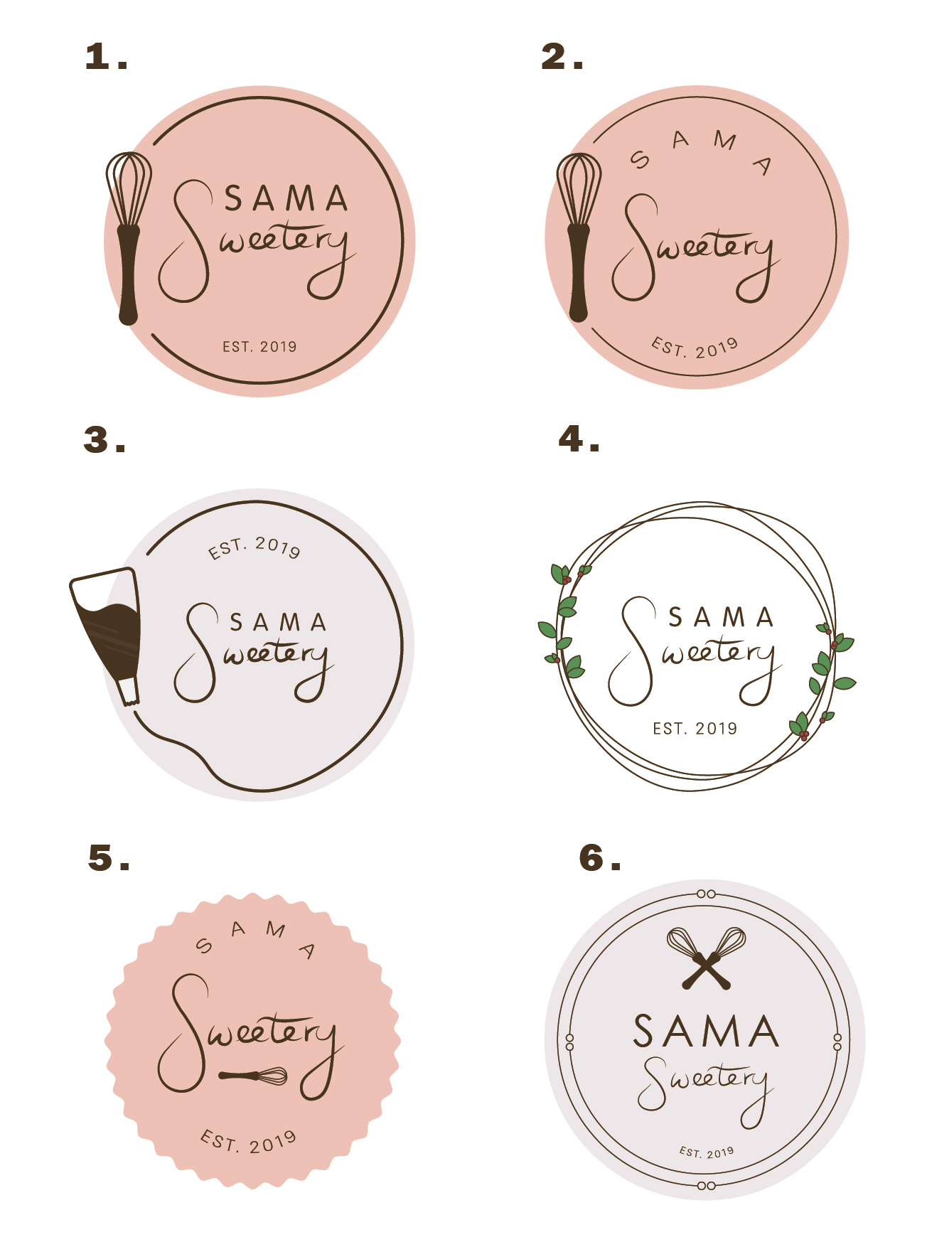
I need a logo for my at home bakery (sugar cookies, cupcakes, cake, bread). I’m looking for something feminine, modern, a little whimsical and unique that would be eye catching and attractive on stickers, labels, Facebook, Instagram etc. SAMA is the first initials of me, my husband and my two kids. I’d like some cursive in there. I’d also need to be able to use it as a watermark on pictures and videos. I'd like the cursive to be more of a hand written feel to it, or the design to look like something we pieced together rather than something corporate.
Marché(s) Cible(s)
Middle class, mostly moms or females. Fundraisers, Bachelorette, Baby Showers, Weddings, activities, school functions, sport teams, events etc. Holidays and family gatherings.
Texte du logo
SAMA Sweetery
Styles de logo qui vous intéressent
Logo d'Enseigne
Logo contenu dans une forme
Logo pictural
Un objet réel (texte facultatif)
Logo mot symbole
Logo (texte seulement)
Styles de police à utiliser
Autres polices appréciées:
- Similar to picture
Couleurs
Le designer choisit les couleurs à utiliser dans le design.
Aspect
Chaque curseur illustre les caractéristiques de la marque client et le style que doit transmettre votre design de logo.
Élégant
Audacieux
Léger
Sérieux
Traditionnel
Moderne
Sympathique
Professionnelle
Féminin
Masculin
Coloré
Conservateur
Économique
Haut de gamme
Exigences
Doit avoir
- Some cursive. I'd like to to be feminine and modern but cute and somewhat simple.
Bien d'avoir
- It would be cool to be able to have SAMA be in all caps and then Sweetery be in a handwritten looking cursive depending on if it looked good. Not sure if it would be better to have everything on one line or if it would look better to have it stacked on top of eachother.
Ne doit pas comporter
- S as a statement symbol since there's a local bakery already that has a cursive R as their logo with a circle around it. There’s also a local bakery that has a rolling pin as a main focal point already.