anniversary symbol for company in pharmaceutical retail solutions
Vous souhaitez remporter un projet comme celui-ci ?
Ce client a reçu 18 designs graphiques de la part de 5 designers. Il a choisi ce design graphique de atularts comme design gagnant.
Inscrivez-vous Trouvez des Projets de Design-
 €70
€70
-
 18 designs
-
 5 designers
Brief de Design Graphique
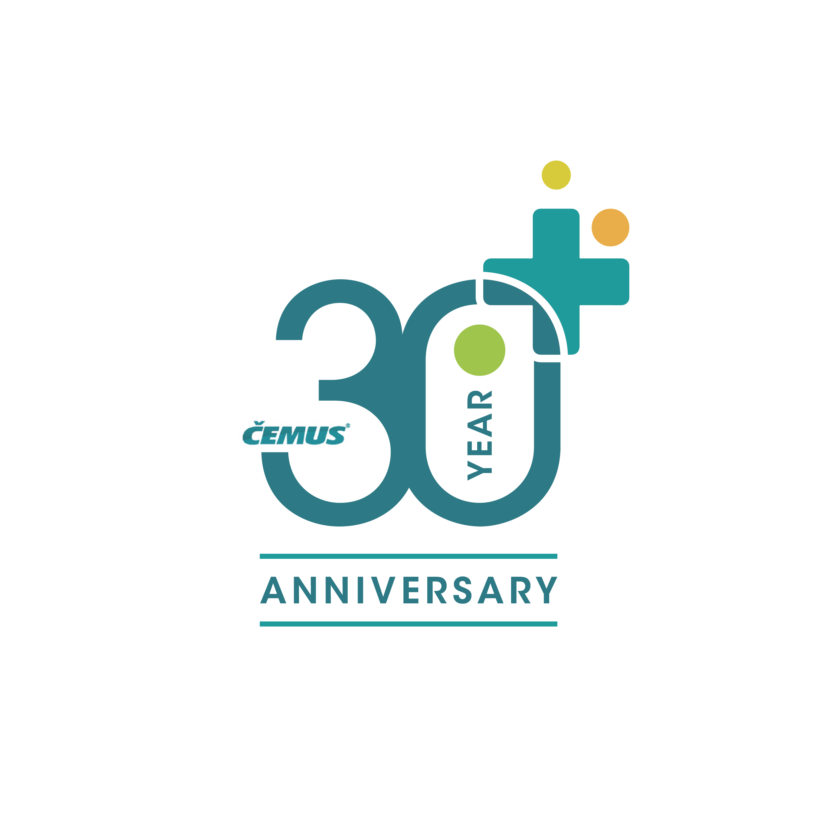
Our company is celebrating 30-year anniversary and we are looking for a graphic symbol that will represent our growth and development within the industry along with our partners. Our company is based in pharmacy retail sector services and our solutions cover wide range of services from interior design to consultancy services for pharmacies. The symbol should represent both growth and pharmaceutical sector and should be suitable for a cover of a A3 promotion material, so it should look good even in bigger size. It should also fit our logo (along with colours) that you can find attached. More information the company can be found on our company website (www.cemus.cz).
Marché(s) Cible(s)
Pharmaceutical professionals with traditional values
Secteur / Type d'entité
Pharmacy
Couleurs
Le designer choisit les couleurs à utiliser dans le design.
Aspect
Chaque curseur illustre les caractéristiques de la marque client et le style que doit transmettre votre design de logo.
Élégant
Audacieux
Léger
Sérieux
Traditionnel
Moderne
Sympathique
Professionnelle
Féminin
Masculin
Coloré
Conservateur
Économique
Haut de gamme
Exigences
Doit avoir
- Should be dominant at our A3 promotion front page.
Bien d'avoir
- The idea could be linked to wood circles or perhaps maze as something symbolizing growth, however the pharmaceutical sector should also be represented there, either in form of pharmaceutical cross, health symbol, medicine or something like that. The design should not be too complex.
Ne doit pas comporter
- The graphics should not be too modern or abstract, it should rather represent more traditional and comprehensive values.