Eight "Word Cloud"-like Graphics of History of Women's Suffrage
Vous souhaitez remporter un projet comme celui-ci ?
Ce client a reçu 28 designs graphiques de la part de 4 designers. Il a choisi ce design graphique de Rickyy comme design gagnant.
Inscrivez-vous Trouvez des Projets de Design- Garanti
-
 US$110
-
 28 designs
-
 4 designers
Brief de Design Graphique
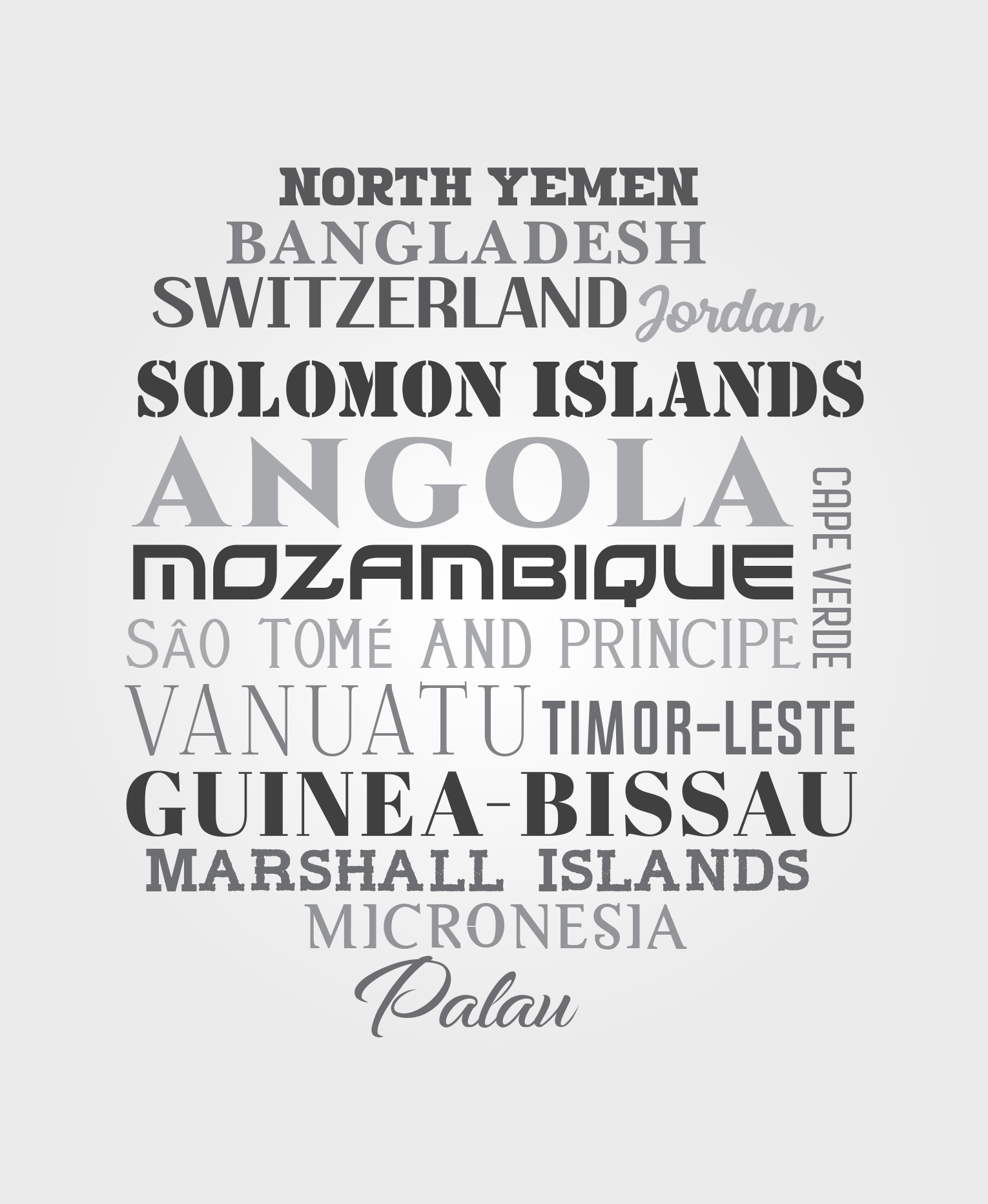
Each of these eight greyscale graphics will represent a period of time in which women achieved the right to vote, around the world. This project is to create eight distinct graphics, which are to be designed using a set of lists (Lists 1 - 5) of countries of the world, in the order in which they granted women the right to vote. This same document contains 3 additional lists (Lists A, B and C) that another designer produced as the winning designs in the last go-round. You can use them as places to start for those 3 graphics. They other designed did a good but imperfect job--we'd be happy if you were able to simply clean up their design. I can provide those files in Illustrator if so desired. KEY INSTRUCTIONS The names of the countries (or regions) must be placed in order, where the top left corner of the first letter of the name of the earliest countries to grant women's suffrage will be toward the (1a) top (1b) left, and the top left corner of the first letter of the name of the most recent will be toward the (2a) bottom (2b) right. See the examples (List A, B and C), and the first "For example" three paragraphs down. Ultimately, each of these graphic designs will each be placed onto a 5.5 inch by (at most) 7.5 inch page. The graphics must have a background that can be removed in Illustrator, or else be white or transparent. The color palate is greyscale, as the graphics will be printed in a 6x9" b&w book. The words for each country should use distinct fonts, ideally using a font that reminds you of the country in question. It is ok to use the same font in different lists, but not in the same list. Though using a left>right design is acceptable, the best designs will place some of the country names into the design using other angles than strict horizontal. HOWEVER, the key to doing this is to remember that this list is chronological based on (1a)(1b)(2a)(2b) above. For example, you might place the name "Japan" rotated vertically onto the design, with the "n" (at the end of the name "Japan") placed closest to the top of the design. In the chronological list, Japan is preceded by India and followed by Malta. The "n" in Japan must not be below a country name that follows Japan chronologically on the list, nor should it be to the right of it. Thus, if the reader considers the design, and looks at it from top-down and left-right, they will first see (all or at least a part of the word) "India" before they see the "n" in Japan, before they see (all or at least a part of the word) "Malta." This allow for the chronology of the lists to be maintained while allowing for more creative design. You can see this example in List C. Finally, you will see that there are groupings of countries in the lists. This format is found when a country (the "original country") has since broken up into two or more other countries (the "secondary countries," which are indented in the lists). When this occurs in a list, a soft line wants to be placed around this grouping within the design, to help the reader recognize that the secondary countries were once a part of the original country. This soft line contains the secondary countries and is to begin and end at the beginning and end of the primary country's name. For example, the former Czechoslovakia (original country) is now the Czech Republic and Slovakia (secondary countries). These secondary countries are surrounded by a soft line (with rounded corners). This soft line should extend out from the "C" at the beginning of Czechoslovakia, down and around the Czech Republic and Slovakia, up and then curve back in to finish at the middle of the "a" at the end of the name Czechoslovakia. This was done INCORRECTLY in List A, and was also done INCORRECTLY in list C. The errors, and how the designer will be asked to correct them, are described below those examples. A
Mises à jour
Need extra days to review
Styles de police à utiliser
Autres polices appréciées:
- Myriad fonts to be used
Couleurs
Le designer choisit les niveaux de gris à utiliser dans le design.
Aspect
Chaque curseur illustre les caractéristiques de la marque client et le style que doit transmettre votre design de logo.
Élégant
Audacieux
Léger
Sérieux
Traditionnel
Moderne
Sympathique
Professionnelle
Féminin
Masculin
Coloré
Conservateur
Économique
Haut de gamme
Exigences
Doit avoir
- See description
Bien d'avoir
- See description
Ne doit pas comporter
- See description