

 Rafraîchir
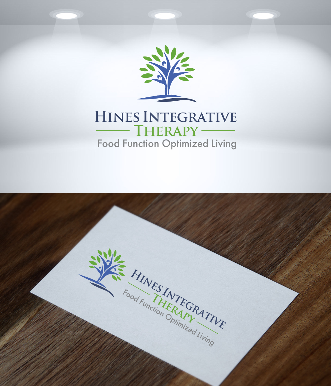
Logo and business card design needed for health/wellness company
Vous souhaitez remporter un projet comme celui-ci ?
Ce client a reçu 69 designs de logo de la part de 26 designers. Il a choisi ce design de logo de likethecookies comme design gagnant.
Inscrivez-vous Trouvez des Projets de Design
- Garanti
- Projet Lié 1
-
 US$150
-
 69 designs
-
 26 designers
Brief de Design de Logo
CREATIVE BRIEF FOR LOGO AND BUSINESS CARD DESIGN
Company: Hines Integrative Therapies
TAG LINE: Food + Function + Optimized Living
BACKGROUND:
Penny Hines is an Occupational Therapist and Certified Integrative Nutrition Health Coach. Penny began her career as an occupational therapist that specialized in helping children with sensory processing issues and complications. She worked closely with families to develop strategies that could be implemented in daily household activities to help children and their families better cope and manage behaviors. Her work has helped countless kids and families restore function, regain normalcy. Children connect more deeply with parents, parents are better able to cope with their children’s issues —and fuller life potential is returned to all parties.
Years ago, Penny was diagnosed with Celiac Disease. This opened up a whole new realm of study for Penny to better understand how food/nutrition affect not only physical health, but mental health. Issues with food and gut health actually impact mental health—causing anxiety, depression and other issues. Penny not only managed to treat herself and restore vibrant health (both mentally and physically), but she went on to study at the Institute of Integrative Nutrition. She is now a subject matter expert on gut-brain connection, and understanding how nutrition and gut function affect how one feels (mentally and physically), but also how one thinks, learns, reacts, and behaves. Thus, Penny had new understanding of how gut health ultimately impacts not only physical health, but mental processing, and the quality of one’s overall life and ability to thrive.
Penny’s business has now grown into an integrative therapy practice. She still works with pediatrics and their families to help resolve sensory processing issues, but now she can also layer on food/nutrition strategies where appropriate to maximize results. She can observe patients and see where food choices are affecting the gut brain connection and exacerbating the sensory processing issues. She works with clients to implement new food strategies and sensory/activity strategies to facilitate positive changes in thinking/learning, behavior, communication, attention, regulation, socialization, mental, physical and emotional health. She coaches on new adaptive food strategies and functional behavior modifications to enable clients and families to achieve physical and mental wellness—and to optimize their lives.
In working with adult clients, Penny will also take an integrative approach. She works to understand the health issues the patient is having, and will layer on various nutrition strategies and adaptive functional strategies in a synergisitic approach to restore health, wellness and optimized living for the client.
Penny’s approach is synergistic/integrative in finding customized, unique solutions for each client. If she was to summarize the key focus of her practice---she would say CONNECTING DEEPLY to restore life. This connection is two-fold: 1). Penny needs to connect deeply with her client to truly listen, understand, hear and diagnose to craft her synergisitic strategies for each client to get results, and 2). Her goal is to enable clients to connect more deeply in their lives to gain enrichment. Often, with pediatric clients with sensory issues, the goal is to get them to connect deeply with their parents.
Design a logo and business card a this business.

Mises à jour
I selected top three designs---all needed some revisions. I sent the designers feedback--but have not seen any revisions to get logos to final form so I can choose winner.
I need the designer "Likethecookies" to finish the project as per feedback. (I am not sure she is getting teh feedback). She needs to complete the tag line.
Marché(s) Cible(s)
TARGET AUDIENCE
• Families (core of Penny’s practice is still children under 5)
• Adults suffering health issues—usually mixed presentation of physical/mental symptoms
• Other practitioners (as Penny is a guest lecturer, trainer, panel expert)
Secteur / Type d'entité
Health And Wellness
Texte du logo
Tag Line: Food + Function + Optimized Living (see executional considerations)
Styles de logo qui vous intéressent
Logo pictural
Un objet réel (texte facultatif)



Logo abstrait
Conceptuel / symbolique (texte facultatif)



Logo mot symbole
Logo (texte seulement)


Styles de police à utiliser

Couleurs
Couleurs choisies par le client et à utiliser dans le design de logo:
Aspect
Chaque curseur illustre les caractéristiques de la marque client et le style que doit transmettre votre design de logo.
Élégant
Audacieux
Léger
Sérieux
Traditionnel
Moderne
Sympathique
Professionnelle
Féminin
Masculin
Coloré
Conservateur
Économique
Haut de gamme
Exigences
Doit avoir
- BRAND VALUES/PERSONALITY---logo/font/colors should convey these values
- • Caring, empathy, compassion
- • Integrity, trust
- • Professionalism, expertise
- • Approachability, Connectivity, openness to communicate on intimate issues
- • Hope , optimism
- EXECUTIONAL CONSIDERATIONS
- • Blues, Greens—colors that are calm, soothing and wellness related
- • Avoid yellow, reds as they convey acute issues, emergencies, inflammation and pain. BUT---there needs to be some warmth/depth to the logo. The business has a deep human connection/empathy dimension—and the logo cannot be too cool. Orange might convey hope, optimism, fun and a degree of warmth.
- • Logo should balance between professionalism/expertise and kid appeal. Logo should convey that Penny works with children/families but not be too juvenile or cartoonish to risk alienating adult clients or other practitioners.
- • Logo should convey Penny’s integrative approach: she layers on strategies such as nutritional coaching in addition to functional strategies to help with processing/sensory issues and helps integrate parenting techniques. Ultimately, all of these are synergistic and help clients restore hope/normalcy --and enable optimized living.
- • Penny is NOT a dietician or a nutritionist. Logo should not suggest that nutrition is the only part of what she does. Nor should the logo be too anatomical (gut/brain) as this doesn’t address the human connection and functional/sensory processing and occupational therapy portion of the business.
- • The tag line is Food + Function + Optimized Living. Please note that the “+” signs are not set in stone. We’re trying to graphically convey the integrative/synergistic approach Penny takes. That she layers adaptive nutritional strategies to sensory/functional processing strategies and the two together yield results of optimized living. Creatives can feel free to explore using graphic design/symbols to showcase the synergistic effect of food strategies plus functional strategies yielding benefits (optimized living) for the client.
- • Use font that is legible, easy to read. Font will be used in Powerpoints, big screen presentations, marketing literature, website and social media.
- • Black/white logo will also be needed.
Ne doit pas comporter
- No red or yellow colors
- EXECUTIONAL CONSIDERATIONS
- • Blues, Greens—colors that are calm, soothing and wellness related
- • Avoid yellow, reds as they convey acute issues, emergencies, inflammation and pain. BUT---there needs to be some warmth/depth to the logo. The business has a deep human connection/empathy dimension—and the logo cannot be too cool. Orange might convey hope, optimism, fun and a degree of warmth.
- • Logo should balance between professionalism/expertise and kid appeal. Logo should convey that Penny works with children/families but not be too juvenile or cartoonish to risk alienating adult clients or other practitioners.
- • Logo should convey Penny’s integrative approach: she layers on strategies such as nutritional coaching in addition to functional strategies to help with processing/sensory issues and helps integrate parenting techniques. Ultimately, all of these are synergistic and help clients restore hope/normalcy --and enable optimized living.
- • Penny is NOT a dietician or a nutritionist. Logo should not suggest that nutrition is the only part of what she does. Nor should the logo be too anatomical (gut/brain) as this doesn’t address the human connection and functional/sensory processing and occupational therapy portion of the business.
- • The tag line is Food + Function + Optimized Living. Please note that the “+” signs are not set in stone. We’re trying to graphically convey the integrative/synergistic approach Penny takes. That she layers adaptive nutritional strategies to sensory/functional processing strategies and the two together yield results of optimized living. Creatives can feel free to explore using graphic design/symbols to showcase the synergistic effect of food strategies plus functional strategies yielding benefits (optimized living) for the client.
- • Use font that is legible, easy to read. Font will be used in Powerpoints, big screen presentations, marketing literature, website and social media.
- • Black/white logo will also be needed.
Fichiers
Télécharger tous les fichiers - 0,0 MBPaiements
Total
US$150
Date limite du projet
06 oct. 2019 16:05:12 UTCOptions du projet
Projet(s) Lié(s)
- offrant un design de carte de visite de US$39 au gagnant
