RedPla.net Logo
Vous souhaitez remporter un projet comme celui-ci ?
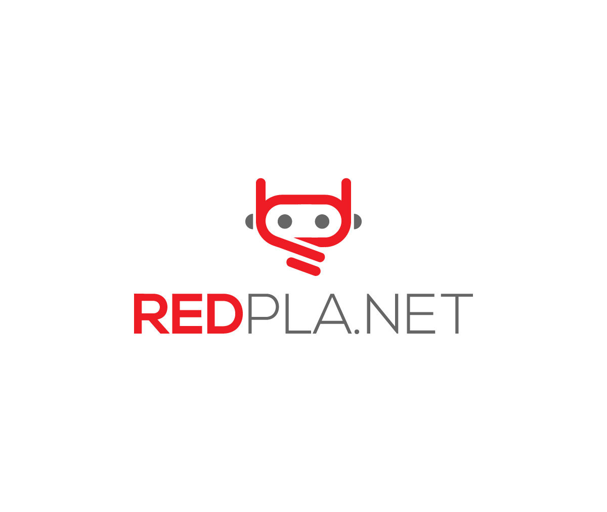
Ce client a reçu 303 designs de logo de la part de 137 designers. Il a choisi ce design de logo de Raju art pro comme design gagnant.
Inscrivez-vous Trouvez des Projets de Design- Garanti
-
 US$240
-
 303 designs
-
 137 designers
Brief de Design de Logo
We need a logo design for a new company my husband and I have formed called RedPla.net. The name comes from our last name "Marzolph". When my husband was in high school people called him "Mars." He is a very punny person and we loved the idea of "RedPla.net" alluding to our "Marz" name. We are a company that focuses on lead generation for our clients. Meaning we are trying to serve them through google ad placements, ux research & design, accessibility audits, and overall strategies that generate them new/quality leads to pursue in their businesses.
We have started to put together a website with content about what we do. It can be found here: http://joinredpla.net/
(Please note that this site has not been branded yet, so do not feel like any brand elements need to come from the site. We have only loaded content into a WordPress template.)
What We Want / Requirements:
- We really like the current treatment of the word RED being bold and PLA.NET using a lighter font weight. We like all uppercase, but feel free to change our minds. :) The problem comes when trying to use this concept on social media. The name is so long, that if this was used on facebook or linked in it is completely illegible when the logo appears small next to our posts. We do not want to be prescriptive, but are thinking that we would like a supporting logo mark that we could use along side or as a replacement to the name red planet in those situations. Besides the obvious planet idea, things we think that could be interesting to explore are craters, martians, astronauts - or something that alludes to what we do (lead generation/ growth).
-We do not really like the idea of an abstract symbol with no meaning. We'd like something really simple or beautifully illustrated. Something clever would really get us excited. Something friendly and inviting is a must. We have uploaded a character that we have found online that we felt conveys this treatment (if illustrated character is the direction you pursue.)
-The .NET is really important to us as it both completes our name and offers the ending to our URL. Please do not remove the dot.
-In the uploaded files you will see two similar color palettes that we like. We are open to other suggestions, we just feel these colors exemplify our personalities best. We also did not want to be locked in to a black, red, and white color palette.
Texte du logo
"REDPLA.NET" / nothing if creating a separate logo mark that is not integrated with the name