

 Rafraîchir
Award Winning Patient Support Program needs infographics designed
Vous souhaitez remporter un projet comme celui-ci ?
Ce client a reçu 13 designs graphiques de la part de 4 designers. Il a choisi ce design graphique de DesignerGuide comme design gagnant.
Inscrivez-vous Trouvez des Projets de Design
-
 US$200
-
 13 designs
-
 4 designers
Brief de Design Graphique
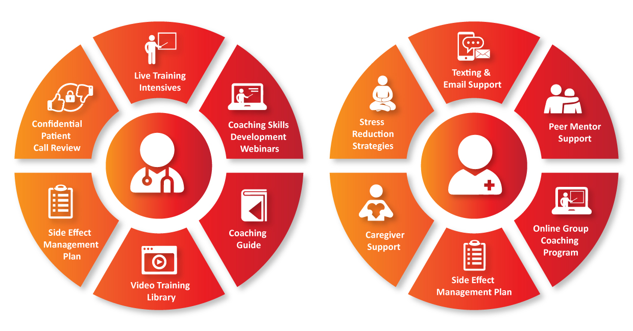
I need two infographics created for my website and my pitch decks. I have two services I offer. Each service has 6 elements to it. I developed and launched an innovative, coaching-based program to help patients better manage side effects and stress as a solution to a challenge that costs healthcare $600 billion annually and costs patients quality of life and reduces positive outcomes. One of the services, my Patient Adherence Training Program, trains healthcare professionals such as pharmacists, nurses, and doctors, to use coaching skills and a behavior change strategy I designed to help them better listen to, understand, and support patients. The program includes live training intensives, coaching skills development webinars, a customized coaching guide, video training and support documents library, side effect management plan, and confidential patient call review. The second program is my Patient Support Program - it provides patients texting/email support programs, peer mentor support, online group coaching program, side effect management plan, caregiver support, and stress reduction strategies. The program was one of 9 finalists for the 2018 Astellas C3 Innovative Patient Support Prize and I was invited to resubmit again this year. The goal of the infographics is to visually illustrate the 6 core elements of the two programs. Adherence and behavior change require comprehensive solutions - therefore the programs have to be robust - but I need to simplify the introduction to what each program includes. Patients deserve better support and are often judged as being lazy when they stop taking medication or don't follow "doctor's orders" - when, in fact, it is a complex list of factors that cause non-adherence. My programs also give them skills to help them enjoy better quality of life. The infographic design I envisioned and mocked up uses icons and can include text naming each icon for clarity. I don't expect the infographic to rely on the image of each icon alone. Also, there is one program element that is the same for both - the side effect management plan - so, while there are 12 elements between the two programs, there will be 11 icons. I would need each of the 11 icons in separate files as well as in a file with the finished infographic so I can use the icons independent of the infographic when I go into detailed slides/breakdown of the elements. I have attached a mock up with notes and breaking out the icons. I have also attached the wireframe for the new landing page to show how the infographics will be featured on the web page. My Well Beyond Ordinary logo was designed using 99 designs and I still love it and get compliments all the time so I'm turning to this process again and hoping for as great an experience and outcome!
Marché(s) Cible(s)
Healthcare organizations and pharmaceutical companies
Secteur / Type d'entité
Pharmaceutical
Styles de police à utiliser

Couleurs
Couleurs choisies par le client et à utiliser dans le design de logo:
Aspect
Chaque curseur illustre les caractéristiques de la marque client et le style que doit transmettre votre design de logo.
Élégant
Audacieux
Léger
Sérieux
Traditionnel
Moderne
Sympathique
Professionnelle
Féminin
Masculin
Coloré
Conservateur
Économique
Haut de gamme
Exigences
Doit avoir
- Consistent design for each icon in the infographic, readable text description of each icon, originally created icons - please do not use the samples in the brief as they are just to give an idea - I do not own the copyright to them.
Ne doit pas comporter
- Don't be insensitive to gender/culture/diversity in choice of icons - needs to be non-specific or a diverse representation