RES Employment Services Company Logo
Vous souhaitez remporter un projet comme celui-ci ?
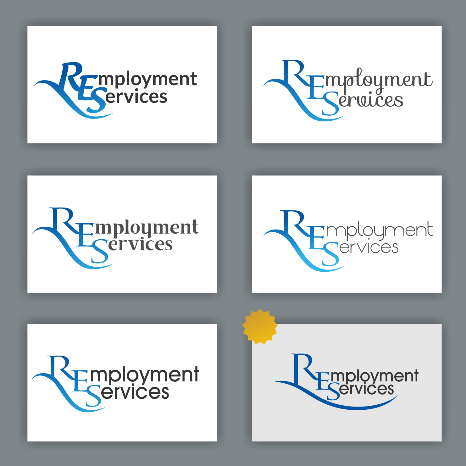
Ce client a reçu 79 designs de logo de la part de 40 designers. Il a choisi ce design de logo de Arham Hidayat comme design gagnant.
Inscrivez-vous Trouvez des Projets de Design-
 A$150
A$150
-
 79 designs
-
 40 designers
Brief de Design de Logo
I would like a logo designed that is similar but better than what i did in word attached. I would like the R (and happy to look at different styles) to have a long tail like shown but i also need to be able to have the R stand alone for different marketing concepts. i would like the blue to be deep but bright and have only the RES in blue and the rest in black. I kinda need this yesterday as well.
I just wanted to be clear again ... The Name is RES orignally it was going to say ROSH Employment Services but that is not an option. Therefore it reads RES ... I would like the R emphasized with the long tail and the E and S to not be repeated but the words incorporated with it like (as in similar to) the attached
I like the flow of thR - i dont want something that LogoJoy will spit at me - is there anyone on here that actually designs - if i wanted something typed from word i could have done that myself
Marché(s) Cible(s)
Nurses, Carers,
Operating within Aged Care and Mental Health
Texte du logo
RES | Employment Services OR R Employment Services
Styles de logo qui vous intéressent
Logo mot symbole
Logo (texte seulement)
Logo de Lettermark
Acronyme ou logo texte (texte seulement)
Styles de police à utiliser
Couleurs
Couleurs choisies par le client et à utiliser dans le design de logo:
Aspect
Chaque curseur illustre les caractéristiques de la marque client et le style que doit transmettre votre design de logo.
Élégant
Audacieux
Léger
Sérieux
Traditionnel
Moderne
Sympathique
Professionnelle
Féminin
Masculin
Coloré
Conservateur
Économique
Haut de gamme
Exigences
Doit avoir
- A long Tail for the R and i would prefer that it is wide as shown as opposed to high
- I would like the blues to be Deep but bright
- The R needs to be as pretty as the one there - nothing masculine