Logo Redesign for Advisory Firm
Vous souhaitez remporter un projet comme celui-ci ?
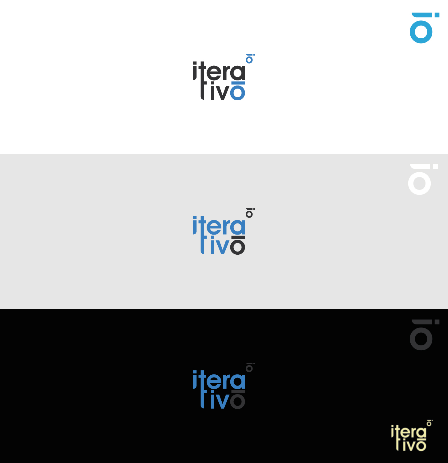
Ce client a reçu 526 designs de logo de la part de 241 designers. Il a choisi ce design de logo de ros-michael comme design gagnant.
Inscrivez-vous Trouvez des Projets de Design- Garanti
-
 US$390
-
 526 designs
-
 241 designers
Brief de Design de Logo
We're looking to have our logo redesigned. We'd like to have a more balanced design, easier to apply and with a simple application (usage) guidelines.
If it helps, we're an Advisory Firm oriented mostly in providing ERP (Enterprise Resource Planning) software to companies. We also provide advisory for process automation, digital transformation and Information Technology.
e're aiming to be a company like Deloitte, PwC, KPMG, Vuo, Grant Thornton.
iterativo word comes from iteration (repetition of a process in order to improve on every new cycle). Most of our work is based on projects.
Mises à jour
Designs look the same
Marché(s) Cible(s)
Small to large companies. No specific niche.
Secteur / Type d'entité
Business Consultant
Texte du logo
iterativo
Styles de logo qui vous intéressent
Logo pictural
Un objet réel (texte facultatif)
Logo abstrait
Conceptuel / symbolique (texte facultatif)
Logo de figurine
Logo avec illustration ou personnage
Logo mot symbole
Logo (texte seulement)
Styles de police à utiliser
Couleurs
Couleurs choisies par le client et à utiliser dans le design de logo:
Aspect
Chaque curseur illustre les caractéristiques de la marque client et le style que doit transmettre votre design de logo.
Élégant
Audacieux
Léger
Sérieux
Traditionnel
Moderne
Sympathique
Professionnelle
Féminin
Masculin
Coloré
Conservateur
Économique
Haut de gamme
Exigences
Doit avoir
- Similar colors (blue, dark gray) but more vivid. Any other tones and tendencies are allowed. Text (company name) is also a must. Something that may show more dynamic.
Bien d'avoir
- Have a nice identifiable symbol which could be easily identified as our company. Currently we use the last O which doesn't look that nice when used alone.
Ne doit pas comporter
- Arrows and bars graphics as we're not a financial, trends or statistics company. Same blue tone.