Old logo Members didn’t understand and the new logo is too plain and boring
Gagnant
Vous souhaitez remporter un projet comme celui-ci ?
Ce client a reçu 55 designs de logo de la part de 26 designers. Il a choisi ce design de logo de K-Ranj design comme design gagnant.
Inscrivez-vous Trouvez des Projets de Design-
 A$150
A$150
-
 55 designs
-
 26 designers
Brief de Design de Logo
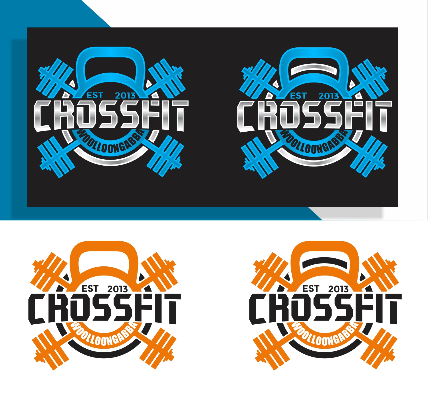
The old logo have a gas mask in it and the members didn’t really understand the meaning of it. I’ve attached a picture of it. A friend has done a basic design of something but I feel it’s too clipart . I want something that has the cross fit barbells maybe weights cattle bells something that looks good can be more detailed. Going to be put on Billboard, shirts etc
Marché(s) Cible(s)
People between age 18-40 guys and
Texte du logo
Crossfit woolloongabba EST 2013
Styles de logo qui vous intéressent
Logo d'Enseigne
Logo contenu dans une forme
Logo de figurine
Logo avec illustration ou personnage
Couleurs
Couleurs choisies par le client et à utiliser dans le design de logo:
f78f20
Aspect
Chaque curseur illustre les caractéristiques de la marque client et le style que doit transmettre votre design de logo.
Élégant
Audacieux
Léger
Sérieux
Traditionnel
Moderne
Sympathique
Professionnelle
Féminin
Masculin
Coloré
Conservateur
Économique
Haut de gamme
Exigences
Doit avoir
- Crossfit Woolloongabba and Est 2013
Bien d'avoir
- I like the idea of having the barbells maybe with weights on it as well as the Kettlebell the new design just looked a bit simple. But I’m open to new ideas
- My current design a black white and orange but I like the idea of Being able to change the colour if it’s guys or girls or if I want to printed on different coloured shirts. It doesn’t have to be one colour maybe up to 3
Ne doit pas comporter
- I don’t really like Silhouette in logo designs
Fichiers
Télécharger tous les fichiers - 5,4 MBJPEG
8E88EF25-3DA9-4F36-BE5E-43143B69BA5C.jpeg
mercredi 5 juin 2019
JPEG
A0F5068D-7533-41E9-A4C5-1B36A3A5363F.jpeg
mercredi 5 juin 2019
Paiements
1e place
A$150